*ahem* Welcome! This is The Day Today, the short-lived faux news program that matter-of-factly takes the piss out of regular broadcast news by becoming a perfect parody of it.
Created by Chris Morris (Brass Eye) and Armando Iannucci (Veep), The Day Today was the television spin-off of BBC Radio’s current affairs spoof On The Hour, also from Morris and Iannucci. The show, which only lasted six episodes, featured a stable of up-and-coming British comedy talent in the guise of mock anchors and correspondents, including Morris, Steve Coogan (as Alan Partridge), Rebecca Front, Patrick Marber, Doon Mackichan, and David Schneider. The fake news team covered all manner of stories, from the innocuous to the completely insane, all with the utmost authority and gravitas.
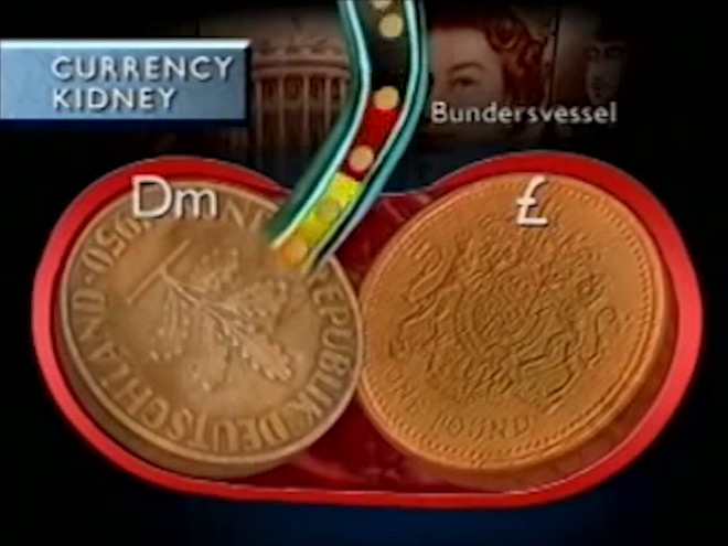
Adding dramatic weight to the phony broadcast was the barrage of hilariously unnecessary infographics, graphics, and spinning globes – so many globes – for the team of self-serious anchors to riff on and react to. 3D graphics were all the rage on news broadcasts in the early 1990s, and the producers, along with designers Richard Norley and Russell Hilliard, exploited this to full effect. Norley and Hilliard, who worked as “real news” graphics designers for ITN by day, won the contract by creating a humourous pitch about the IRA using dogs as bombs. The graphics team took five months to create the funny, excessive, and often purposefully incomprehensible graphics that became a staple of The Day Today, which scored them a 1994 BAFTA for Television Graphic Design.
Title Designer RUSSELL HILLIARD of Jump Design details the creation of the BAFTA-winning The Day Today title sequence.
RH: Talkback commissioned Richard Norley and myself to design and produce the logo, titles and extensive programme graphics for their comedy news spoof The Day Today. The show was a development of the radio series On The Hour.
[Creative Director] Richard Norley was running the commercial design department within ITN at the time. Talkback had approached them because they were looking for people with experience in making news graphics. Richard had previously been Head of Graphics on Channel 4 News and before that was at the BBC.
The Day Today was about parodying and exaggerating the style of news delivery. The occasional self importance or over-dramatic tone of voice, or the over analysis and egged-out reporting on something slightly banal (a prelude to the emergence of 24-hour rolling news coverage and the necessity to fill airtime). The Day Today would mimic current news perfectly but then take it further – ‘news plus’... the ‘super news’ of the future. It doesn‘t know when to stop! The Day Today wanted to be what super-keen news producers would make if only they were given the opportunity.
The Day Today segments featuring Chris Morris and Doon Mackichan
And this ethos came across in the graphics. Often repetition was used as a way of hammering home a point – don’t just tell something once, but again, and again. A sting involving zooming out on a globe – which turned out to be positioned in the ‘O’ of ‘TODAY’ kept repeating – turning it into a rather ludicrous fractal zoom, finally ending with the screen multiplying into pixels spelling out the word NEWS.
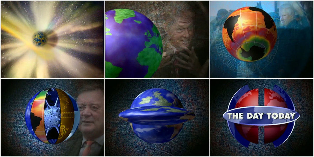
The title sequence followed suit with this approach. It was based on the classic news globe – a graphic device featured in many, if not all news programmes. But The Day Today wouldn’t have one globe, or two globes… it would have loads of globes. And each globe would be styled differently to reflect a different aspect of news.
The sequence starts with the ‘big bang’ – the beginning of time – can’t get any more important than the creation of the universe! Following that is the ‘Geology / Tectonic’ globe, showing the shifting of land masses into their current recognised state. Then there is the self-important ‘Over-sized UK’ globe. ‘Environment’ globe is made up of bands of colour representing temperature. ‘Science’ globe is a molecular model with metal map shell. The ‘Financial’ globe is made from a pound coin and the ‘Sports’ globe is a football. Each globe zooms and spins out towards the viewer in a dramatic imposing manner.
Music played a vital role in the sequence. Jonathan Whitehead brilliantly captured the mood and tone of news titles themes. The end in particular evokes News at Ten but with a refrain that just keeps going and going, each musical stab getting bigger.
The final logo animation matches this music. It kicks off with the arrival of yet another globe made up of all the presenters. Then follows a bizarre, overly complicated animation of twists, turns and morphs, each one hitting the orchestral stabs. This needlessly intricate graphic path finally settles on a logo made up of a globe, naturally.
Each episode had an extra bespoke animation added at the end of the sequence, which would introduce Chris Morris, the news anchorman, popping up to say simple phrases like ‘Welcome’ or ‘News’.
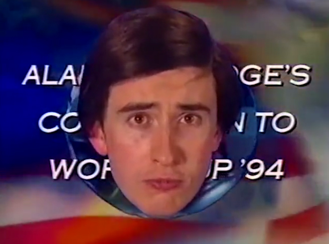
The Day Today "Sports" segment featuring Steve Coogan as sportscaster Alan Partridge
Throughout the series the graphics were made to look professional and slick, but what they were doing was often rather daft. The producers, Chris Morris and Armando Iannucci wanted people to believe this was a real news programme if they switched over to it, so the graphics themselves were never made poorly – they just illustrated funny things excellently.
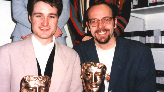
Russell Hilliard (L) and Richard Norley (R) were the recipients of the 1995 BAFTA Award for Excellence in Graphic Design for their work on The Day Today.
LIKE THIS SITE?


