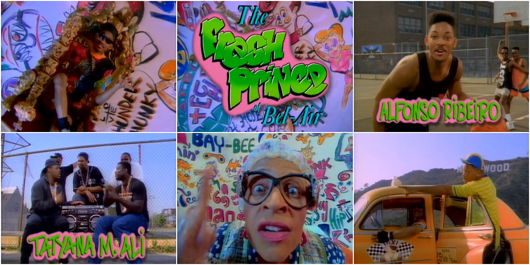
Watch the opening credits for The Fresh Prince of Bel-Air, and two things are likely to happen. One, you’ll start singing along. Two, you’ll feel a warm nostalgia spread through you like hot cocoa. That might come from the days you watched the show when it originally aired or in reruns. It might also come from seeing something that’s nearly three decades old that – despite all its dated style, colours, and fashion – has lost none of its charm. Either way, to watch The Fresh Prince opening is to look back. But 26 years ago when the show premiered, it was looking forward, even anticipating, the evolution of TV main title design.
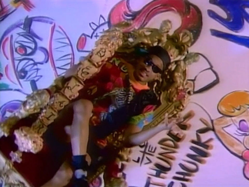
In 1990, TV openings – for sitcoms especially – weren’t particularly creative. More often than not they’d feature a montage of clips from existing episodes or actors dutifully posing for the camera as their names appeared. Sitcom openings conveyed basic information about the cast and crew, and propped up the theme song. The Fresh Prince of Bel-Air was different. Its opening was an entirely original work full of vibrant colours, intricate graffiti, sped-up cartoonish motion, and a dose of slapstick. It was a standalone work telling a self-contained backstory that was creatively distinct from the show – right down to Will Smith’s mother in the opening being different than the one in the show.
In this way, it’s not far off from what we see in our current Golden Age of TV main titles. Sure, it may not resemble the openings of series such as Game of Thrones, Jessica Jones, or Vikings, but it serves the same function: focusing on a show’s tone and spirit, rather than merely its star performers. That ahead-of-its-time inventiveness, along with its playful creative quality and infectious theme music, is what has made it one of the greatest TV openings of all time.
But how then did it come about? Well, we’d like to take a minute, just sit right there, and we’ll tell you all about the main titles for The Fresh Prince of Bel-Air.
Parents Just Don’t Understand
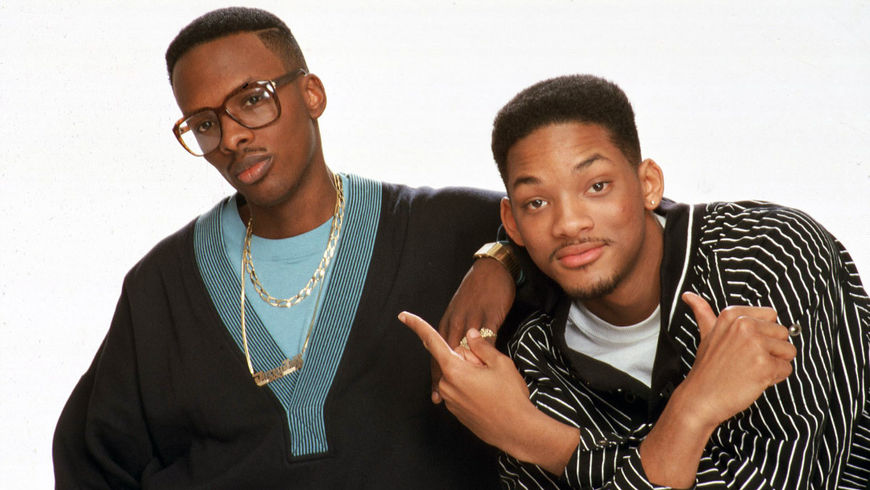
DJ Jazzy Jeff (Jeff Townes) and The Fresh Prince (Will Smith)
The Fresh Prince of Bel-Air main titles (and the show) might never have happened if Jive Records executive Ann Carli hadn’t needed a music video director for a new hip-hop duo the label had recently signed: Jeff Townes and Will Smith, otherwise known as DJ Jazzy Jeff & The Fresh Prince.
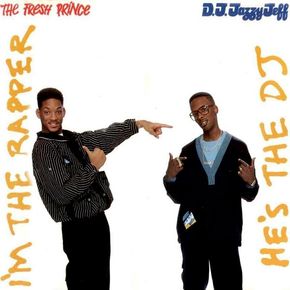
Album cover for He's the DJ, I'm the Rapper (1988)
Two years before a show about a West Philadelphia kid moving to Bel-Air premiered, Jive Records was looking to shoot a video for the duo’s promising second single “Parents Just Don’t Understand” off their album, He’s the DJ, I’m the Rapper. “Parents” was a different kind of hip-hop song, and Carli knew she needed a different kind of director to both bring it to life and ensure the pair made a strong first impression.
Carli wasn’t a fan of the usual music video-making process: send a song to a production company, who would assign a director to create a treatment – usually, without ever meeting the musicians. No, Carli wanted a director who would get to know DJ Jazzy Jeff and The Fresh Prince and make a video that achieved her goal: “What could we do that could really tell this story within the budget that we had, in a way that personified the group?” Enter Scott Kalvert.
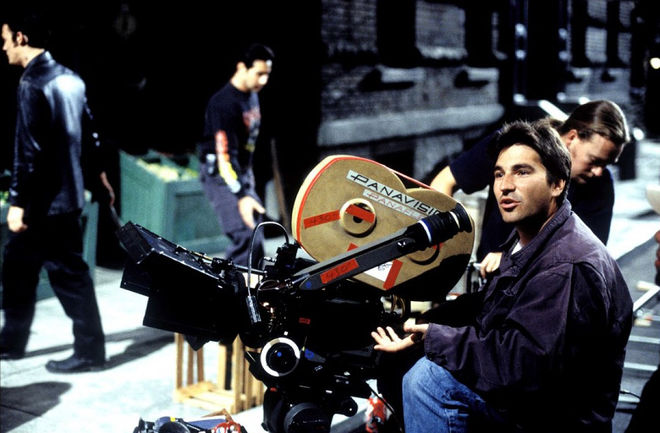
Director Scott Kalvert on the set of his 2002 film Deuces Wild
Kalvert (who sadly passed away in 2014) would go on to direct many music videos and the Leonardo DiCaprio film The Basketball Diaries, but in 1988 he was still in his early days. The director used to visit Carli’s office regularly to talk about movies, music, and his ambitions. He wanted to make an impression on her. Eventually, in 1987, Carli gave him a chance, and he directed the video for Kool Moe Dee’s “Wild Wild West”, which enjoyably merged hip-hop with the visual tropes of Western movies, while staying in line with Kool Moe Dee’s swaggering personality. Kalvert impressed Carli. “What I loved about him was that he wasn’t bound by just doing whatever anybody else was doing,” Carli says. “A lot of rap videos at the time were basically, ‘Okay, we need gold chains. We need sneakers. We need fancy sweatsuits, and some breakdancing and maybe some girls.’”
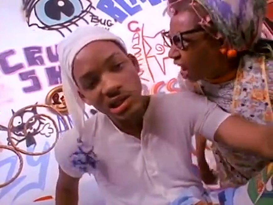
Kalvert’s willingness to do something different, and work with artists to build on-screen brands true to their personalities, was what led Carli to hire the director for DJ Jazzy Jeff and The Fresh Prince’s “Parents Just Don’t Understand” music video. He met with Townes and Smith, presented his treatment, and they hit it off. The importance of this collaboration to The Fresh Prince of Bel-Air main titles is easy to see. The graffitied walls, the sped-up Looney Tunes moments, and Smith’s cocky, flirty, slightly spoiled, megawatt charm character is all right there. As Carli puts it: “That video was the blueprint for the opening title sequence.”
That video was the blueprint for the opening title sequence
Music video for DJ Jazzy Jeff and The Fresh Prince's 1988 single "Parents Just Don't Understand", directed by Scott Kalvert
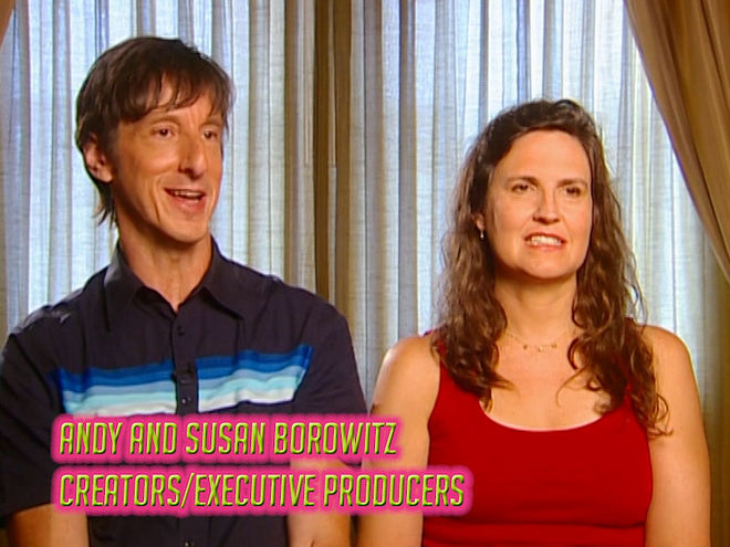
It was also a blueprint, it turns out, for the show itself. “The video for ‘Parents Just Don’t Understand,’ actually, was one of the things that initially convinced NBC to make a pilot deal with Will,” says Andy Borowitz, who collaborated with his then-wife, and writer-producer Susan Borowitz on creating The Fresh Prince of Bel-Air. It was Susan who provided much of the show’s approach and its main thematic thrust. In a 2015 article in Time she discussed a New York Times article she’d read about how some African Americans’ success was seen as selling out. This, she thought, would make a great television show. She said to Andy, “Why don’t we make it about that? Why don’t we make it about how there are all these different ways of being black?”
Once NBC had been convinced to make the pilot, the Borowitzes took the first major step towards the creation of the show’s main titles: the song. “From the beginning of the pilot process, there was never any doubt that Will would rap the opening theme,” says Andy Borowitz.
I’m the D.J., He’s the Rapper
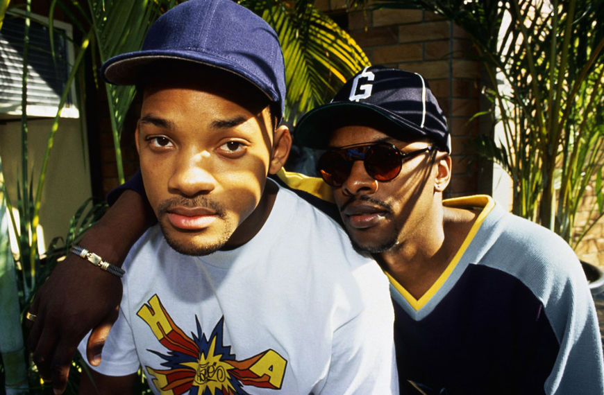
Will Smith and Jeff Townes
Jeff Townes (DJ Jazzy Jeff) was in Detroit, enjoying a day off from a summer tour with his musical partner, when Smith got a call. Smith had to fly out to Los Angeles to audition for a TV show. That same night he returned. He got the show. Townes could barely believe it until he saw it for himself. “When it turned into the pilot, and I saw the pilot, I remember looking at him and just saying, ‘You are really on a TV show.’ This is like all of the TV shows that you watched, and this is actually happening,” he says.
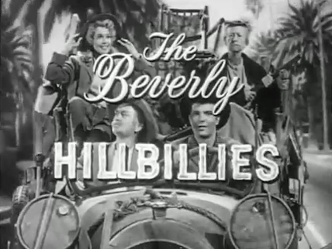
Soon, another call came, this time for both of them. The Borowitzes wanted a theme song with a particular goal: “The song was supposed to be a hip-hop answer to classic sitcom themes that explained the premises of the shows, like Gilligan’s Island and obviously The Beverly Hillbillies,” says Andy Borowitz.
The Beverly Hillbillies (1962) season one main titles
That task should have been daunting for Smith who, it turns out, is a big classic sitcom fan (“There’s no bigger student of American sitcoms than Will Smith,” says Borowitz), but it played to his creative strengths – lyric writing that tended towards linear and conceptual storytelling. “Will would always say the hardest part for him is concept. Once he has a concept, he can write a song in 10 minutes,” Townes says. With The Fresh Prince of Bel-Air, the concept was already there in the established backstory (although with the rap, Smith added the scene on the playground with the “couple of guys who were up to no good”). “He just wrote about the premise of the show. It was nothing for him to write that,” says Townes.
Fresh Prince writers and producers, including Andy and Susan Borowitz, discuss the title sequence in an excerpt from behind-the-scenes documentary Back to Bel-Air: A Fresh Look
Creating the beat for the theme also played to Townes’ creative strengths honed, like Smith’s, over years of making music. “It wasn't a whole lot of thought process that went in, because we were so used to doing music at that time, that that was just second nature,” he says. “Making songs was our job. The television show wasn't our job yet. Our job was we were artists, so that part was the easy part.”
The duo created one of the most beloved TV themes of all time far quicker than you might imagine.“It was literally 25 minutes, and he was in the booth recording vocals,” Townes says. “I just made the first piece of music that came to my mind, he started writing and we made a song.” Nearly 30 years later, he says it’s probably good they didn’t know how big the theme, and the show, would become. “If I would have known the magnitude of this, it probably would've scared me to death,” Townes laughs. “When doing the song, I didn't think that this was going to be on a television show that was going to be played every Monday night, for millions and millions of people, and would be played for the next 20 years. It was just me doing a piece of music.”
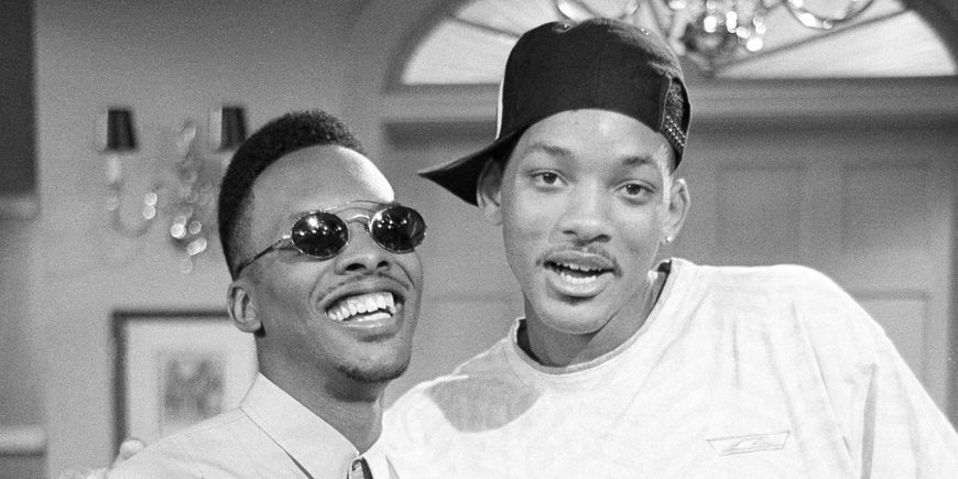
Jeff Townes (as Jazz) and Will Smith on the set of The Fresh Prince of Bel-Air, 1990
Once that piece of music was created, it was time to create a video for it that would serve as the show’s opening sequence. There was never any doubt for the Borowitzes and NBC as to who would get the job. “When it was time to shoot the main title, we went with the people behind the video of ‘Parents,’” says Andy Borowitz. Scott Kalvert came in with a treatment that deliberately stayed in line with what had inspired the show. “The idea was ‘Parents Just Don't Understand,’ ‘Girls Ain't Nothing But Trouble’ and ‘The Fresh Prince of Bel-Air’ were all somewhat the same song and video,” says Townes, who appears in the video as one of Smith’s basketball buddies. “We basically took our experience of making records and videos and turned it into the intro of The Fresh Prince of Bel-Air.”
The footage was shot in about a day (“that was quick back then,” says Townes) in Philadelphia and on various sound stages, as well as in Los Angeles for the scenes of Smith with the taxi (contrary to urban legend, not driven by producer Quincy Jones). Once it was completed, the title sequence had one final stage to complete: the logo and the titles.
Taking It to the Top

Fresh Prince of Bel-Air Logo Designer Wendell Johnson
Wendell Johnson, now a successful production designer, represents one of those Hollywood stories that are hard not to love. He began as a page on the Paramount Studio lot, and by the late 1980s worked his way up to being a production assistant on shows like Star Trek: The Next Generation. He was also known around the lot for his artistic abilities. “I was kind of the graphics kid who you could call to do some freelance graphics around Paramount. That's what I did on the side to make ends meet,” he says.
One day in 1990, Johnson got a call. Johnson had worked as a PA on a sitcom called Webster (1983-1989) and met Mara Lopez, one of the show’s associate producers who knew about his artistic side projects. Lopez had just joined a new sitcom called The Fresh Prince of Bel-Air, and had been assigned the task of creating graphics for an opening sequence. She immediately thought of Johnson for the job, called him, asked if he wanted to create a logo. He said, “Yes.”

Fresh Prince of Bel-Air Associate Producer Mara Lopez
If that seems like an informal approach to main titles – especially in comparison to today, when openings are often handled by independent studios – well, things were different in 1990. “Back then it was pretty much, ‘Okay. I know a guy who does graphics or someone in the art department,’” Johnson says. “Usually the art director or set designer would end up doing it.” It was also a matter of money – or lack of it. “You kind of were scrappy back then,” Lopez says. “We didn’t go to some facility and say, ‘Come give us presentations.’ This wasn’t that. This was ‘How do we do it for the cheapest amount of money and we get the most bang for our buck?’”
Lopez knew Johnson could deliver that bang, but she had a specific request for a logo that needed to be timely and non-traditional: it had to be graffiti-based. One reason was that graffiti was trendy at the time, and the creators knew it would appeal to their younger target demographic. The other reason was conceptual consistency. After all, there’s graffiti on the tagged wall behind Smith’s spinning throne, and there’s the scene where Smith gets caught with a spray can and pretends it’s deodorant. Design needed to mirror content. Johnson did a little of that on his own initiative too. Look at the logo, and you’ll notice “Fresh Prince” is in graffiti-style lettering and “The” and “Bel-Air” is in a more elegant, italicized serif. “The refinedness represents the family that he's moving into. The graffiti part represents [Smith]. That was kind of the idea, the yin and yang of the show,” Johnson says.
The designer realized both his and Lopez’s goals in roughly a week, working by hand, referencing the book From the Platform: Subway Graffiti, 1983-1989 for inspiration, and using paper, pencils, and ink to create three black-and-white options. When he finished, he submitted them to Lopez. It was up to her to apply the finishing touches.
Brand New Funk
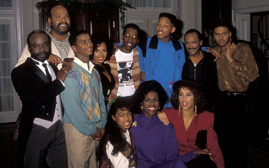
The Fresh Prince cast on set: (from left) Joseph Marcell, James Avery, Alfonso Ribeiro, Tyler Collins, Kadeem Hardison, Will Smith, Executive Producer Quincy Jones, Al B. Sure!, Tatyana Ali, Janet Hubert, and Karyn Parsons, October 20, 1990
Once Lopez received Johnson’s black-and-white logo she set out to give it – and the title cards based on it – the colour treatment. With the help of a man named Scott Jeffers at Unitel, a now-defunct Los Angeles post-production facility, she applied a very particular colour scheme. “The notion that we would do hot pink and lime green was inspired by Will’s clothes and by the palette of the video,” Lopez says. But the colours also had a practical purpose. Because the shots of the tagged walls were so visually cluttered, they needed colours that would stand out against them. That’s why the lime-green letters have pink halos around them. “We had to try to give it a little depth, and wanted to put it on a bright enough background so that the letters would pop,” she says. “We wanted it to stand out, but not totally obscure what was going on in the background because it was all so adorable.” After that, they set out to create the graphics for the actors’ names in the credits. But there was one more key thing Lopez did to the main titles.
Die-hard fans know that there’s a longer version of The Fresh Prince of Bel-Air’s opening. In it, Smith spins in his throne a little longer, his mother packs his suitcase, and Smith enjoys first-class treatment on an airplane.
You want to get right to the lyrics because you don’t have that much time
The extended Fresh Prince of Bel-Air (1990) main titles featured in the pilot episode
Lopez was assigned the task of editing, and while she loved those moments, the realities of TV and advertising time demanded cuts. “It felt appropriate as a music video to be full-length, but for a main title sequence we just wanted to shorten it up,” Lopez says. “Will going around in a circle was fun to watch, but you want to get right to the lyrics because you don’t have that much time,” she says. The longer version did air a handful of times, but it’s the shorter version that has become so beloved.
Rock the House
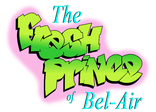
Fresh Prince of Bel-Air logotype, designed by Wendell Johnson
Almost 30 years later, when the creators reflect on The Fresh Prince of Bel-Air’s main titles, they admit it may look dated. “When you look at it now in terms of what could be done graphically it seems a little primitive,” says Lopez. Something so rooted in its time will inevitably seem dated, but that’s not always a bad quality. By being so reflective of the themes of its time, The Fresh Prince of Bel-Air titles become an emblem of it as well. “We were the first show to use graffiti as a title treatment as far as I can recall,” Lopez says. Johnson too emphasizes the timeliness of his work. “This logo was really hip back then,” he says. “I guess it's nostalgic now, but back then it was trying to be cutting edge of what was going on with other logos.” Even Townes came to see what made his work stand out then. “It’s funny, just doing this interview, there’s so much that I never correlated. I’m sitting here like, ‘That was a music video,’” he says. “The reason it was cutting edge was no one had ever done a music video as the intro to the show.”
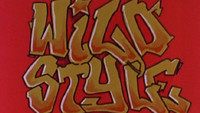
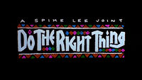
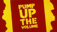
They’re not wrong. While there was precedent in cinema for use of graffiti in main titles (Wild Style and Pump Up the Volume, for example) and openings as hip-hop music videos (Do the Right Thing), they were rare in television. Looking back on The Fresh Prince of Bel-Air’s opening titles, it’s not just the individual parts – the logo, the titles, the music video treatment, the theme song – that seem so ahead of their time. It’s the whole as well. Rooted in how sitcom main titles used to be done, and pushing towards how TV main titles would be done decades later, the opening credits present a bridge between the past and the future.
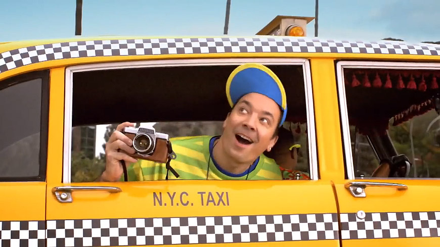
Tonight Show host Jimmy Fallon parodied the Fresh Prince of Bel-Air opening title sequence in 2015.
It’s arguable whether a direct link can be drawn between The Fresh Prince of Bel-Air and, say, The Sopranos, but Fresh Prince did have an immediate influence on other TV show openings. This can be seen in the hip-hop inspired themes of Martin, Living Single, All That, In Living Color, and even The Super Mario Bros. Super Show. It’s also unquestionable that Fresh Prince’s credits anticipated the creative and conceptual philosophies of TV main titles now, which establish and reflect the spirit of a show with a strong, unique first impression.
“It’s all the things you want in a main title sequence,” Lopez says, and it’s impossible to disagree. It’s a sentiment millions of people came to share as the finished product debuted on September 10, 1990, and began its journey to become something we all would come to know and love. Its conceptual ambition and inventiveness made The Fresh Prince of Bel-Air titles so – pardon the pun – fresh and helped it create an impression that has endured, and renewed itself, for nearly three decades. It’s evolved to a point that none of its creators could have ever imagined. “To this day, Will and I look at each other and we just laugh, because we didn't expect this,” Townes says. “We didn't know what to expect, but that was the last thing that we expected.”
Director: Scott Kalvert
Producers: Andy Borowitz, Susan Borowitz
Associate Producer: Mara Lopez
Logo Designer: Wendell Johnson
Music: "Yo Home To Bel-Air" by The Fresh Prince in association with A Touch of Jazz, Inc.

