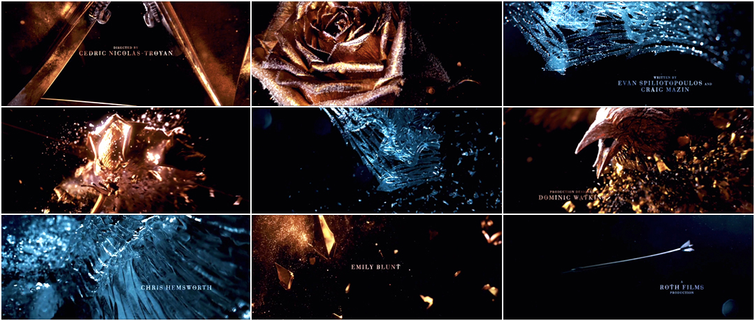
There is an immense satisfaction in seeing an axe smash through gold, in watching an arrow explode the soft flesh of a rose. In the main-on-end title sequence to The Huntsman: Winter’s War, Creative Director Manija Emran and a robust team at The Mill use elaborate motion control rigs, glittering props, and finely crafted ice sculptures to do just that.
The film is both prequel and sequel to 2012’s Snow White and The Huntsman and follows closely in its title design footsteps. In Winter’s War, the end title sequence acts as farewell to a fight that sees powerful sisters – Charlize Theron as Ravenna, the Evil Queen, and Emily Blunt as Freya, the Ice Queen – wage a war of gold and frost, sword and sickle. Featuring the song “Castle” by American singer Halsey, and the destruction of crowns, flowers, beasts, and birds meticulously carved from ice, the sororal bonds once forged are shattered into a thousand pieces.
A discussion with Creative Director MANIJA EMRAN.
The last time we talked was about your title design for the documentary We Are The Giant which came out in 2014. What have you been up to since then?
Manija: A few small titles for some other docs and films, including Z for Zachariah and Maggie, as well as larger projects including commercials for Nike and Reebok – not forgetting the design work for the Oscars!
Maggie (2015) main title sequence, designed by Manija Emran and Henry Hobson
So a busy few years, then! You also designed the lettering for the titles of the first Huntsman movie, Snow White and the Huntsman. What was that like?
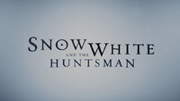
The previous film titles were a joy to work on. I had just started at The Mill so my role was relatively small then, but it allowed me to understand the mythology of the characters and the interaction between them. I was brought onboard to build a custom typeface. The director, Rupert Sanders, wanted something feminine yet with a hard edge. And so Henry Hobson and I created a typeface and named it Ravenna, after the queen. I very much enjoyed the challenge of representing a character through a custom typeface.
Snow White and The Huntsman (2012) main-on-end title sequence, designed by production studio The Mill
What was your process like this time around, working with the continuation of the story, but as creative director?
This time was a complete shift. Knowing the world of The Huntsman from the first one, I was able to use this to create the design space for the titles, to look at the two sides and create the juxtaposed worlds for sister versus sister to live visually.
Once a design direction was chosen, Robert Sethi, with his master CG background, and I double-tackled the creative direction. We had an amazing, big team of very talented and dedicated artists that brought to life the designs. It was a big ask – 40 shots – in a short timeframe, but the fantastic CG team, lead by visual effects supervisors Becky Porter and Gawain Liddiard, jumped at the challenge.
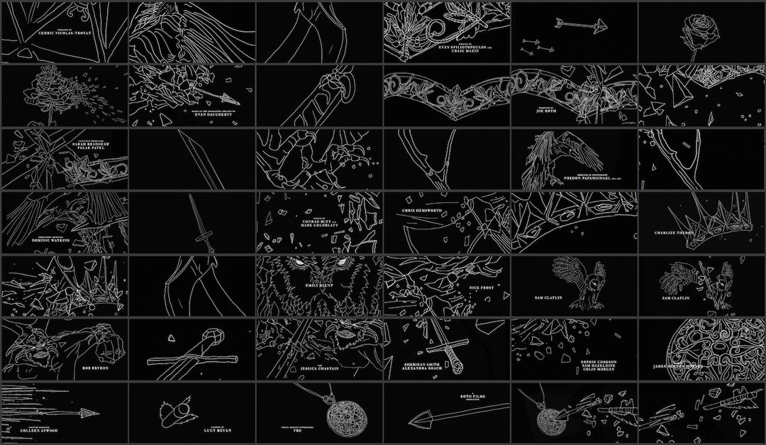
Storyboards illustrated by Manija Emran
What was the first meeting with Cedric, the director, like?
The first meeting with Cedric was a whirlwind of enthusiastic understanding. He knows and appreciates design, which allows that rare relationship to breathe. Before the pitch phase, he ran us through the plot and some scenes from the film, to show its visual language: backgrounds, main characters, key scenes, et cetera.
Cedric comes from a CG background and this knowledge lends itself to seeing the potential in a shot, and he can clearly communicate how to push it further.
The owl was a gorgeous piece of craftsmanship and I was both heartbroken and excited by its destruction.
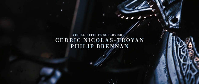
Still from the Snow White and the Huntsman (2012) sequence featuring the credit for Cedric Nicolas-Troyan
The brief was to complement the film with a title sequence that re-lived the contrasting sibling characters found within: Ravenna and Freya. So he liked the idea of the title design visually covering both gold and ice. How this was to take form, he left open, and so there was a great amount of creative freedom.
So how did you start? What were your initial concepts?
Initially I designed four of five ideas. I pulled together ideas that pushed the concepts of frost and frozen moments, as well as the molten gold world, playing with graphic and illustrative realms and all-CG spaces. Knowing that with Robert we could achieve strong CG worlds gave me a completely new lens to look through.
The process was initially about exploring those powerful contrasting characters and using their main visuals – ice and gold – as a playground, juxtaposing them against each other and exploring that. After viewing the film, for a week I tackled a few different design interpretations, some reliant more on live action, others more on CG, a combo, an all-graphic route. From a flowing gold mirror re-forming from its frozen shards, to an ice journey through a cracking fragment, to frozen objects being shattered proving that love will prevail, to a painterly direction... Different design routes set to a beautiful background to complement the film’s palette.
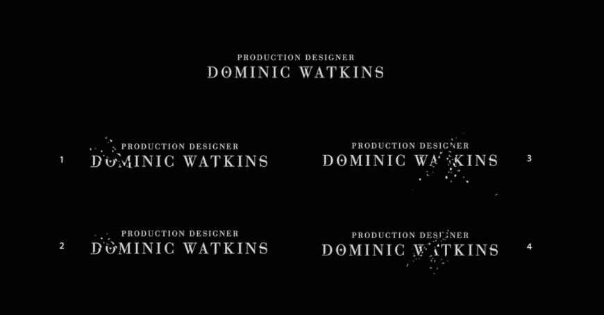
Explorations for the animation of typography by Manija Emran, using the typeface Ravenna that was designed for Snow White and the Huntsman
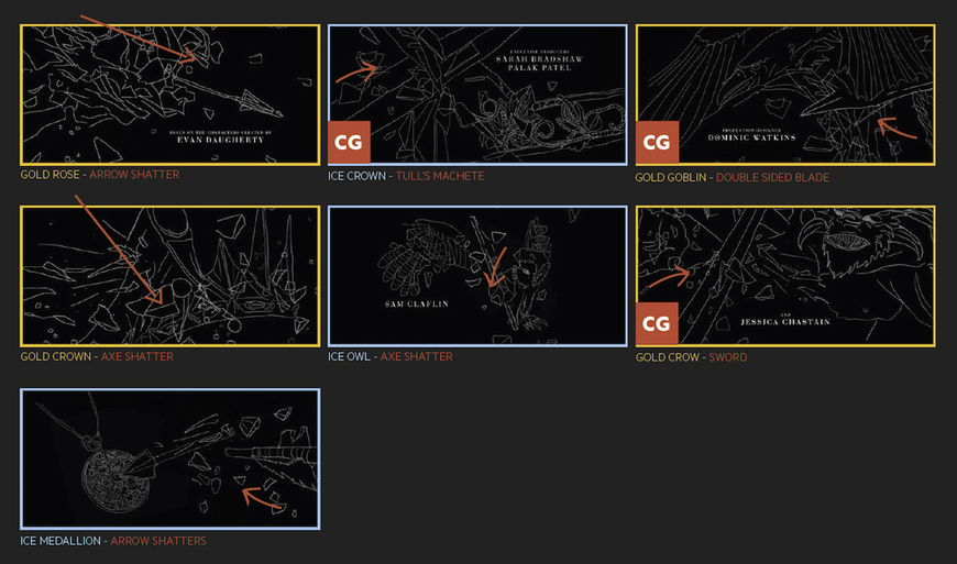
Moments of impact illustrated by Manija Emran
Tell me about that live-action shoot. How did you set everything up, and how did you achieve those shots?
This was a huge undertaking. The high-end CG, the shoot, and the design all push the boundaries of any budget so I had to get my hands dirty upfront. I sketched each storyboard frame pre-shoot, and then Robert and I had each camera move pre-visualized.
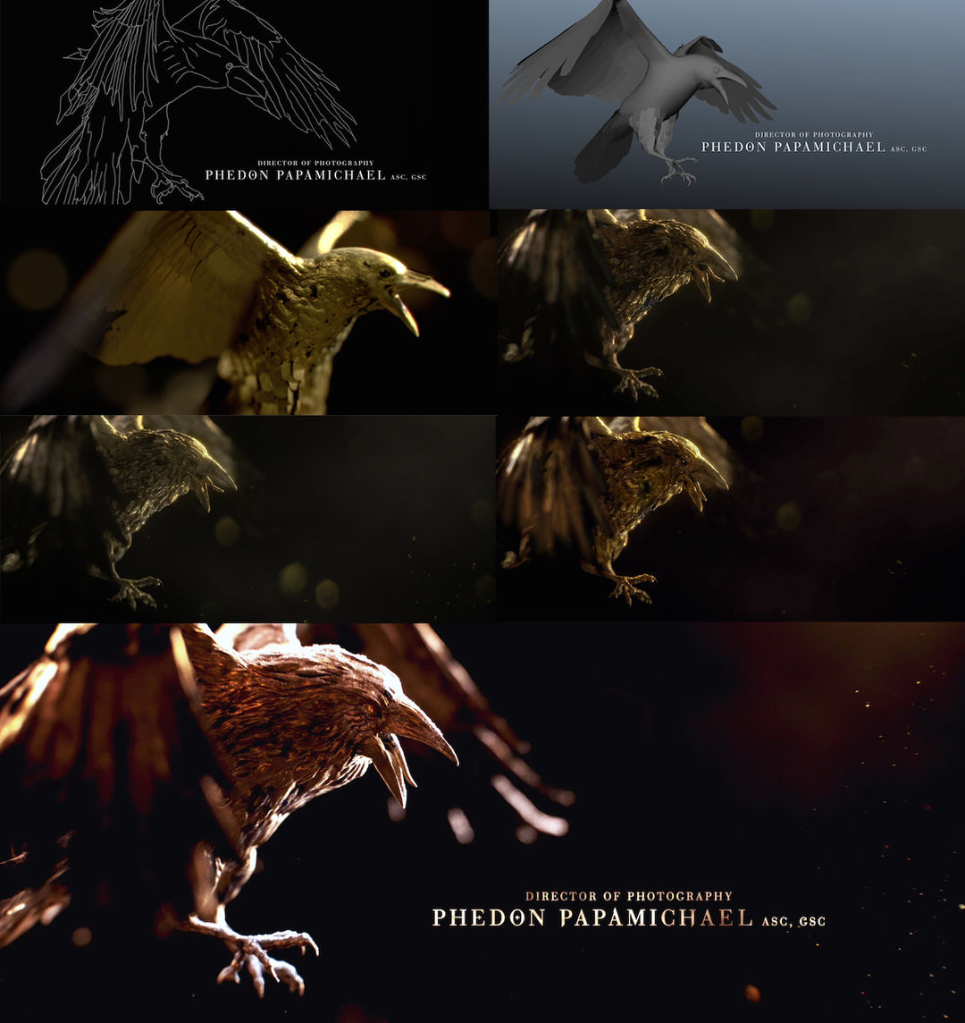
Development of the CG raven
Initial previs test of the raven, looking at how it would need to move to match the 3D camera moves and impact
The BOLT moves lightning fast so we could move with the flying arrow. This preparation was more intense than any other job I have done.
Shot layout and animation previs of the rose being hit by the arrow for the motion control camera
We then outputted these moves to a complex BOLT camera – a 3D motion control rig that costs more than a small house if you were to buy one! We rented it. This camera then replicated the moves we had designed. The reason we had this camera is that I had proposed we shoot live-action arrows and drop live-action axes on real objects... the speed was key so with a Phantom 2000fps camera we needed a robotic arm to match the camera speed. The BOLT moves lightning fast so we could move with the flying arrow. This preparation was more intense than any other job I have done.
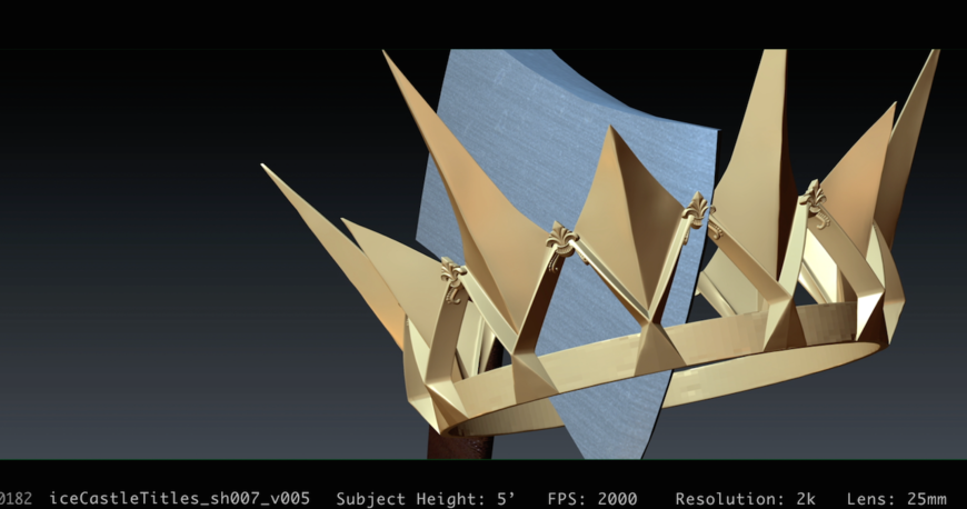
Animation previs of the crown being hit by the axe for the motion control camera
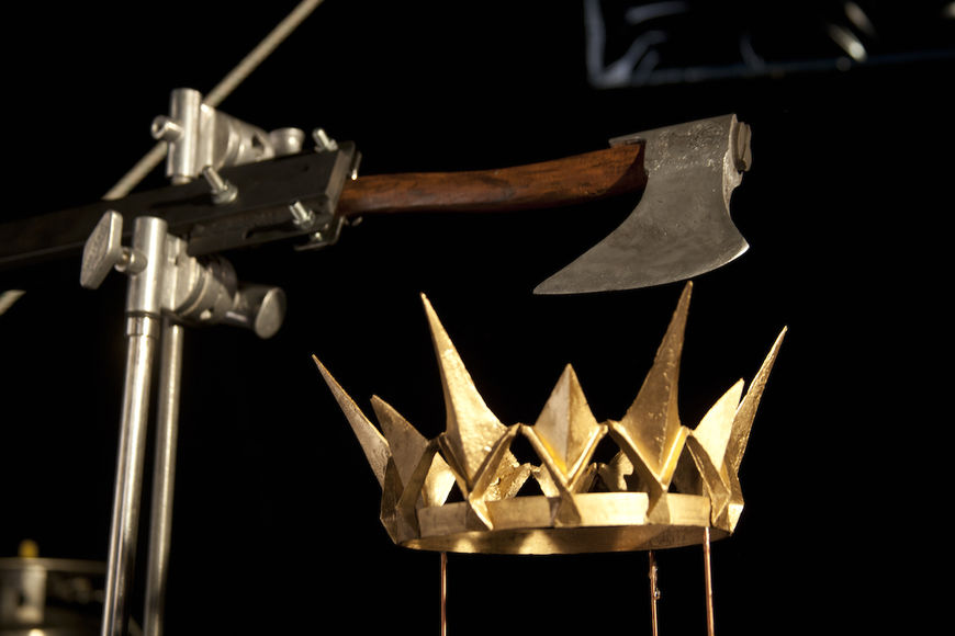
Photo of the axe and crown rig set up to pinpoint the moment of impact
BOLT motion control camera on set, shooting the golden crown being shattered by the axe on the rig with DP Jim Matlotz in the background
We combined our high-tech techniques with a number of materials. The ice was formed and sculpted from pre-designed and 3D objects. The owl was a gorgeous piece of craftsmanship and I was both heartbroken and excited by its destruction. It’s a strange place to be seeing the work sheared to pieces by a powerful motion-controlled axe dropping on it!
Ice sculptor refining the ice sculpture on set, giving the owl additional cracks in its wings. Ice sculptures by Ice Bulb.
The arrows were hugely exciting, seeing the rig fire them across the studio with precision to destroy objects, the rose, the medallion, and ultimately itself.
The arrow rig was great. The dangerous power of the device and then seeing it play back in slo-mo, seeing the particles falling from it as it glides through the air with this seemingly bizarre wobble as it blasts through the rose or the wall with utter precision, that was my highlight.
Proof-of-concept video and initial test of the rose and arrow impact, shot on an iPhone
After the shoot, which tools and software did you use to put it all together?
It was a lot of Maya, Houdini, Nuke, Flame, and After Effects.
With such a complicated shoot, what are some of the big lessons you learned?
I think – try not to do so much in one day! We had 27 setups to shoot in one day with a motion control rig, ice, shattering gold, frozen roses, firing arrows, and smashing sculptures. A usual shoot day with motion control allows for four shots...
But I am so happy with how much we pushed the possibilities. The complex camera technique and the 3D were areas that tested the way of creating work like this. We found a visually delicate world despite these brand new techniques and those challenges and obstacles, which I’m most proud of.
What have you seen or watched lately that’s been exciting to you?
I actually quite like the titles for Broad City. It’s quick, light-hearted and seems right for the show – and of course I like the show itself!
I wish The People vs. OJ Simpson had a title sequence, as it was a great show and it would inspire such an amazing collection of ideas.
Is there anything that you would love to work on that just hasn’t come up yet? What would be a dream project for you?
With a newfound world of 3D, I would love to do a Bond movie. Combining those graphic sensibilities with the 3D world would be a dream.

