Kim Jong Un Attends Screening of The Interview in Pyongyang
PYONGYANG (KCNA) — Kim Jong Un, First Secretary of the Workers' Party of Korea, First Chairman of the National Defence Commission of the DPRK and Supreme Commander of the Korean People's Army, attended a screening of the slanderous American motion picture The Interview and gave field guidance to those present.
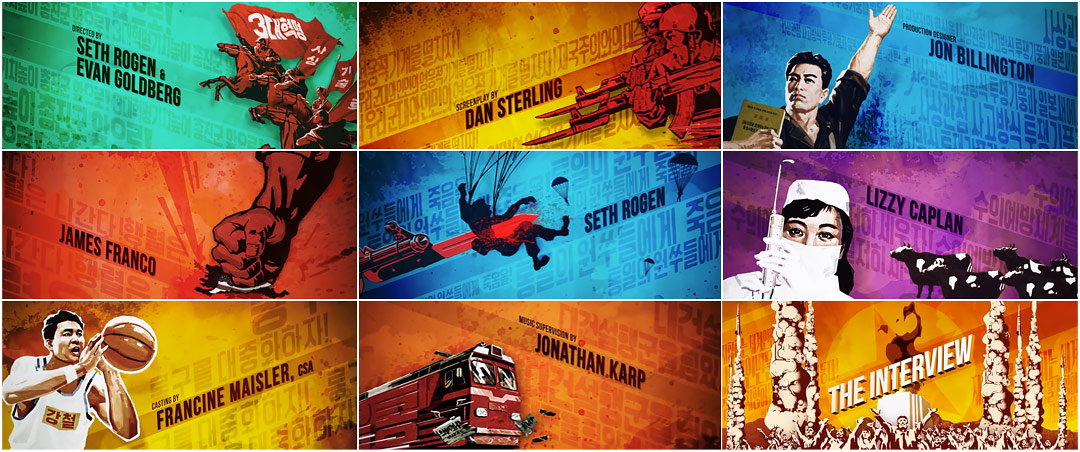
As predicted, the Supreme Leader did not take any joy from the film, which he ranked far below Space Jam, his favoured Hollywoood imperialist motion picture. However, upon viewing The Interview's ending title sequence he recollected with deep emotion the feats of title designers past. He said the title sequence has demonstrated the might of a power thanks to the comrades at Laundry! These most brave soldiers of title design devotedly worked to build an ending of film credits sequence worthy of the great struggle, he continued, and one far too excellent for a comedy motion picture made by Canadian Generalissimos Seth Rogen and Evan Goldberg, who he maintained will meet the serious punishment of history for their slanders against him.
It is a great pity that this end credits sequence should be attached to such reckless U.S. provocative insanity, he said. He reminded those in attendance of the gust of hatred and rage that enveloped the nation in the wake of the film’s release, but expressed belief and conviction that the film’s ending sequence was a true victory for the valorous field of title design, a victory that will be immortal in history.
He called for intensifying the military drills in the coming months, too, and decisively raising the quality of training.
A discussion with Creative Director ANTHONY LIU and Senior Producer DAN MASCIARELLI of Laundry Design.
Tell us a little about the team at Laundry Design.
Dan Masciarelli: We are a team comprised of many talented designers, animators, writers, directors, and editors who all bring unique experiences and skillsets to the table for each project we approach.
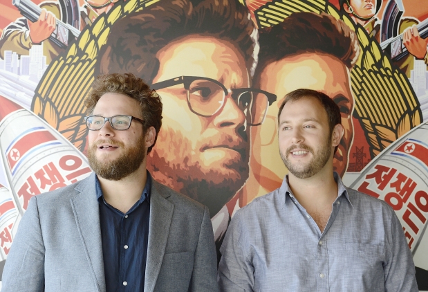
The Interview directors Seth Rogen and Evan Goldberg
In 2005, good friends PJ Richardson and Anthony Liu founded the company in a small office in Hollywood. Since then, thanks to a diverse and talented team, they have expanded into a thriving 5000 square foot studio able to tackle projects across a variety of mediums.
How did Laundry Design become involved with Seth Rogen and Evan Goldberg?
Dan: Seth and Evan have been friends with Anthony Liu for years. When they were closing in on the release of This is the End, Laundry was approached to help bring the logo for their production company, Point Grey, to life.
They wanted to create a logo animation that was different and unique for each film they made under their banner. We worked with them to develop an idea of animated etchings on a classroom desk based on Seth and Evan’s school days in Canada.
This is the End was the first to kick off the series and was followed up by a custom version for The Interview. While working on the logo, we pitched them a bunch of ideas for a title sequence and were thrilled when they wanted to move forward with one.
Retro Columbia logo and Point Grey production logo for The Interview
What was the first meeting about The Interview title sequence like?
Dan: We had heard tales of their mysterious movie about an interview with the leader of North Korea, but didn’t know any plot details beyond that. Our first glimpse of the film was a preview test screening we attended in Orange County. It was great to first see it with a real audience and hear the laughs and reactions, even though it was still a working cut. Seth and Evan actually snuck into the back of the theater once the movie started, so they could see it play along with us. We knew very quickly while watching it that this would probably be a somewhat edgy and controversial comedy film, but we couldn’t have anticipated all of the ensuing drama surrounding the film.
Tell us about the original concept for the title sequence and how it developed.
Anthony Liu: Initially we set out on our design phase by creatively discussing the funniest ways to encapsulate the over-the-top humor of the film within the titles. We came up with a huge spread of ideas and themes from the film we felt were worth illustrating. We then mocked up frames for each of these ideas and presented them to Point Grey. They had great feedback right off the bat and steered us in some very fun directions.
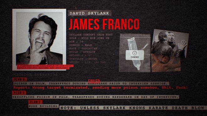
“CIA Dossier” pitch concept
One concept centered around secret dossier files the CIA had collected by surveying the primary cast in their most embarrassing moments. We come up with some entertaining backstories that the film didn’t even allude to, like Lizzy Caplan’s character being a wild party girl who was only solicited and trained by the CIA because she was the type of woman James Franco’s character was attracted to… his “honeypot” as is quoted in the film. We wanted to lend more depth to our sequence to make it feel completely in line with the tone of the film, a natural extension of it.
Another concept centered on the massive North Korean “human pixel art” crowds and having thousands of people flip through these cards to create the titles. They are able to coordinate some amazing performances and it would have been an awesome challenge to figure out how to replicate this for the titles without having to fill a stadium with people and get them all to flip in sync.
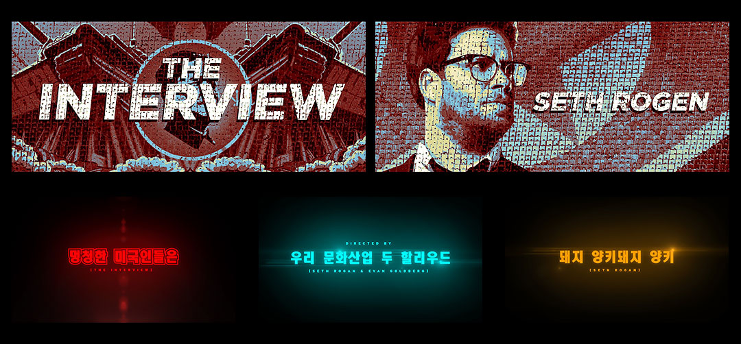
“Flip Card” and “Mis-Translated” pitch concepts
We also pitched an idea to create beautiful and typographic cards written in Korean with small English translated subtitles beneath to bring the viewer into the mindset that they were about to enter a North Korean world. Each subtitle would actually be an inside joke to anyone who could read Korean and would say funny things about each character in the film.
Ultimately, our talented art director Anthony Maiuri did an awesome set of frames based around the idea of utilizing North Korean propaganda art that fit perfectly with the irreverent tone of the film. It managed to both enhance and stay true to the inherently ridiculous illustrations that actual North Korean propaganda posters feature. We spent many hours researching and scouring the internet for the most over the top imagery that North Korea could provide and then used those as a springboard for the titles. We then worked to develop an animation style that brought some life to the imagery as well as energy to the overall sequence.
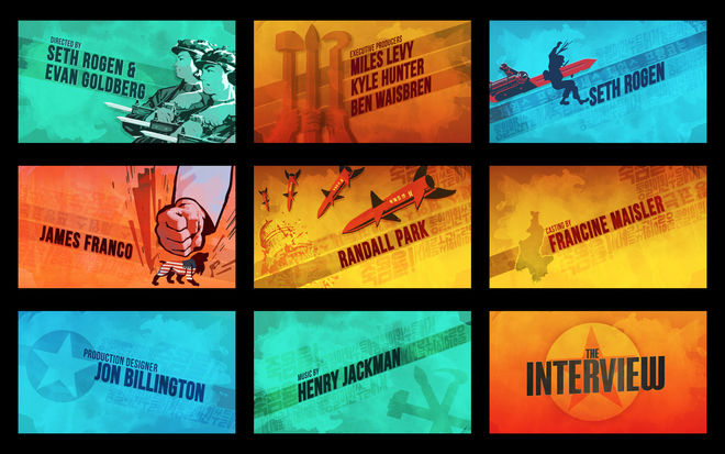
“Propaganda” pitch board by Anthony Maiuri
North Korean propaganda art is pretty twisted stuff. Everyone always seems to be smiling but the subject matter can be very dark. Finding reference material for the sequence must have been quite an experience.
Anthony: It was definitely one of those situations where you would find yourself joking about how crazy and ridiculous some of the reference we would find was, and then remember that these are a real product of a regime that the U.N. has accused of “crimes against humanity”. Like the film itself we tried to maintain a bit of a tongue-in-cheek humor about the whole thing and look at it like we were bringing these issues to light in a way that would hopefully rob them of their power by showing just how ridiculous the North Korean government is.
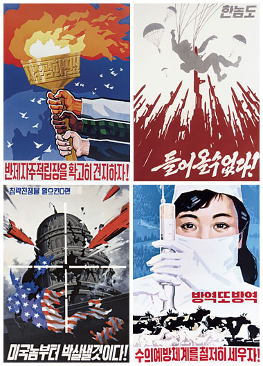
North Korean propaganda art examples
The experience really opened our eyes to the different forms of visual brainwashing that North Korea imposes on its population. When you look at numerous images and start to see the big picture, the juxtaposition of nuclear warheads flying through the air right next to smiling hardworking citizens is really what sticks with you. Also, there may not be any crazier form of propaganda than tens of thousands of people filling a stadium and becoming human pixels in a grand display of nationalism. It is simultaneously totally impressive and utterly disturbing.
Dan: It was an extremely fun experience seeking out any artwork that comes from North Korea, and especially propaganda art. Not many people know much about North Korea, except that they have massive control over their people and the flow of information and one would assume that would severely suppress artistic expression.
But it quickly became clear to us that when they actually approved of and even sponsored artwork, you could feel the anxiety and tension that must have gone into each composition. Even the art that focused more on building up the civic pride of North Korea (as opposed to anti-American art like US Troops being crushed under the wheels of tanks), there was still a quiet aggression behind it. It’s practically baked into the faces of the characters in the posters.
Was there anything you wanted to include that didn't make the final cut?
Anthony: The directors were very open to our ideas and thoughts on what felt appropriate for the film and would work best with the animation. They pretty much gave us free rein to build a sequence that represents the diversity of North Korean propaganda art.
Dan: Actually no. Seth and Evan were so open to pushing the comedy and outrageous nature of the piece to the limit, that there weren’t any compositions we put together that were deemed “too much.” We even have what is probably the most violent scene of them all, where a parachuting US soldier gets bayoneted in mid-air, over Seth’s actor credit.
How’s your Korean? Designing a sequence with North Korean typography must have been challenge. Who was your Chosŏn'gŭl* expert?
*The Korean alphabet, commonly known as Hangul or in North Korea as Chosŏn'gŭl, is the native alphabet of the Korean language.
Dan: Not good! Although we actually have a few Korean designers in-house who speak Korean as a first language, so it was a lot of fun to find new art work and take a guess at what it said, then wait for their translation to see how close we came.
Does the Korean writing in each shot relate to the art on screen or the credits being shown? Did you hide any easter eggs in the writing?
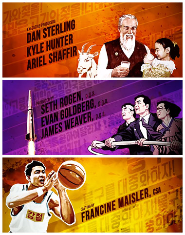
Korean writing examples from the end titles
Anthony: The Korean writing on each card is very closely related to the propaganda imagery we are seeing on screen. We stayed true to the wording and usage of each design. For example in the scene with the goat and the grandparent/child, the text says something like: “More milk and meat, by positively expanding grassland!” or in the basketball scene the text says: “In all institutions and workplaces, let’s popularize basketball!”. A lot of the imagery with missiles say things like “Destroy America First” and that sort of jargon.
Dan: We were extremely tempted to drop some funny lines into the backgrounds or into the poster artwork, especially based on our other concept of intentionally mis-translating the text to play up the humor. But we were asked to give detailed English translations with each piece, so we decided not to tempt fate. Which was probably a good idea considering the hoopla that ensued around the feature when it was actually released.
What’s your favorite part of the sequence? Was there anything that took you by surprise while working on it?
Anthony: My favorite part was actually seeing it all come together with the music. It was totally unexpected and added just the right amount of surreal-ness to the titles. I also especially like the strange imagery like the girl and the grandpa and the goat or the woman with the syringe and the cows.
Dan: We have a definite sweet spot for the reprisal main title that we built to cap off the end of the sequence. We had to reconfigure this great piece of retro artwork that had a semi-art deco style to it. It showed a very diverse group of North Koreans standing united with their arms raised to the sky.
There was something triumphant about it, but also something very eerie at the same time. The overt nationalism was an obvious façade for the more ominous tension. That’s when the idea came about to explode the scene at the very end, as if a culmination of their disdain for North America was strong enough to nuke the planet, and themselves in the process, just to inflict the final blow and have the last word.
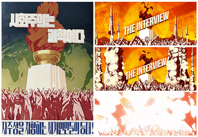
Korean artwork comparison with the main title reprisal
What did the directors think of the finished product?
Dan: They loved it. It was the perfect way to end a comedy like The Interview. It ended the film in the same manner that the movie played throughout, a wild and fun trip through a subject that is usually only fodder for fear.
The release of The Interview was a little touch and go there for a bit. What was it like facing the possibility that your work might never see the light of day?
Anthony: It was definitely surreal to see what a wide effect the imminent release of the film was having and how it came to dominate the national media for upwards of two weeks. We obviously would have been disappointed for ourselves and our friends had Sony decided to shutter the film completely, but luckily for everyone involved the studio came up with a plan B and it opened with a major digital release and a lot of buzz.
Dan: A major film starring James Franco and Seth Rogen will always see the light of day, even if it doesn’t get a major official release as planned. A bootleg or workprint, will always find it’s way to the ocean of the internet. Locking something in the “vault” to hide it away from the world is a definitely not in the cards anymore.
Which tools and software did you use to put it all together?
We used a combination of our usual toolsets for this one. Cinema 4D build outs of particular scenes with compositing in After Effects.
What are some of your personal favorite title sequences, either classic or contemporary?
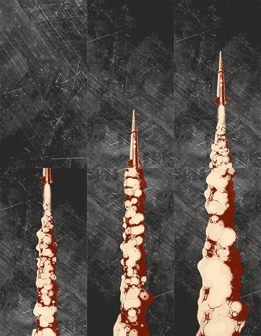
ICBM precomp test
Anthony: I recently started re-watching The Sopranos and I hardly ever find myself fast-forwarding through that opening even after seeing it dozens of times. It sets the tone perfectly for bringing us into Tony Soprano’s world. Some other favorites for various reasons: Tron, Enter the Void, Fight Club, The Girl With a Dragon Tattoo, Lord of War, Napoleon Dynamite, Cowboy Bebop, Alien, Iron Man, 300, Se7en, X-Men: First Class, A Fistful of Dollars, Game of Thrones, Halt and Catch Fire… I could keep going.
Dan: We are all great fans of the title work done in nearly all of David Fincher’s films. The roller coaster ride that launches you into Fight Club, the eerie elegance of Panic Room, the balls-out horror trip that starts off The Girl with the Dragon Tattoo. And To Kill A Mockingbird, it’s hard to forget one of the original brilliant marriages of titles and story content.
What excites you outside of design?
Anthony: I love cooking and challenging myself to make things from scratch. Hot sauce, bread, pasta, pizza, fermented stuff. Since I spend so much time in front of a computer it is nice to be able to come home and make something physical that we can eat.
Dan: Aside from the design aspect of what our studio does, we love the writing component of our creative approach. We concept verbally on nearly all of our projects, then take to written treatments before we get into our design exploration phase. That’s one of the most fun parts of the process for us because we take off all limitations of budget, practicality, and any of the other limitations that come from the real world when you set to actually produce something. For that window of time we take off all restraints and turn ourselves over to what we like to call the “What if…” phase.
Support for Art of the Title comes from

NEW YORK FILM ACADEMY LOS ANGELES
Learn the fundamentals of 3D Animation with our award-winning faculty.

