Civilization is over. What you were – your life, your plans, your future – it’s all gone. It ended the night she died in your arms… The same night the whole damn world went to shit. Your name is Joel. You are a survivor.
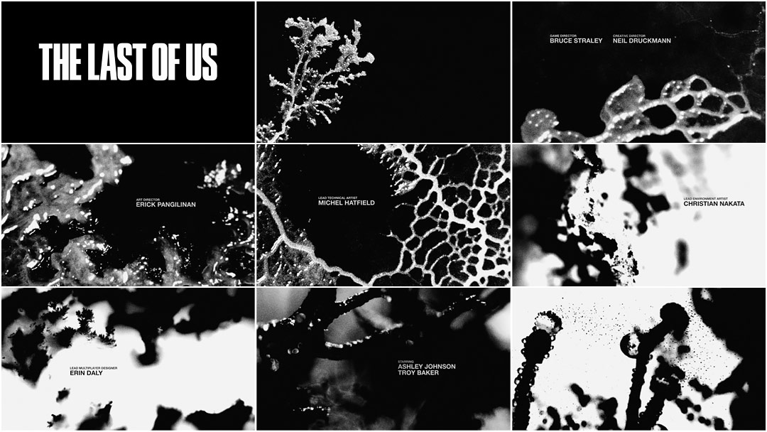
Bridging the 20 year gap between a gut-wrenching prologue and the brutal post-pandemic journey that follows, the title sequence for Naughty Dog’s video game The Last of Us paints a picture of a decaying and ruined United States. News reports broadcast the plague’s progress as tendrils of fungus cut through an eerie blackness to the tune of Gustavo Santaolalla’s poignant score. The brisk sequence encapsulates two decades’ worth of misery and terror in a world where infection means a fate worse than death. It functions as both a respite for the traumatized player and as exposition designed to fill in the blanks, setting the tone for the gruesome adventure ahead. Mould grows, spores disperse, anarchy reigns, and society as we know it collapses entirely. You are a survivor… but what good is survivin’ without something to live for?
A discussion with The Last of Us Creative Director NEIL DRUCKMANN, Title Sequence Director/DP KEVIN JOELSON, and Title Design Director HENRY HOBSON.
First, can you tell us a little about your respective roles and how you got involved in this project?
ND: I was the Creative Director on The Last of Us, so I just gave the initial direction to Arran Green and Kevin at Sony San Diego and let them run with it.
KJ: I was brought in by our senior manager. Basically the group that I work for is an internal agency within Sony – we help come up with videos and brand content for PlayStation. When the project was given to me I essentially was the creative director, director, producer, cinematographer, and editor.
HH: Kevin brought me on as a Creative Director alongside him. I helped design and conceive some original concepts, helped move things into production, and then continued as a creative director with Kevin on the sequence itself. I co-directed on shoot day as well.
Unlike most games, The Last of Us features a full-blown opening title sequence which plays an important role as part of the prologue. Was this the idea from the start?
—Henry HobsonWe had this kind of murder room – everything was plastic-wrapped like a Dexter or C.S.I. horror scene – covered in black ink.
ND: We’d never done anything like this before and initially we weren’t planning on an opening title sequence at all. But we had a scene at the beginning of the game where Joel [the main character] is with his daughter Sarah. She’s dying in his arms and then we cut to 20 years later and dive quickly into the journey. There’s a lot of exposition thrown at the player. I think we underestimated the impact of Sarah’s death because people were having a hard time following the next scene – they were still recovering from it.
So, we needed a way to create space between these two scenes, and one of the ideas I came up with was an opening title sequence. We also decided that we could use the title sequence to give players a sense of what happened during the 20-year gap in the story. It would set up the state of the world, the quarantine zone, and the idea of this group called the Fireflies, before we meet back up with Joel. Hopefully, that would give players enough time to recover from the previous scene and pick up the story on the way. So that was the initial impetus for it and then we reached out to Sony San Diego with the ideas.
How far along was the game at this point?
ND: It was pretty late in production – all the scenes were already in the game. It was after Alpha, but I don’t remember the exact date.
KJ: We had about six weeks before the disc needed to go to print. Some original concept development started in late January and early February, but I don’t think we really pushed until March or April 2013.
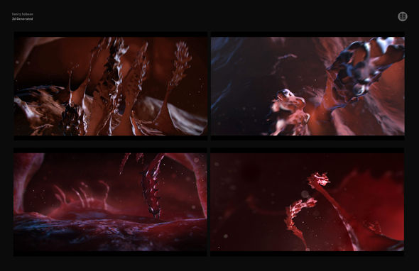
3D generated frames by Henry Hobson
Did you explore any other design ideas?
HH: Kevin and I spoke about other concepts, but both Naughty Dog and Sony had clear ideas in mind, which was really great. Unlike a film title sequence, where usually it’s kind of a “do whatever,” “play with whatever” sandbox, there were really clear, guided concepts with The Last of Us, like showing the spawning and backstory of this virus in an abstract way. The other concepts relied on different renderings of growth – some more 3D, some more graphic – but all spawned out of – and spawn is the appropriate word – that way of thinking.
Naughty Dog and Sony were set on establishing a powerful yet abstract message in the early sections of the game. How can we best render this growing and emerging virus or mutation and still be intriguing and not too explicit? The high-contrast concept was actually borne of the game itself, which had a gritty, real, analog graphic approach. Some of the 3D pre-rendered stuff is very different from the game – it’s very polished, colourful, and vibrant. So the concepts started to progress towards the grittier, high contrast, black-and-white look.
ND: When I was first talking to Arran [Arran Green, Senior Manager – Creative at Sony San Diego] about some of the early concepts, we were inspired by all the time-lapse videos of fungus growing in BBC’s Planet Earth. It’s just beautiful and creepy and eerie, which were all adjectives that describe the game as well.
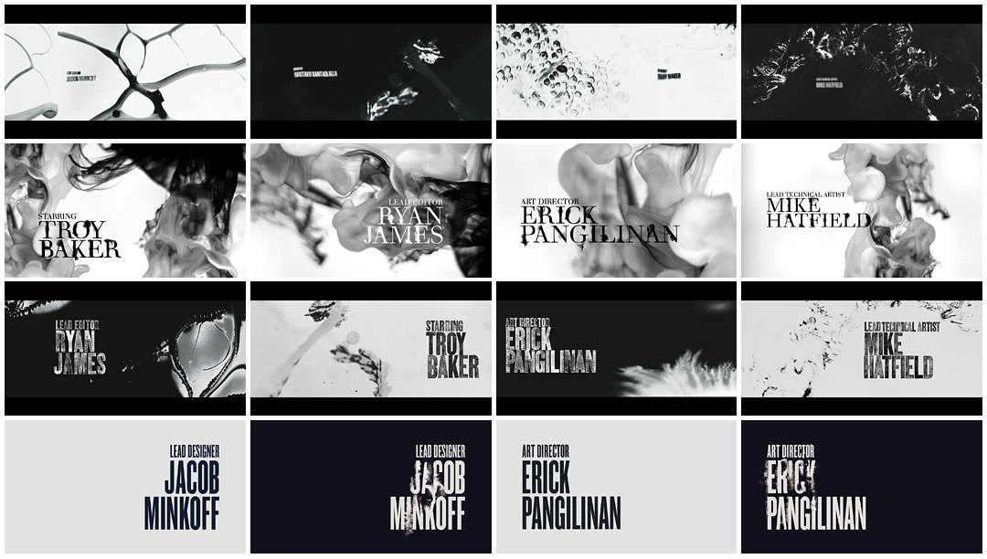
Typeface concepts by Henry Hobson
But the challenge that I communicated early on was that it can’t look like it could exist outside the game. If it’s too polished, if it’s too CG-looking, it would feel divorced from everything else. So we kept moving towards that high contrast look. Even though it was so abstract and rendered in a completely different style – shot from real life – it still fit the aesthetic of the game.
KJ: And it worked really well with that bold The Last of Us logo, with just a little bit of grunge. If there was going to be a graphical element to tie-in the game it needed to marry with that logo.
So how did you go about capturing that “grunge”? What was the process for achieving that texture?
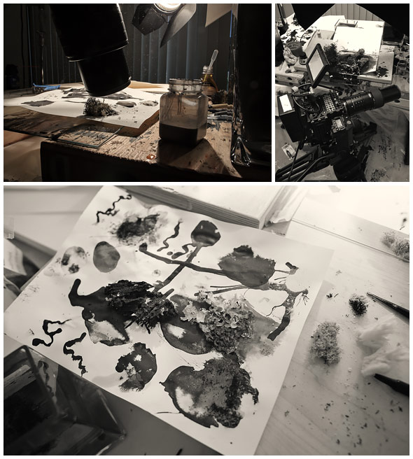
HH: What was great about this process was being able to send over a shopping list – a list of weird and wonderful materials, different products, liquids, resins – all bits and pieces that were just going to be an experiment. It was down to having this library of materials and substances, I’m sure 90% of which were terribly harmful.
—KEVIN JOELSONBy the end of those two weeks I had a pretty severe cold, I think from all the spores and slime moulds, but it had to get done.
When we started off, we had water tanks, dropping ink into those, which just looked like the same old water tank work seen so often – so we abandoned that. Then we tried every kind of paper surface imaginable, which was nice but again, whatever you added to the paper it still looked familiar.
HH: We had this kind of murder room – everything was plastic-wrapped like a Dexter or C.S.I. horror scene – covered in black ink.
KJ: Yeah, I have to admit that creating that plastic-wrapped room and having everything shrouded in plastic really helped.
HH: Kevin and I spent a day in San Diego, just covered in black ink, pouring it on every surface imaginable, and every shot just ended up looking like paper! We had black ink, some natural sponges, mosses – everything borne of nature – and then we had compressed air, literally computer cleaning compressed air. If you shook the can heavily you could actually freeze the surface of whatever you sprayed it onto, so the back end of the sequence is actually the reversed footage of this freezing and unfreezing of black ink. It creates the look of the black mould, but it wasn’t anywhere near far enough. It worked perfectly for the back end, but the front needed that extra help from real mould.
Ink and paper tests
What was it like working and shooting with fungus? I don’t imagine it’s the most cooperative subject.
[laughter from all three]
KJ: There was a point where we realized that the only proper way to shoot organic matter was to grow organic matter, shoot it, and accept the happy accidents. There are definitely downsides to doing that. I had canisters of mushrooms that didn’t take at all for two or three weeks and I was just dead in the water and had to order another set! We had latched on to the idea of the slime mould from an animatic that was one of the original concept boards. We had pitched them probably seven ideas, and the one called “Beautifully Infected” – which was all about capturing the beauty of the growth – Neil immediately said, “That’s the one, but it has to be grungy.”
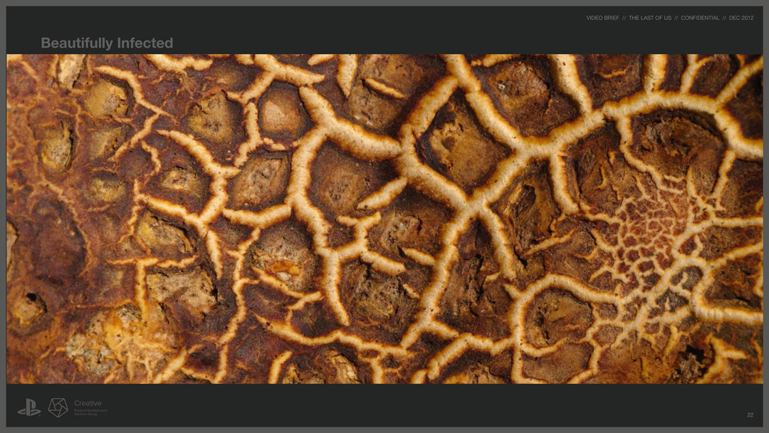
“Beautifully Infected” image from initial pitch deck.
So I found some slime mould stuff and some YouTube videos and hacked something together. Within three days we had our foundation. Then, we needed to grow the slime mould and take on that challenge. The whole beginning was a week and a half of growing mould – it grows pretty fast, especially under ideal conditions – and I had two or three timelapse cameras running on it at all times. I ended up taking it to my house and growing some there with my wife watching the cameras. We shot everything camera raw so that we had the most to work with. By the end of those two weeks I had a pretty severe cold, I think from all the spores and slime moulds, but it had to get done.
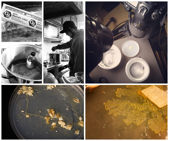
Slime moulds growth and timelapse shooting
—HENRY HOBSONWith experimental stuff, you always tread a fine line between abject failure and embarrassment and something really exciting and cool happening.
Is there any computer-generated footage in the sequence?
HH: There’s one shot at the end – the transition. That’s the only shot.
KJ: Yeah, the spores leaving the mushrooms.
Can you tell us about the lenses and equipment you used to capture the shots?
KJ: The first test was done with the 100mm macro Canon lens – the 5D Mark III, a pretty typical Canon lens – and then a Zeiss manual 100mm macro. It was just not small enough to capture the world, though. We couldn’t get enough detail to make it shallow enough to be artistic and cool and shallow enough to hide the fact that we are trying get away with doing ink on paper. The second test came a day and a half before Henry and I were going to get together – I had the Epic on site, I had both the 100mm macros in my arsenal – but it just was not working.
So I went back to a couple of references I’d seen online and realized that a few of the Macro World videos we’d seen on Vimeo, all the guys were using this macro MP-E 65mm lens from Canon. After seeing that footage I was like, “It’s done.” I called up B&H, I had it overnight delivered to the studio, and we had the lens for the day Henry arrived. In our first test it did exactly what we needed.
We shot at 120 frames per second and 100 frames per second to get 4K and 5K out of the Epic, which helped with cropping, reframing, and capturing things that move very, very quickly – in a macro sense – in slow motion.
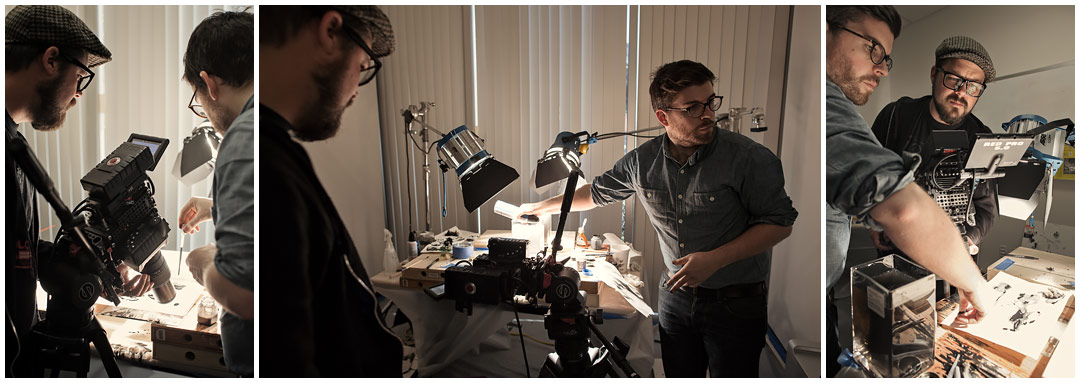
Ink and paper shoot with Kevin Joelson, Henry Hobson and Jared Gray
And otherwise, what tools and software did you use?
KJ: The primary stuff was that Canon MP-E 65mm lens and the RED Epic. It was edited in Premiere Pro CS6 and After Effects CS6, for the title and grainy design/hi-con look.
HH: The original pre-production level stuff and earlier concepts were Cinema 4D, After Effects, Photoshop, and the usual toys.
What elements of the sequence are you most happy with?
KJ: [laughs] I think the most laughable element is that there’s a piece of tripe in there. There was something about walking into the supermarket and saying, “I’m just going to walk through and find something that looks like some kind of cellular organism.” I remember the look on everyone’s face when I walked in with the tripe and tried it, applying the kind of technique we’d been using. It worked out amazingly. That was probably the most memorable and enjoyable part – it was just so ridiculous.
HH: For me, it was when we were in the room – having had the failures of the paper and the ink tank – and pulling out the freeze spray. Spraying it on a sponge covered in black ink and then seeing this amazing reaction as the frost grew around the sponge, then holding for a split-second before melting away, and watching that black ink start to move and trail its way through the sponge. When that moment happened I remember this feeling of salvation, knowing that it was going to work. With experimental stuff, you always tread a fine line between abject failure and embarrassment and something really exciting and cool happening.
KJ: Absolutely!
—Henry HobsonAs budgets start to get slashed on film title sequences, TV has picked up interest in the sequence because it’s such an iconic part of the branding.
Sponges, ink and compressed air
What are some of your favorite title sequences, whether classic or contemporary?
HH: I’m completely obsessed with the intro to Enter the Void.
KJ: I’m particularly fond of the True Blood title sequence. There’s something about the cinematography and that “found footage” nature of it that rings true to my style. It feels like what I would do if I were asked to do something for them.
ND: The obvious one that comes to mind is the intro to Se7en. I also think the opening to Game of Thrones is incredible!
Where do you see title design going with respect to video games? Do you expect it to fall in line with what’s being done in other mediums or do you think it will diverge and take advantage of the interactivity offered by games?
HH: Coming from the film world, I think it’s very comparable. I think Neil could answer that a bit better than we could. How far could it go? Could you go interactive?
ND: Yeah, we just sort of stumbled on this thing when we were looking for a way to solve the problem with that gap between the two cinematics, but it was such a great solution because it not only helped with the pacing but also with the storytelling. That’s when it’s really important, and that’s when you need to pursue whether you go interactive or not. I think people will start to explore those avenues, but it always has to be about asking, “Is this in service of the game? Is this in service of the experience we’re trying to create?” instead of saying, “Let’s just do a cool intro sequence for the sake of doing something cool!”
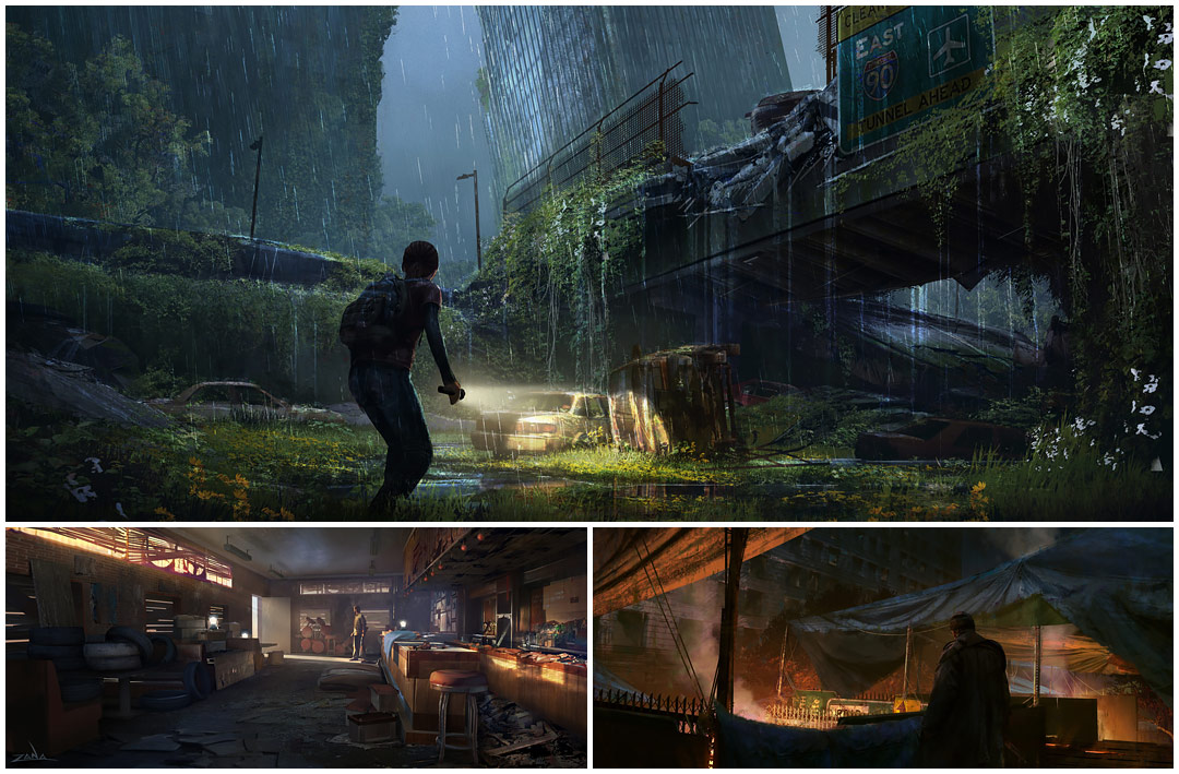
Game concept art by Naughty Dog
Henry, what are some of the differences between producing content for games as opposed to for film and television?
HH: What’s interesting is just how similar it is. As with the games themselves, The Last of Us feels so cinematic. The rules are the same as I might have working on a film title sequence.
You don’t really hear about video game title sequences, and so I think it’s just the beginning of a whole new wave. As budgets start to get slashed on film title sequences, TV has picked up interest in the sequence because it’s such an iconic part of the branding. Video games may start to fill the void that film is abandoning as budgets shrink. Games offer a very similar canvas with which to tell a story.

