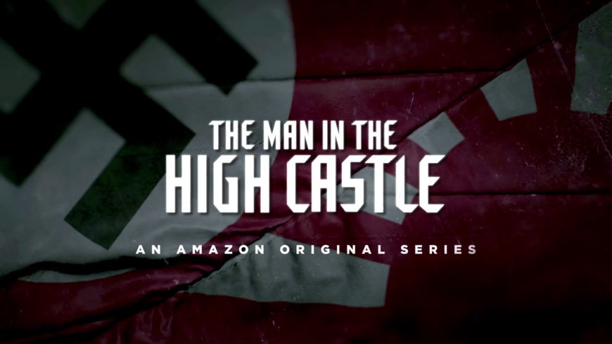
In Amazon’s The Man in the High Castle, an adaptation of Philip K. Dick’s alternate history novel of the same name, it’s 1962, the Allies lost World War II, and the two major Axis powers have divvied up North America between them. The narrative revolves around film canisters containing a revolutionary re-writing of history. That notion – of a dangerous film retelling history – is woven into the fabric of the show’s title sequence, created by Elastic.
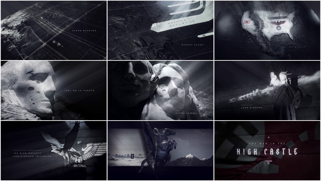
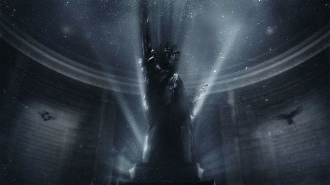
The first sounds are of a film projector starting, and the sequence presents a number of images with the flickering and uneven style of projected celluloid. We move over a map of North America as monuments have combat footage projected on and through them. Lady Liberty, Joan of Arc, and the eagle blend together effortlessly to establish believable Nazi–American iconography. The map-making imagery is also fascinating here, recounting the outcome of World War II using the visual language borrowed from numerous war movies, showing lines moving on maps and the shifting lines of power.
But the most interesting, and most poetically resonant, choice made in this sequence is the use of “Edelweiss”, sung in heavily accented English by an almost whispering female voice. Ironically, this most famous “Austrian” song actually isn’t Austrian at all – it’s an American song, written by Jewish-American songwriters Rodgers and Hammerstein for The Sound of Music in 1959. That sort of play would no doubt appeal to Nazis, relaxing in occupied America. But in this alternate historical context, for an American to sing, “Bless my homeland forever” is downright tragic.
The key emotion conveyed by the title sequence is one of yearning, of doomed nostalgia, and the quiet struggle to maintain one’s identity in the face of huge historical forces. This brilliantly anticipates one of the major emotional themes of the show, and frames what follows in that elegiac mood.
Winner of the 2016 Emmy in Outstanding Main Title Design.
A discussion with Creative Director PATRICK CLAIR of Elastic.
What did you do to immerse yourself in the world that Philip K. Dick created for The Man in the High Castle?
Patrick: The team from Scott Free reached out to us and shared some information on the show and source material. Like many people, I’m a huge Philip K. Dick fan – and screen adaptations of his work have shaped my love of cinema, from Blade Runner to Total Recall – so the chance to work on such a project was exciting.
The Man in the High Castle title sequence posed an interesting challenge. Dick’s story is complex and layered and the titles really needed to do some heavy lifting in terms of establishing the concept of an alternate history and timeline. They also needed to establish the geography of a USA divided into two conquered states, poised in an emerging cold war between Japan and the Third Reich. At the same time, they could not get bogged down in informational or expositional storytelling. Like all main titles, these needed be seductive and poetic, evoking the characters and drawing the audience into the world of the show.
The Man in the High Castle (2015) series trailer
There are a lot of different concepts that went into this sequence. Could you walk us through them?
Patrick: We’d been playing with projection concepts for a while, and we immediately saw that projection could be a perfect mechanism for conveying the clash between our world and the alternate history of the story. The projection also brought to life the film reel that plays a central role in the story, as well as providing a way to delve into military and map graphics while still maintaining an evocative filmic aesthetic. We pitched the basic concept to the show team, and they backed us all the way.
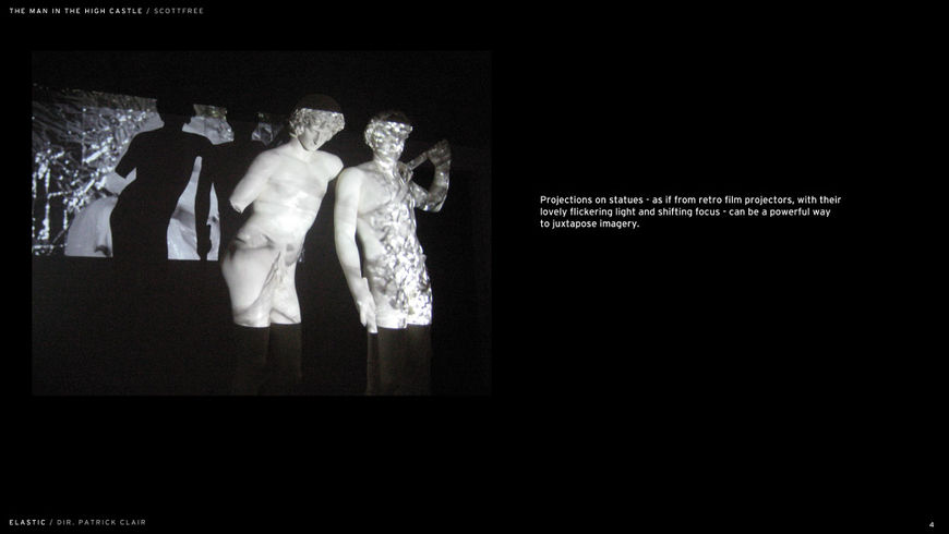
Image Set: The Man in the High Castle title sequence inspiration boards
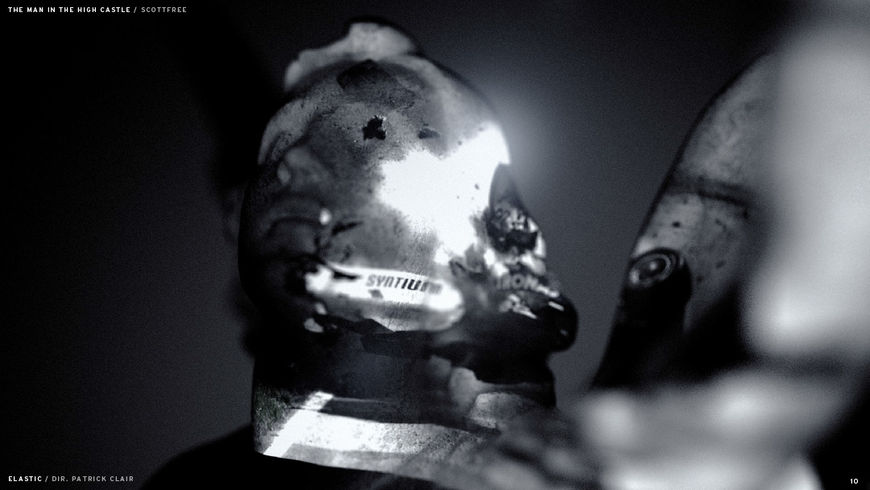
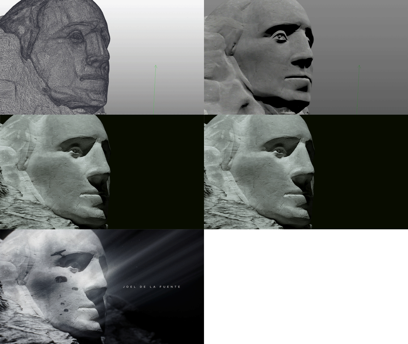
Image set: The Man in the High Castle technique tests
Patrick: The next part was interesting. We looked at a range of iconic American symbols and the way they contrasted with Nazi iconography. There’s a really interesting relationship there between eagles, colours, statues – it’s quite unsettling to see how the Nazis polluted these symbols with such an amoral legacy. We tried to walk a fine line of evoking these visual relationships in a way that was emotional but also respectful of grand icons like Lady Liberty or Mount Rushmore. The projected imagery was based on stock, but heavily manipulated to fit the compositions. The most important thing to me is the relationship between the elements, and the team worked hard to recreate historic footage in precise configurations to hit our design targets.
The map at the center of the sequence mixes topography and topology – it establishes the setting as well as the events that created the universe of the series. What inspired this approach and what challenges did it pose?
Patrick: For the map, we tried to keep things simple. The image of the US cleaved in two is pretty powerful by itself, and we wanted to give the audience a chance to absorb that before moving into more provocative imagery.

Image set: Map variations
Patrick: Next, on Mount Rushmore, we tried to get the paratroopers to look like tears rolling down the faces of the presidents, as if they’re mourning for what could have been – our reality. But in their world, the great American dream has been hijacked and destroyed.
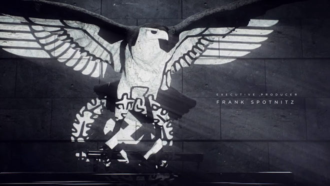
Patrick: The eagle is probably my favourite frame, the beautiful organic shapes of the grand American creature, cut into geometric slices by the oppressive graphic slashes of the Nazi symbol, was our way of visually expressing the violence, tragedy, and disruption of the invasion.
Mount Rushmore and the Statue of Liberty are two of the most recognizable monuments in the world, but what was the basis for the woman on the horse?
Patrick: The final statue is nonspecific, but it was designed to evoke Joan of Arc. This story is really about a tough, resourceful female revolutionary faced with overwhelming opposing choices. The horse-rider is trapped between images of east and west USA, a symbol for her choices in the story between sides of the battle, companions, and the country's future.
Let’s talk about the main title theme, “Edelweiss.” It's not what most viewers might expect, but it creates an eerie contrast with the visuals. At what point in the process did you know that this was going to be the song?
Patrick: Early in the process, Scott Free suggested the “Edelweiss” track, which we loved. Oftentimes, it’s tempting to go large on a soundtrack. I just loved how sparse and quiet this track is. It’s emotional because you know the tune, but unsettling for its hauntingly sparse recreation.
"Edelweiss" as sung by the original Broadway cast of The Sound of Music (1959)
Who did you work with on this title sequence and how big was the production team?
Patrick: We created the sequence with a moderately-sized team at Elastic, many of the same designers and animators that I work with across my projects: Paul Kim, Raoul Marks, Kevin Heo, Sam Cividanis.
The amazingly talented Jose Limon, also from our Daredevil team, sculpted many of the models you see – he has a great touch for organic shapes and the human form.
Raoul lead the animation, primarily working in Cinema 4D with some Maya and ZBrush artists in support.
The indomitable Jamie McBriety produced the project, with EP Jennifer Sofio Hall overseeing us.
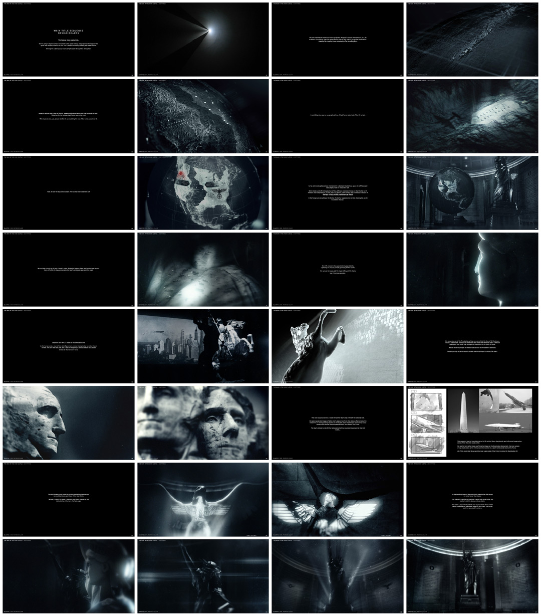
The Man in the High Castle "boardamatic"

