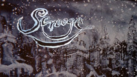
There’s a gift under the Christmas tree with your name on it. For a few tantalizing moments, before the wrapping paper comes off, it’s the perfect present: It’s anything you want it to be.
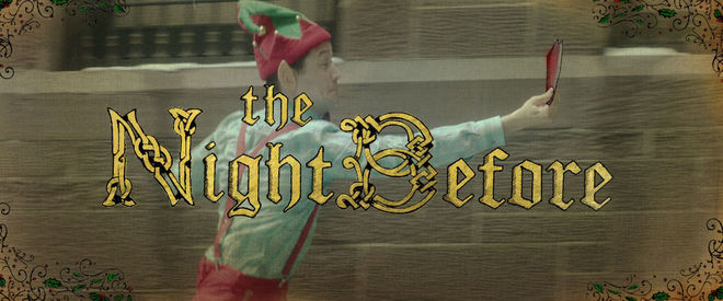
To kick off The Night Before – a hilarious holiday comedy about a trio of aging man-children (Seth Rogen, Joseph Gordon-Levitt, and Anthony Mackie) seeking the true meaning of Christmas – Laundry Design went with a classic trope: the storybook. This simple but effective device, used in countless films over the decades, was the ideal way to set up this surprisingly earnest Christmas comedy, but it was also one of many concepts considered. And that’s where the story gets interesting.
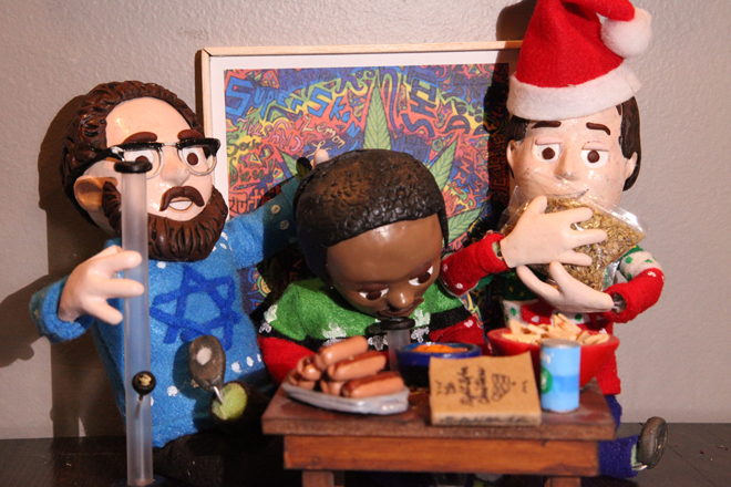
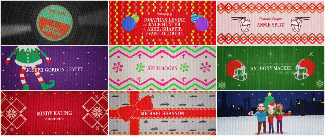
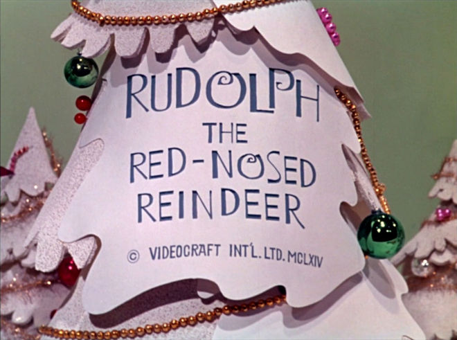
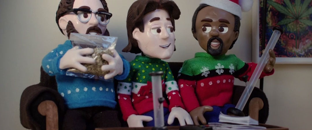
Channelling the work of beloved stop-motion studio Rankin/Bass, Laundry originally envisioned an animated intro in the style of Rudolph, the Red-Nosed Reindeer – infused with all the requisite naughty behaviour and drug paraphernalia that one might expect from a Rogen/Goldberg joint. A pitch-perfect proof of concept was created, the beer and bongs at odds with the cornball Christmas theme. Although it ultimately ended up on the cutting room floor, the stop-motion concept directly inspired the development of the film’s bumping end credits sequence. Featuring a parade of silly sweaters, old school raps, and miniature models from the unused concept, the raucous closer to this Yuletide adventure hints at what could have been.
So, was it a missed opportunity or meant to be? Sit back, relax – put on your favourite Christmas sweater – and reminisce with Pete Rock and C.L. Smooth.
A discussion with Creative Director ANTHONY LIU and Head of Features & Broadcast DAN MASCIARELLI of Laundry Design.
When we last spoke, it almost looked like The Interview wasn’t going to be released. What was the response like to your work on that film and what has Laundry been up to since then?
Dan: We’ve received great feedback and a number of compliments from clients and artists alike on The Interview title sequence. It was great fun to work on and the perfect way to close out the viewing experience of that film. Everyone seems to vividly remember it, down to specific title card compositions.
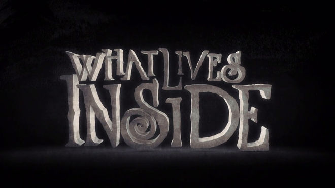
Since the release of The Interview, we’ve been ever-expanding, pushing our creative and production scope into other features, creating in-film design as well as title sequences. We just wrapped up a package of design for the new Warner Bros. film The Accountant with Ben Affleck, as well as a feature called What Lives Inside, which has a very artistic title sequence that puts the viewer into a unique world of sketched and tactile imagery centered around the “creative process” in its purest form.
What Lives Inside (2015) main titles, produced by Laundry
So, for The Night Before, let’s start at the beginning. You guys created the Point Grey Pictures ident for this, right?
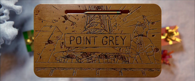
Anthony: We work with Point Grey on a logo for each film they do. We always keep it tied to the film, but we try to push boundaries with every outing. It’s a unique experience to see how much of a mini-story we can convey in 10 seconds, especially with the design framework of moving carvings etched into a wooden desktop.
Santa ends up alone on a hill, blasting the snowmen hordes with his flamethrower.
We brainstormed a range of initial ideas going from sweet to totally epic and insane. One involved opposing armies of snowmen and elves fighting a Lord of the Rings-style battle in the snow. Santa ends up alone on a hill, blasting the snowmen hordes with his flamethrower. Another imagined a dark version of the North Pole where the elves had enslaved the snowmen and were forcing them to create a massive pyramid-style monument to Santa Claus. A third was inspired by Bill Watterson’s Calvin and Hobbes and started out sweet with a child just finishing a snowman. The snowman then comes to life and, zombie-fashion, eats the boy. We then see scenes of horror throughout a snow-covered small town infested with snowmen zombies.
Those ideas were probably all a little too out there so we ended up with something sweeter and more in the true spirit of Christmas. Evan Goldberg pitched us the idea of having Santa barreling recklessly through the New York City skyline, then crash-landing at the famous Rockefeller Center Christmas tree. Then Santa would do the only thing you would expect him to do: break into a full-on Michael Jackson dance number, complete with crotch grabbing as the Christmas tree explodes around him. It’s just the right way to kick off the holiday feeling as we jump into the film.
Point Grey studio identity, produced by Laundry
You guys have worked with Seth Rogen and Evan Goldberg on a few films now. How did the conversation about The Night Before start?
Dan: Recently they’ve started to involve us early in the process. We screened a rough cut of the film in January 2015, almost a full year before it was scheduled to release. The director, Jonathan Levine, was interested in having a “Christmas storybook” opening and asked if we’d contribute some explorations. We began developing ideas and concepts to present and checked in over the ensuing months as they worked through post-production. We ended up creating the opening book animation, the end book animation, the interior main title, and the main-on-end sequences.
The Night Before (2015) interior main title
What about the logotype, that ornate lettering design? Who designed that?
Dan: The ornate logotype, as well as the line illustration, were executed by our lead designer Nicole Choi under the direction of Anthony Liu.
The logotype for the title card itself is first seen on the printed pages of the opening storybook illustrating the studio and production company credits. Then we revisit an emphasized gleaming version for the main title card reflecting the joy that Ethan is feeling. We bookend the whole “Christmas tale” aspect of the film with a version of the final shot illustrated in the same style of the opening, complete with the traditional “The End” in our logotype font.
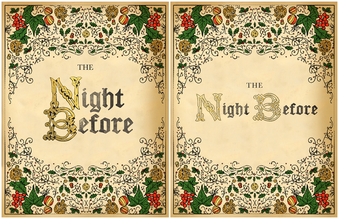
Image Set: Storybook covers featuring illustrations and lettering designed by Nicole Choi with direction by Anthony Liu
You originally went in a much different direction for the film’s opening though, didn’t you? Tell us about that.
Anthony: In the initial discussions, the guys were more interested in developing an interesting bookend for the film, bringing the viewer in and out of the story with a visual framework. The story presents the audience with classic tropes of holiday films, garnering a sense of nostalgia then turning it on its head with a modern and R-rated comedic take.
We created a moodboard focusing on some of our favourite classic Christmas animation styles and walked them through how we might apply each one to the opening. One of the treatments that we all felt might be amazing was that of the classic ’60s Christmas film by Rankin/Bass, Rudolph, the Red-Nosed Reindeer.
Rudolph, the Red-Nosed Reindeer (1964) main titles, produced by Rankin/Bass Productions
Anthony: We thought it would be hilarious to bring a modern drug-infused twist to such a nostalgic animation style. We created a stop-motion test using characters sculpted, modeled, and sewn together by hand and photographed frame-by-frame in-house using a DSLR and Dragonframe software.
Had you shot anything in stop-motion before? What was that like?
Dan: Yes, we’ve done stop-motion work for a handful of commercial spots. The challenge is always in how much detail you can put into the physical sets and characters. It usually comes down to time versus budget. In just a few days we needed to create a proof of concept that would sell the idea. Our motion test has only a basic level of detail, but it still required a substantial amount of work from a few people.
The Night Before (2015) stop-motion proof of concept, animated by Kevin Glick
Who built the models and made those tiny holiday sweaters?
Anthony: Kevin Glick, an extremely talented and creative stop-motion director. We brought him in to help us execute the initial motion test. Kevin created every character from scratch using his toolbox of materials and reference images of the actors from scenes in the film. Since the actors wear “ugly Christmas sweaters” in the film and it’s a running theme throughout, we thought it would give an immediate bit of visual comedy to create mini-sweaters for the puppet versions of the actors.
It’s similar to walking onto a dancefloor at a party: don’t waste time feeling self-conscious, just let it all hang out.
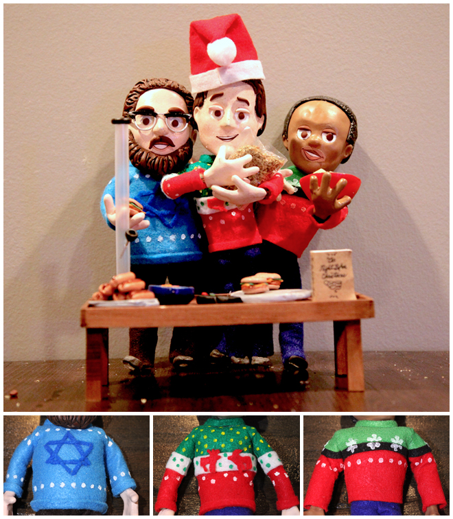
Image Set: Stop-motion proof of concept designs and models
So why didn’t that stop-motion concept make it?
Dan: Even though the director loved the stop-motion test and the concept, the finished film was better suited by the storybook concept that we did for the opening and closing. The oversized old-time Christmas book was the strongest way to ground the story in an “age-old traditional” telling motif. The discussions we had with the director always surrounded his desire to have the classic and quiet storybook come to a close with the end of the film’s story, then to leap into the end titles with a raucous sequence that was still inherently “Christmas”, but would be filled with visually loud imagery and send the audience out in a super-fun way. The ugly sweaters were one of the ideas we had – by far the favourite. It allowed us to keep the irreverent comedy of the film going until the last minute.
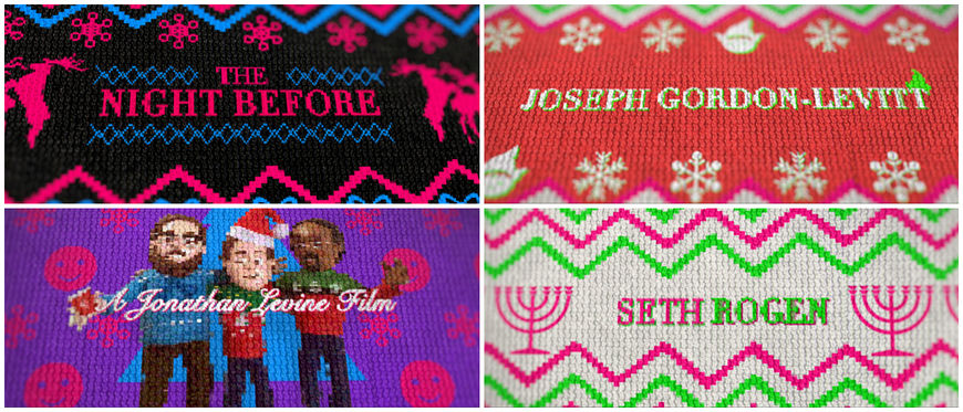
Image Set: "Ugly Sweaters" styleframes
Could you walk us through some of the alternate concepts developed for the main-on-end sequence?
Dan: The main-on-end design is rooted in energy and excitement similar to the “Ugly Sweaters” concept that we finished for the film. Jonathan always told us that the film would finish with the reveal that it was Santa Claus reading the story to the elves at the North Pole. The closing of the storybook signified the end of the traditional Christmas tale motif, and would then set off a wild party with everyone from Santa’s elves to Jesus himself cutting loose in a blowout party. They actually shot the party sequence but opted not to include most of it in the final movie. Jonathan showed us an edited version of that scene and allowed us use of the footage. It had plenty of over-the-top moments as well as a few cast cameos, and we felt it was an essential concept for exploration.
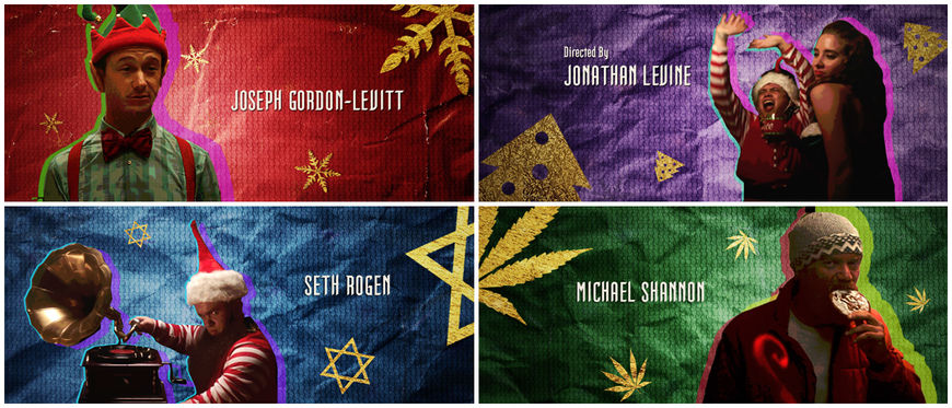
Image Set: "Rockin' Abberations" alternate styleframes
The sheer intensity of the party visuals inspired us to create a “blurred vision” look infused with holiday colours and lighting. We felt a party as epic as that would result in some definite spotty and hazy moments that were hilariously perfect for a credits sequence.
“Daze of Xmas” is an approach centered in a holiday celebration context, pushing the forms of snowflakes and other graphic elements to an almost abstracted place. The colour pallet and overlapping technique visually excites the eye, and also gives the sense of a large canvas to weave in ornate versions of each credit.
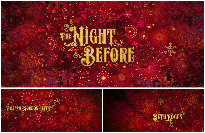
Image Set: "Daze of Xmas" alternate styleframes
Dan: Much like “Daze of Xmas” the “Wrapped” style focuses on a geometrical design patterning, less dense and with a lighter colour scheme. The wrapping paper motif ties it into the film and the holiday season overall.
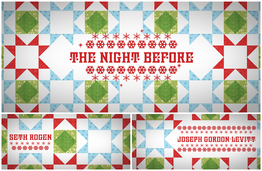
Image Set: "Wrapped" alternate styleframes
Dan: The “Paint By Night” concept depicts fun holiday imagery as if it were spraypainted graffiti tags, like what you’d expect to see on a journey through the city. Since the characters in the film are on a trek to reach the Nutcracker Ball, this concept thematically ties together fun visuals with story points in a look that's expressive and loud, even in the dark of night.
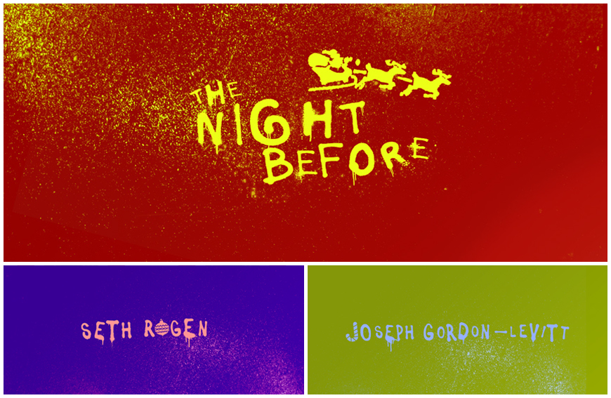
Image Set: "Paint by Night" alternate styleframes
Dan: “A Tradition” is geared toward the concept of family. The character Ethan and his best friends celebrate the holiday partying like crazy and acting as a surrogate family. This design depicts a series of off-kilter family photos.
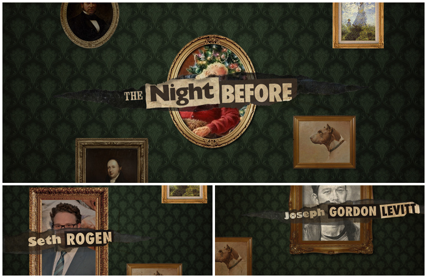
Image Set: "A Tradition" alternate styleframes
Tell us about the music choice for the end sequence – “The Creator” by Pete Rock and C.L. Smooth. Fantastic song! How was that chosen?
Anthony: That was all Jonathan Levine. He had that in mind pretty much the whole time we were discussing the end titles. Looking at his body of work, it's pretty clear he knows his music! We just wanted to hold up our end of it and create a visual that reached the same level of excitement.
Which tools and software did you use to put it all together?
Dan: For the storybook sequences, we built everything in Cinema 4D to create an authentic-looking book cover and pages that flip by across the screen very close to camera. We designed the sweaters in Photoshop, and animated and composited it all in After Effects.
What has the studio been watching lately? What’s been exciting to you guys?
Dan: All through our studio the must-sees are Fargo season two, Mr. Robot, and Jessica Jones.
Any final thoughts? Some words of wisdom you care to impart?
Anthony: It’s not very often you’re asked to create art that is intentionally gaudy or lo-fi. When you find yourself with that opportunity, you should always seize the moment because it’s very liberating to push your design sense to that end of the spectrum now and again.
It’s similar to walking onto a dancefloor at a party: don’t waste time feeling self-conscious, just let it all hang out.
