Author Pat Kirkham discusses the opening titles for The Pride and The Passion, from her authoritative book Saul Bass: A Life in Film and Design.
Saul had worked with Stanley Kramer since the late 1940s, creating advertising campaigns for at least fourteen Kramer productions. His two title sequences for Kramer were for vastly different films: The Pride and the Passion (1957) and It’s a Mad, Mad, Mad, Mad World (1963).
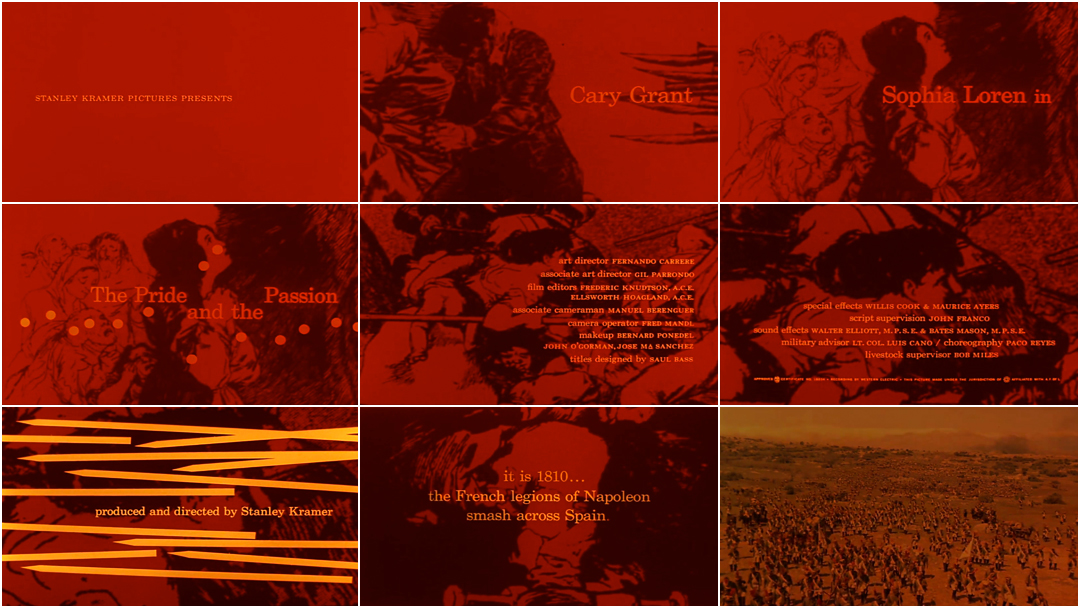
For The Pride and the Passion, set during the 1810 Spanish War of Independence, Saul used images from Goya’s powerful contemporary Disasters of War etchings, which depict Spanish civilians fighting against Napoleon’s army.
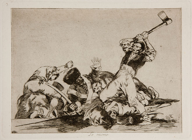
Image Set: A selection of plates from Disasters of War, a series of 82 prints created between 1810 and 1820 by the Spanish painter and printmaker Francisco Goya.
Details from the etchings fill the screen and are overlaid in blood red. Saul then added jarring superimpositions of muskets, spears, a spray of bullets and exploding gunpowder. The first scene of the film, a panoramic view of the retreating Spanish army, fades in under a red screen and, for a few moments, the images are suffused with the color of blood.
Saul designed particularly imaginative items in strong, rich colors of the premiere, but did not claim the main publicity campaign. The album cover, however, is very similar to Saul’s storyboards for a trailer, as are some posters that include sketches of the film’s stars, suggesting that he may have devised a campaign that was altered by the studio.
Pat Kirkham is Professor in the History of Design, Decorative Arts and Culture at the Bard Graduate Center for Studies in the Decorative Arts, Design & Culture, New York. She has written and edited a number of books, including Charles and Ray Eames (1998) and Women Designers in the USA 1900–2000 (2001).
©2011 Laurence King Publishing Ltd. Used with permission.
Title Designer: Saul Bass
Discover more Saul Bass

SAUL BASS: A LIFE IN FILM AND DESIGN
By Jennifer Bass and Pat Kirkham

