Sudden dizziness, shortness of breath, chest pain, a fall, and then… what?
Every minute of every day, someone dies as the result of a heart attack. Husbands, mothers, sons, and sisters; it can and does strike anyone. It’s an epidemic in North America, with more than 25% of all deaths caused by heart disease. This is an oft-trotted statistic. But what many people likely don’t realize is that cardiovascular disease is also big business.
That business is the subject of Patrick Forbes’ film The Widowmaker, a documentary that explores the world of modern cardiology. From preventative technology like stents and calcium scans which are favoured by many doctors to the invasive – and expensive – open heart surgeries that are preferred by hospitals and insurance companies, a war between what may seem like common sense and what lies in established medical dogma is waged with millions of lives hanging in the balance.
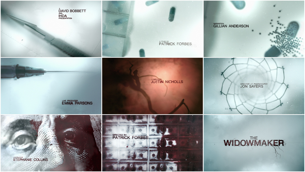
The opening title sequence, designed by production studio Jellyfish, addresses this battle directly. Does going under the knife mean what it used to? Established medical practices are put under a microscope, examined, re-examined, and then turned on their head. New approaches are uncovered, old ones are reconsidered, all while the spectre of the almighty dollar hangs in the foreground. The film’s title is a reference to the so-called widowmaker artery – a grim nickname bestowed upon the left anterior descending artery or LAD – the blockage of which can cause devastating and deadly heart attacks in otherwise healthy individuals. As veins pump and blood begins to seep and spread, a question lingers: How many lives could have been saved?
A discussion with Art Director TOM BRASS and Art Director DAVID PENN aka Sixfingers.
Give us a little background on yourself and your current position.
Tom: My name is Tom Brass and I’m the creative director at Jellyfish Pictures, where I’ve worked for about five years. Before that I worked as a storyboard artist and comic book illustrator. Before that, way back in the dim mists of my twenties, I used to work on TV shows as a cameraman and director – It’s been a varied career!
David: I'm a freelance art director and designer working under the name Sixfingers. I started out editing video in London back in 1999. I found that I was enjoying the titles work a lot more than the editing. Shortly afterwards, I decided to freelance as a motion graphic designer, working on diverse projects – broadcast, computer games, live stadium shows, and most recently film and title sequences.
So, how did you start when it came to The Widowmaker?
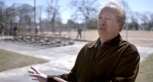
Clip from the documentary The Widowmaker
Tom: I was originally contacted by Oxford Films, the production company who made The Widowmaker, to pitch on another film, a feature doc called Ten Billion. We put a nice pitchbook together for the film, but it got delayed and Oxford Films felt that we might be right for Widowmaker instead.
I went to see Patrick Forbes, the film’s director, who showed me footage from his rough cut and explained the story. It was essentially a detective story, looking at two different techniques for treating heart disease patients and a scandal where millions of heart attack deaths could have been avoided. I was struck by what a strong sense of place there was in the film. It’s a road movie across the USA and is dripping with Americana. Also, there was a profound sense of loss that I really wanted to tease out.
I got to work on a pitch to try and win the job and in the meantime, I gave Dave a call. We’d worked together on many projects and I’ve always been really impressed by the quality of design and attention to detail that he brings.
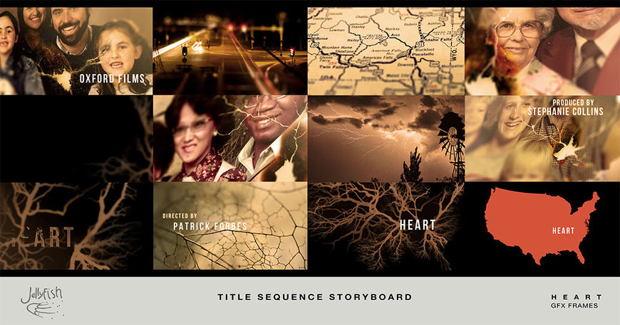
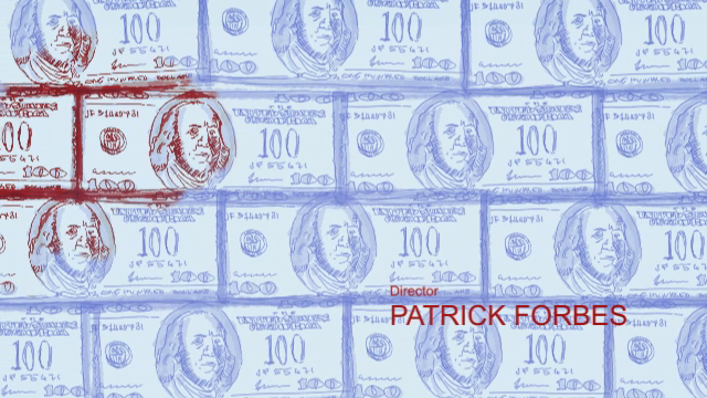
Image Set: Original title sequence pitch boards by Tom Brass. The film was initially going to be called Heart.
So you had the pitch, you got the job, and you called in Dave for reinforcements. How did you proceed together?
Tom: Dave and I went in for a meeting with Patrick, the film’s director and he asked us to think again about the themes of the film. Although he really liked the boards that won us the pitch, there were some reservations. What he really wanted to emphasize was a conflict between ‘blood’ and ‘money’.
I came up with the idea of using two visual strands that play off each other. The first strand would be extreme close-ups of medical instruments, heart disease pills, all the apparatus that keeps a patient alive. These images would be contrasted with shots from deep inside the human body, showing the territory that the medical equipment is trying to save.
David: My mind was buzzing with optical phenomena like light bleed, flickering bulb filaments, after-image, shallow depth of field. Things like extreme, claustrophobic close-ups and twitchy, one-axis camera movements with zooms and focus corrections suggested themselves right from the start. I liked the idea that the objects would loom over us, as if we were inside the lightbox. For a documentary of this nature, a sense of focused scrutiny felt right.
Tom: Looking at the medical equipment as if it was on a lightbox gave it a sense of clinical examination and obsessive focus. The camera was designed to move like that of a microfiche machine, making the camera feel like a mechanical inquisitor, dispassionately interrogating its subject.
Talking the ideas through with Dave, we felt that the sections inside the human body should feel very different – the camera would be calm and suspended, in stark contrast to the anxious energy of the lightbox shots.
David: On day one, I roughly sketched some key setups then began placing them onto a timeline.
Title sequence animatic
As it turned out, the sequence didn't veer far from that scrappy animatic. I’ve always thought of a cut as a satisfying cinematic device and using cuts gave us the option to reshuffle shots. I think I only switched the order of two shots but when an extra credit sprang up near the end I was able to work up a new shot – the syringe – and insert it without any headaches.
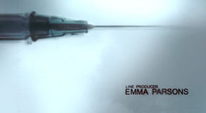
A late credit addition to the sequence and a syringe
What proved far more iterative was the 3D and rendering process. I was continually tweaking and experimenting with lighting, materials, and render settings. This was probably the project where I first used Cinema 4D in anger and I wanted to make sure that didn’t show!
Tom: We decided to bring in flashes of extreme close-ups of hundred dollar bills into the lightbox shots, teasing the moment at the end of the sequence when the two strands come together – blood billows across a sea of banknotes, staining the clinical blue of the lightbox imagery a deep, blood red.
David: There was a bit of to-ing and fro-ing with the final title card, too, before something was reached that everybody was satisfied with. Most of the concern was about how many veins should emerge from the type!
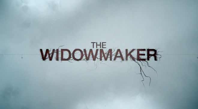
The Widowmaker title card
You didn’t do any live-action shooting?
David: No, but I definitely would have enjoyed to go with live action. I’m more at home working in software, and with a limited budget it made sense not to wander too far out of comfort zones. The controlled, linear camera moves that are so easily achieved in 3D may have taken a bit of head-scratching had we shot the sequence. Not only that, but the level of control that 3D software offers is so appealing; it’s fantastic to be able to adjust details right up until the eleventh hour.
A welcome surprise was when people we showed it to seemed to take the 3D for real. Maybe they were just being kind but I’m choosing to believe them!
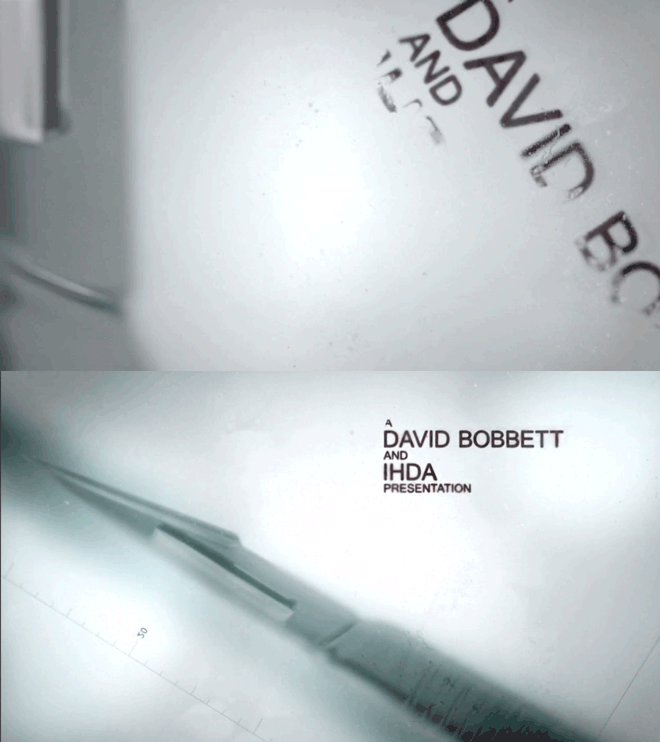
Examples of typography and composition
Talk about your type work. It seems like you paid quite a bit of attention to the typography, which is nice to see.
David: I’m glad that you say this, because for a while after finishing the piece, I was anxious that I had over-worried it!
Tom: We always knew that we wanted a really nice sans-serif typeface for the titles. I think that we chose Mangal in the end. It’s a great font, partly because it’s so utilitarian and uninflected. It’s one of those fonts that soaks up meaning from its surroundings like a cube of tofu soaks up flavour! Dave created a very effective technique for filling in the cold, clinical letters using spreading capillaries.
David: I came up with a method that attempts to imitate surface tension or capillary action within the type. I had designed it on a large scale to give options for closeups and for the final resolve, but once I had reduced the type to a size that felt elegant, I was concerned that the detail was getting lost. Looking at it now, I'm happy with it; I think the method achieves an irregular, non-digital feel.
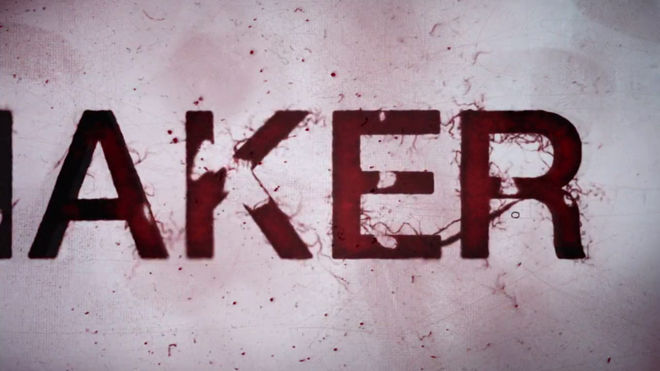
Still from the title card reveal featuring the capillary action effect on the typography
Tom: It created a lovely tension between the clinical lines of the font and the organic shapes building it up – another echo of the central visual motifs of the sequence.
David: I’m not sure you can overstate the importance of good typography! One of the reasons that I was so keen on Tom's original boards was because he had hit that beautiful balance between composition and type. I think an ill-considered choice of typeface can mar a sequence beyond redemption.
One way or another, I’ve happened to work with some very inspiring and influential designers – Paul Belford, Michael C. Place, and the chaps at Tomato. Working with and around great designers really aids your appreciation of type. You always hope that some of their meticulous attention to detail rubs off on you.
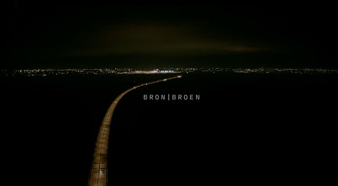
The Bridge (Bron|Broen) title sequence, designed by Andreas Öhman and Jonathan Sjöberg at Naive.
I think the original Danish/Swedish show The Bridge provides a resonant example of how beautiful composition, a good edit, and sympathetic, carefully set type can pay off. I love the restrained, sophisticated elegance of those titles. I think the music is a really good fit, too.
Let’s talk about the music and sound design for the piece. Who created that?
David: The sound design was the work of James Locke-Hart. He’s an incredibly gifted chap. It’s always a delight getting your pictures back with James’ work – he doesn't miss a thing, responding to the slightest detail in ways I'd never have imagined. Certain visual techniques rely upon sound design to be completely effective.
Tom: The clicks and whirs that James synced up to the camera moves really add to the sense of dread in the lightbox sections of the sequence. I can’t imagine the sequence without his sound design now – it plays a really integral part to the effect.
Seems like the team was quite small. Did you work with anyone else on this?
Tom: The team was very small. I was creative director and Dave directed and executed the sequence entirely on his own. I can’t understate what a massive amount of love and work he gave to the project.
The sequence was produced for Jellyfish by Carmen Perez Marsa and one of our other talented designers, Matthew Lee, developed Dave’s designs to execute some interstitial graphics elsewhere in the film.
And which tools and software did you use to put it all together?
David: I used Cinema 4D and After Effects. I don't think I used plugins beyond Trapcode Particular. I have been using After Effects for over a decade but Cinema 4D only for two years or so.
So, obviously you’re both fans of titles. What are some of your personal favourites, whether classic or contemporary?
Tom: The first title sequence that really had an effect on me was for something far less well-known that I saw when I was a kid: The sequence is from an obscure, but incredibly creepy horror movie from 1988 called Pulse.
Pulse (1988) end credits sequence designed by David Oliver Pfeil.
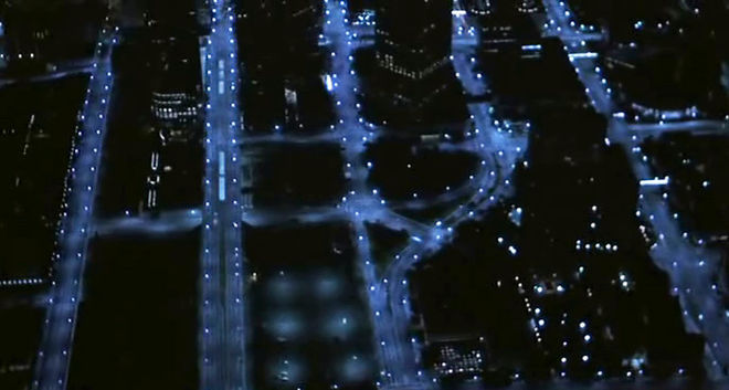
Essentially, Pulse is a classic haunted house story set in a suburban, American family home. But instead of ghosts, it’s the home’s electricity supply that is terrorizing the family. The film has a really great closing credits sequence, which juxtaposes macro photography of circuit boards with aerial shots of city streets lit up at night. No humans, just endless, repeating grids of circuits and sodium-lit streets. The sequence really conjures up a sense that there is some malevolent force moving through the world’s electricity supply that could alight on any home at any time. I was unplugging everything in my bedroom for weeks after seeing that!
David: A sequence that still looks peculiarly fresh to me is that of Dr. Strangelove, and I will never tire of The Shining’s vertiginous helicopter shots and unsettling soundtrack – something about the credits rolling counter to the footage strikes me like a river running upstream, so effective in giving a foretaste of things travelling unnaturally and immutably towards a terrible conclusion.
As a bit of a rotoscope fan – watching more than making! – I’ve long been a fan of the opener of A Fistful of Dollars, along with the work of Iginio Lardani generally. Saul Bass is to be assumed, I suspect. I’ve also come to admire Sandy Dvore’s work – though I hadn’t discovered it prior to my visits to Art of the Title!
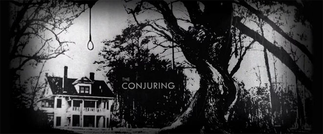
Re-watching our Widowmaker sequence for this interview, I'm struck by its parallels with The Conjuring titles, though I don’t recall discussing it as a reference.
The Conjuring (2013) main-on-end title sequence designed by Aaron Becker
That’s a sequence I admire more each time I watch it: especially the way the cutouts from the images presage the type, not to mention the little details that can be missed on first viewing – like the inverting crucifix.
What do you think piqued your interest in titles? What lead you to this kind of work?
Tom: I first got really interested in design from looking at record sleeves. As a music-obsessed teenager, I loved Reid Miles’ typographic record designs for Blue Note, Kraftwerk’s album designs, Julian House’s covers for Stereolab.
But my great hero is the comic book artist Chris Ware. He is an absolute, stone cold genius. He has created his own unique, highly complex, richly decorative but deeply emotional visual language. I think that he really is one of the master craftsmen of visual storytelling working today. If he ever wants to do any animation, we’ll happily help him out.
David: I think MK12 was the first studio that really caught my attention. I was in awe. Gradually I became aware of more and more of these amazing studios whose work impressed and daunted me in equal measure. When I started getting great clients, the inspiration often came from closer to home.
In the past few months I’ve been quite taken by the ubiquitous work of Malika Favre, for instance. These days I love that there are such great resources for inspiration. Pinterest, Vimeo, Motionographer, Art of the Title. It means you no longer have just a handful of prevailing inspirations but continually shifting influences.
Support for Art of the Title comes from

CINEMA 4D BY MAXON
Featuring an Unmatched Live 3D Pipeline with Adobe After Effects CC

