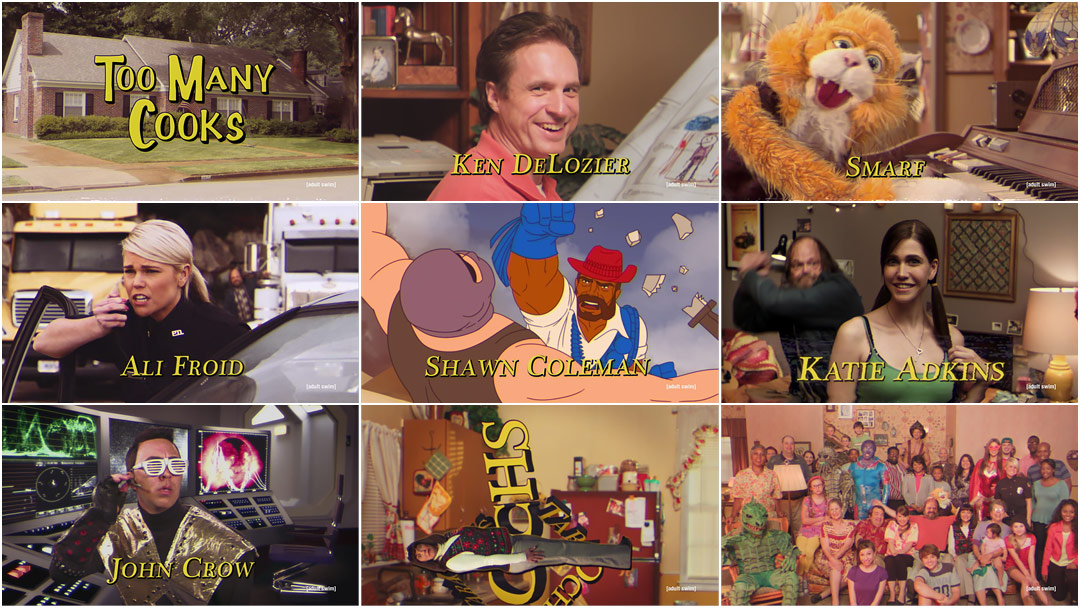
How many cooks is too many cooks?
The answer to that question and so much more are contained within Casper Kelly’s Too Many Cooks, an unremitting and increasingly nightmarish 11-minute onslaught of 1980s-style television title sequences, complete with puppet cat, anthropomorphic typography, and, of course, a cannibal machete murderer.
Much like the TV shows it’s lampooning, Too Many Cooks begins innocently enough. An overlong and intentionally unfunny Family Matters-esque opening slowly but surely unravels, dovetailing sitcom and soap, police procedural and sci-fi adventure show, Saturday morning cartoon and every genre in between, before ultimately descending into utter madness and absurdity. It also features a theme song so catchy, so insufferable that you’ll be singing it all day.
The Adult Swim short turned viral video hit is exactly the kind of fantastic, non sequitur weirdness viewers have come to expect from the channel behind shows like Aqua Teen Hunger Force and Tim & Eric, and yet nothing can possibly prepare you for it. Too Many Cooks is at once a bizarre love letter to a bygone era of American TV title design and a hilarious deconstruction of our shared pop culture heritage.
A discussion with Too Many Cooks writer/director CASPER KELLY of Adult Swim.
Tell us a bit about yourself, in terms of your background.

Writer/Director Casper Kelly
I started at Cartoon Network doing promos. I did a Scooby Doo/Blair Witch parody in the late ’90s that kind of took off and then I was able to slide over to Adult Swim where I've had the pleasure of writing for Harvey Birdman, Aqua Teen Hunger Force, Squidbillies, and I've also written a book called More Stories About Spaceships and Cancer. And I'm working on a feature. And I'm doing season two of Your Pretty Face is Going to Hell.
So where did the concept come from for Too Many Cooks?
I think it was a shower idea. I always liked that type of comedy, like Andy Kaufman or how David Letterman would repeat something and you'd get tired of it and then it would become funny again. I combined that with the idea of a sitcom intro that just kept adding characters and it wouldn't stop.
I had the idea of doing this for Adult Swim, where I work, but I thought... it's not going to really carry 11 minutes and so I just sat on it. I told some co-workers about it who told my boss Mike Lazzo at a party and he liked it so he said do it, but he said you're right, that will only carry you about four minutes and then you've got to start zigging and zagging and layering other ideas. You know, right when the audience is starting to get bored or kind of figure out what you're doing you've got to zip them in another direction.
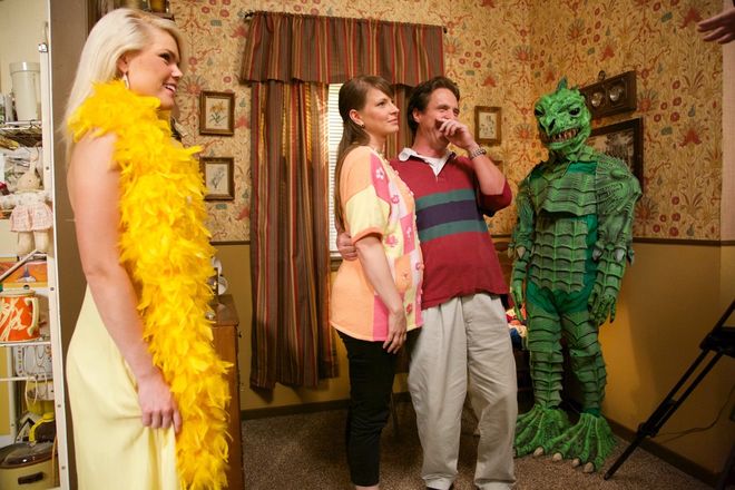
Relaxing between takes on the set with a green monster
So how was that developed, taking that initial idea to what it became?
We had to do it very quickly because we had a short window. I wrote an outline and would add ideas to it. It was a layering process and even the day of shooting I had more ideas, like when the girl is hiding in the closet and the credits are shining through, and I'd have to beg, saying, “Can we do this part, too?” It was basically shotgunning every idea I could think of that gave me a certain feeling and then seeing if I could make it all fit together.
Did you binge-watch shows from the ’80s as research?
A little bit, yes. We downloaded show intros from YouTube and we edited them together to get a feeling of how it worked and when an audience would get bored. So when we were shooting I would know how much extra I would need to have.
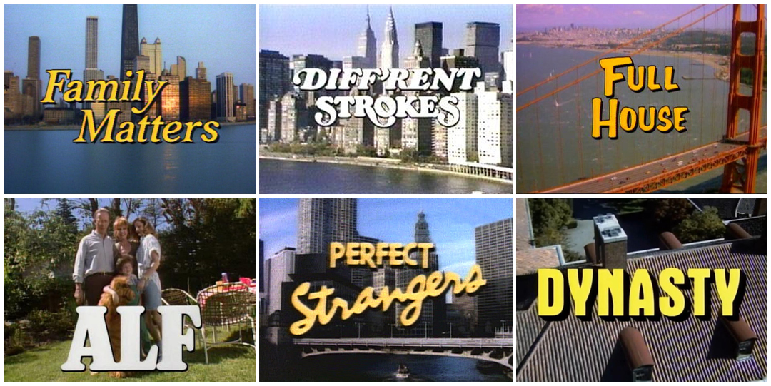
Title cards from television shows of the 1980s and 1990s
You also mix genres a lot – there’s the cartoons, the superhero stuff, the sci-fi. How did you weave all that together?
Yeah, I think that was my first idea of how to continue messing with people's minds after you extend the sitcom idea – to start shifting genres. That was the second idea and then I figured out, well, you're going to need more than that still. That's going to get you to five minutes tops.
So then you kept expanding on that?
Yes, you're shifting genres and the audience enjoys that for awhile, but then if you do that too much they're going, “Okay, I get it.” So that's when you've got to zigzag again. I think that just comes from working at Adult Swim and shows like Aqua Teen Hunger Force, which do a good job of trying to keep surprising an audience. It's also a benefit of having 11 minutes. We can throw some of the formula out the window because it's short.
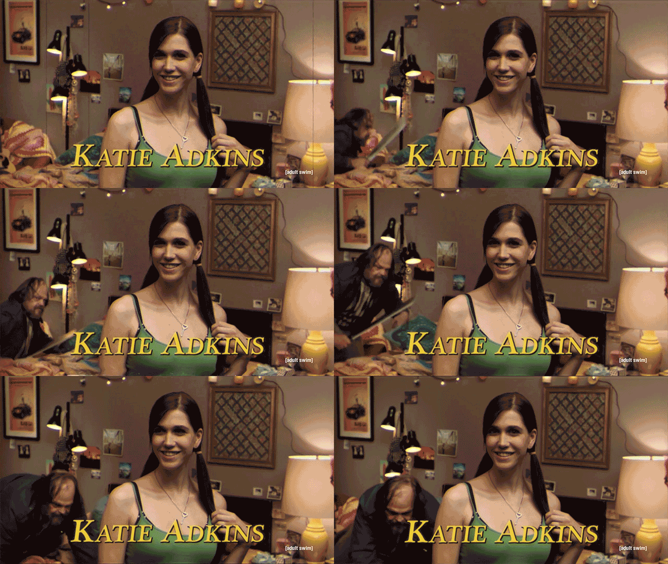
Tell us a bit more about the character of the murderer, who appears quite early. Did you have that idea from the beginning or did that just come about during shooting?
It was before we were shooting. My editor Paul Painter and I, we like dark stuff like David Lynch’s work and Mulholland Drive, and so we thought of that.
The actor started as an extra on our show Your Pretty Face is Going to Hell, and we liked him so much we have given him speaking parts in season two. He played a demon. He was also an extra on Anchorman 2 and The Walking Dead. My direction to him was very specific for each shot, but in my head he is a man who tried to be a sitcom dad - with his attempt at a Cosby sweater and such - but just will never allowed to be a part of this world he has to dwell in. So he's gotten a little bitter and vengeful about being left out.
Did you have a checklist of must-have elements from show intros that you wanted?
I sort of did, but I ended up working more intuitively because there's some genres I didn't hit. Then we put in a horror movie genre which isn't really a TV genre. Again, just to mess with people and be off-kilter.
Was there anything that was off limits or that you thought would be too dark?
I don't think so. I think I was nervous on the set. We had a joke with a topless woman doing Pictionary and there were kids on the set so we just shot that split screen – they were not there together. That was new for me.
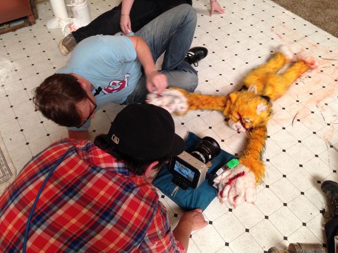
Smarf gets his close up in this behind-the-scenes shot
And Smarf? Where did he come from?
Chris Brown built Smarf. I was trying to think of every archetype of sitcom character that could be added to this family and so my thoughts eventually came to Alf.
Were there any ideas or scenes that you didn't end up using?
Yes, there's two that come to mind. At the very end when they're on the couch we had a flaming juggler walk by in the foreground and we went back and forth on that... we decided that was too wacky. I know the whole thing is wacky, and he was great, but it just didn't feel right.
And then I also had an idea for the ending credits. I had a fake “Stay tuned for Two in the Bush where Chloe has her hands full!” and then we have a girl in a New York apartment who says a sound byte and then he says, “Stay tuned...” It was a little toss to another fake show but I think we decided it was just funnier to have very fast ending credits.
And the fact that the minute the show that this sequence is meant to introduce starts it's a To Be Continued...
Yeah, that was a surprise. I had some weird lines that the husband and wife would say. There was a scene planned but it ended up being more hilarious that he doesn't get the first sentence out and more frustrating for everyone, which is funny.
You said you had a tight production timeline – how long did you have from concept to execution?
Well, pre-production was fast, just a couple of weeks, maybe a week. The shoot was three days. It was fun because you kind of learn these TV cheats that a lot of sitcoms would use. Like there's a police scene where it's a briefing and they're clapping and congratulating a guy – that was in a show, I can't remember which one. It might have been TJ Hooker. It was just people standing with folders against a wall and then a cop there and you totally believe it's a police briefing room. It's the craziest thing.

How to shoot a police precinct: just add people holding folders in the background
So you were learning how to create ’80s-style TV by shooting a parody of ’80s TV?
Yeah!
And then what about your post-production?
That was a long time, it was like a year, because we were doing Your Pretty Face is Going to Hell, so I worked with the editors around that.
Also the music took a long time. I wrote the lyrics and then the music was written by Shawn Coleman and Michael Kohler – they do audio for a lot of Adult Swim shows. We didn't really have the money to pay them their usual rate, so they had to do it between their other jobs, too. They both said this was the hardest thing they ever did! They were tearing their hair out. It was harder than they thought it was going to be when they took it on. I feel like I could have made a movie with the effort I put into this.
We were surprised that you didn't use a 4:3 aspect ratio, which is what shows of that era were shot in.
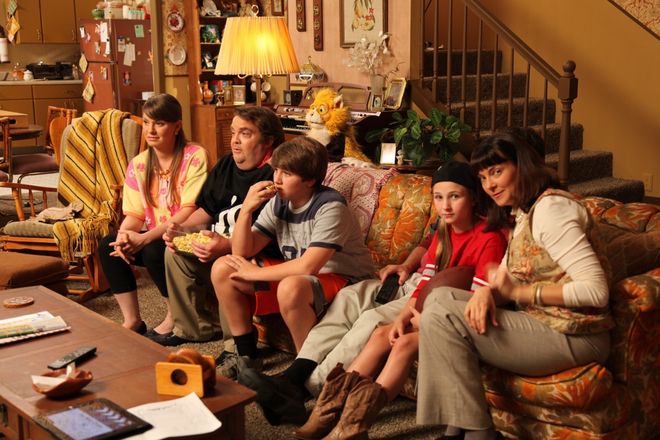
Family time on the couch
You're 100% on the money. That was discussed and I went back and forth on it. We even talked about shooting it on old equipment like that movie Computer Chess which was shot on VHS equipment, but it was such a shot in the dark that I wanted the flexibility of high-res. I started shooting with the idea that we could crop it if we wanted to, but I kind of liked the feeling that it's off and incorrect immediately.
How did you come up with the idea of making the credits part of the scene as actual characters and then reversing the actors to become their credits?
That was in advance too because I knew I only had three days, so I wrote every idea I could think of. If you're going to tackle this idea of credits let's go for every idea you can think of. The “intronitis” and so on. So that was all figured out in advance but it was a matter of uncertainty whether we would need it or if it was fine to just carry the one idea of the repetition. We ended up using pretty much all of the craziness. We needed all of it.
What’s your favorite part of the sequence?
I love when the credits and the people are reversed, I love when she's in the closet and her credits are shining through. And I do love also – this was figured out late when we were doing the audio – that the theme song is kind of traveling with the killer as he's running. That was not part of the idea initially. Shawn Coleman had that idea and I was like, “Yes. That is creepy.”
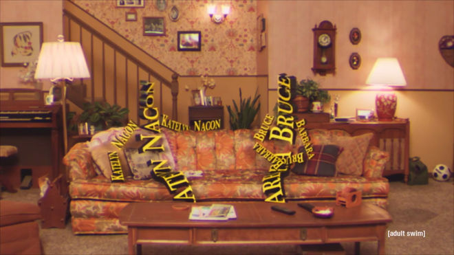
Anthropomorphic credits sitting on the couch
LIKE THIS ARTICLE?


