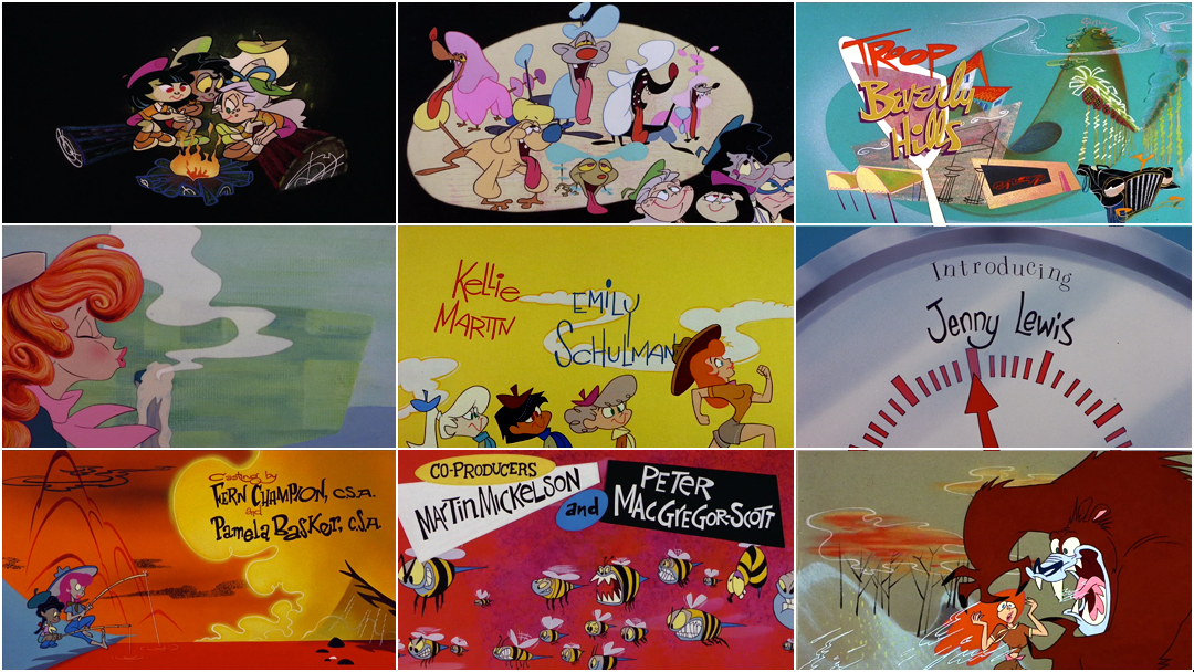
“Well, I love to set a bad example,” said animator John Kricfalusi, talking about his work on the opening titles of Troop Beverly Hills. Having spent much of his time prior to 1988 animating Saturday morning cartoons for companies like Hanna Barbera and Filmation, he relished the opportunity to do something more indulgent for 1989’s Troop Beverly Hills. “It's the first time I ever got a chance to animate and design a sexy girl,” he recalls. For his previous work, “it was completely taboo to draw women who were good looking because it would set a bad example for young girls.” The producers of Troop Beverly Hills had no such concerns with their animated opening – despite its key demographic.
The film centers around Phyllis Nefler (Shelley Long), a flighty housewife determined to prove herself capable by shepherding a troop of wealthy Wilderness Girls. Produced by animation pioneer and director Bill Kroyer’s studio Kroyer Films, the title sequence was created by a team including John Kricfalusi (The Ren & Stimpy Show, The Ripping Friends), Jon McClenahan (Animaniacs), Jim Smith (Mighty Mouse, Ren & Stimpy), Mike Kazaleh (Mighty Mouse, The Simpsons), Kent Butterworth (The Smurfs, He-Man), and Eric Stefani (The Simpsons).
In the 1980s, digital techniques were beginning to seep into Hollywood animation. The “combo technique” developed by Bill Kroyer and his partner Susan Kroyer was used to great effect in their previous animated openings, but was used only sparingly in Troop. This allowed the murderer’s row of animators to let loose. Jim Smith and John K. handled much of the layout duties, with Kricfalusi animating Phyllis with the flashlight. Smith drew the scene in the canoe, while Kazaleh animated the girls with the wine bottle and the corks. Kent Butterworth animated Phyllis interacting with the bear toward the end of the sequence, wrapping herself in its furry paws before scampering away.
Read about this sequence and John K.'s other animation work at his blog, John K. Stuff!
Though the team was illustrious, a thorough look at the finished product reveals several sloppy mistakes. Key animators’ creative demands pushed the production schedule to its edge, resulting in a delightful but less-than-perfect title sequence. And while the film may have missed its mark as top shelf comedy and as social commentary – indeed, Roger Ebert called it “a sitting duck for satire” – its animated opening succeeds in jacking up the joviality.
A discussion with Title Designer, Director, and Animator BILL KROYER of Kroyer Films.
So, it was the late 1980s, and your studio was working on commercials and animated title sequences. What was the industry like at the time?
Well, there was a revival happening. The Little Mermaid had already happened and so things were picking up. But there wasn’t a lot of Disney-quality animation happening outside of Disney, and that was why we had our studio. If you didn’t work at Disney, there was really no other place to go where you could work on a Disney-style film, which is what we ended up specializing in. Especially because we had that computer technique, which made our stuff unique. That’s eventually how we got FernGully, you know? The Australian guys came to Hollywood, wanting to do a Disney-style film, and there was literally no studio in Hollywood that was doing what you would call Disney-quality feature animation except us, so that’s how we ended up getting the film.
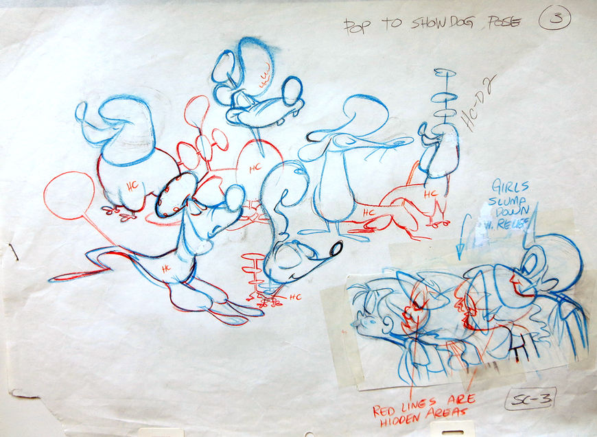
Production drawing of dogs and children
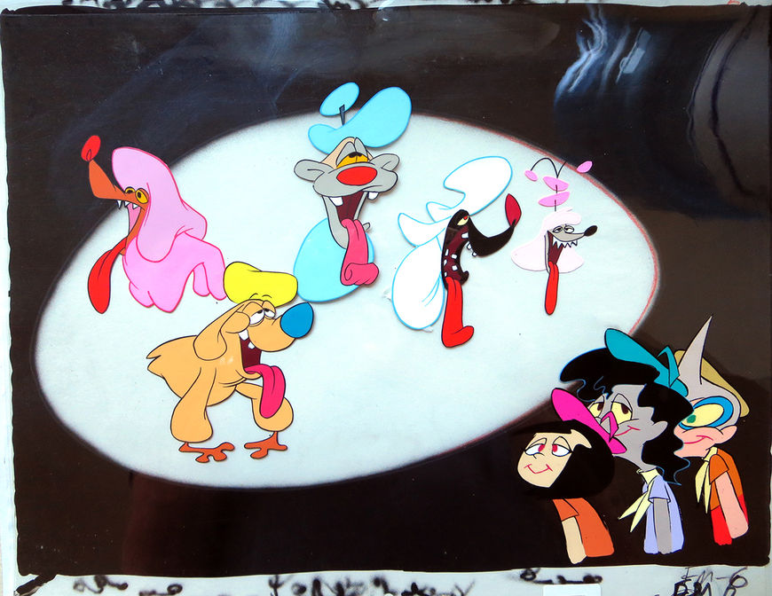
Animation cel featuring dogs and children
How did the opening sequence of Troop Beverly Hills come to you?
People saw our previous titles, and just inquired, asking, “Who did this?” They approached us, and said, “Would you do something for this project?” We said, sure, we’d like to, and it was really as simple as that. In typical fashion, they had us come in and look at the cut [of the film], which was pretty far along at that point. They said, “Can you come up with some ideas for a title sequence?”
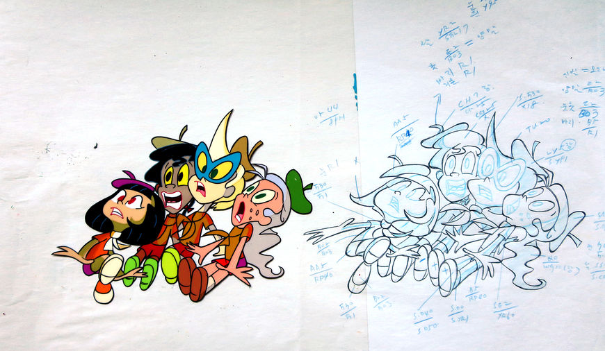
Hand-inked animation cel and production drawing of the troop
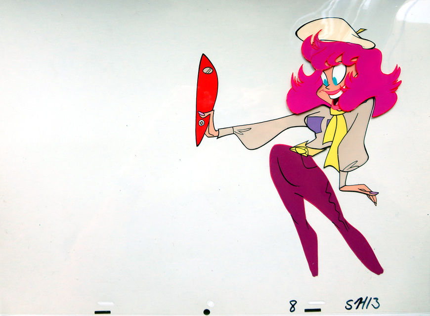
Original hand-inked animation cel featuring Phyllis and the shell of her Swiss army knife
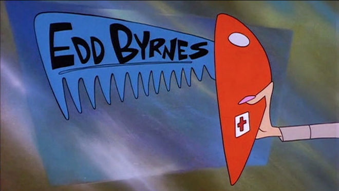
Actor Edd Byrnes' credit appears on the Swiss army knife's comb, which is a reference to Kookie, a character Byrnes played in the TV show 77 Sunset Strip. Kookie combed his hair so often that a song was written about it, called "Kookie, Kookie, Lend Me Your Comb".
The team for this one was a little bigger than for your previous sequences, right? You had John Kricfalusi, Jon McClenahan, Jim Smith...
At that moment, we had a lot going on in the studio. But I wanted to do the job, and I was looking for a way to make it look fresh and different from other things we had done. I had known John Kricfalusi for a while. He was really a talented guy. I think he had just gotten fired from a project [laughs], which was always happening to him. So he was free, and I said to him, “How’d you like to come in and design this title sequence?” John said, “I’ll do more than that, I could bring in a couple other people. I could bring in a background painter, a designer, an animation guy to really help you out.” I said that’d be great, so he did that. And believe me, it had its good and its bad points! [laughs]
[laughs] Tell me more about that! Did you have to rein anybody in?
Yeah, you know, I discovered John’s trademark. He just said, ”Let me go off and don’t bother me.” He really wants to do it his way, and he doesn’t want to have to work under schedules or timing. He’s pretty demanding that way! I mean, the initial work he did was really great, and I liked it.
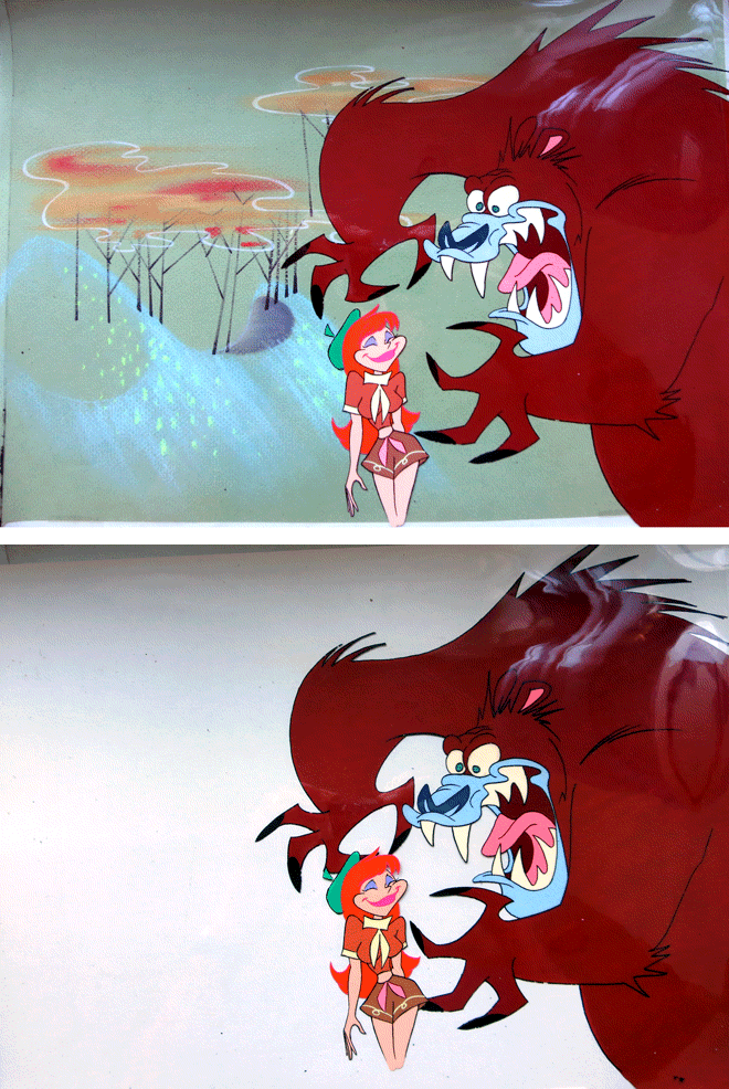
Original hand-inked animation cel and painted background
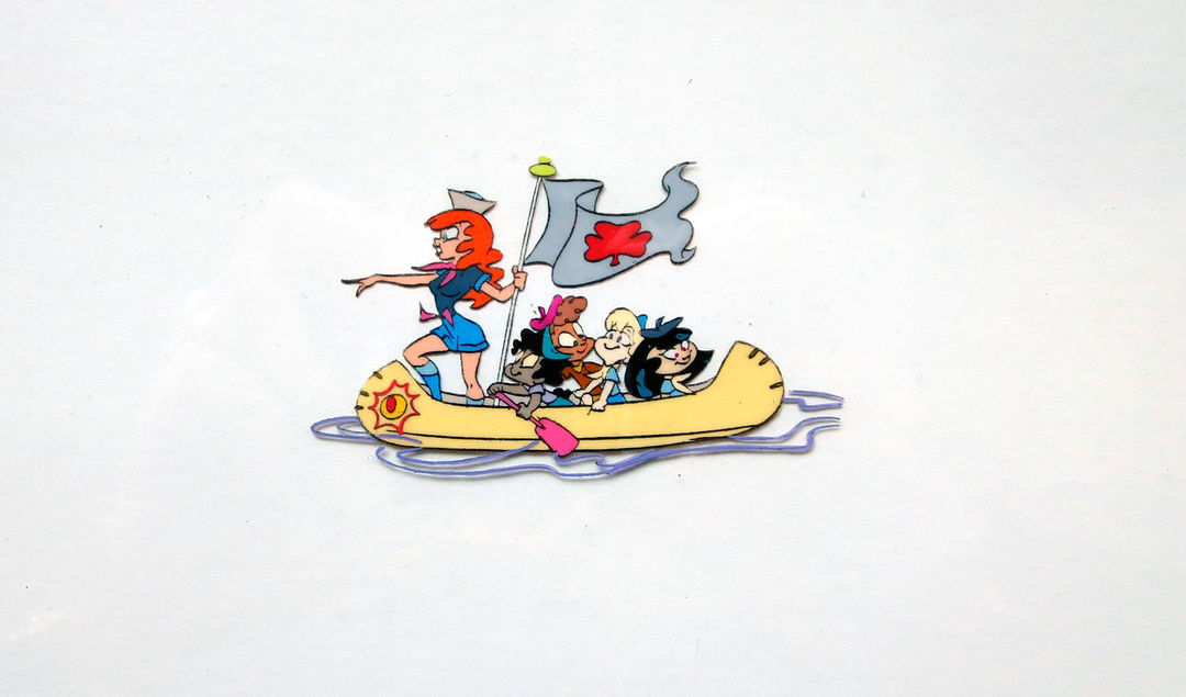
Hand-inked animation cel featuring the troop in a canoe
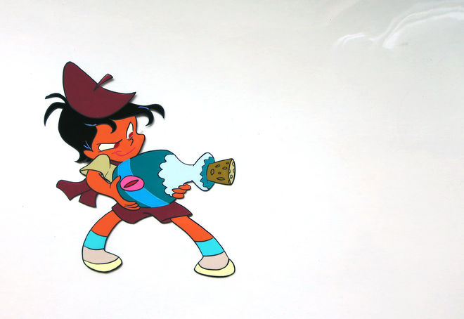
Original hand-inked animation cel
I thought, this is great, we’re gonna get this done ahead of schedule. And then I come back a week later, and all of a sudden there’s all new scenes! And I say, “What’s going on?” And John says, “Oh, I gotta keep trying, I gotta try something different.” He could never make a decision, you know? He never wanted to let anything go. He can’t stop and say, “Let’s go with that.” That became the trademark when working with Kricfalusi. It became kind of a running joke. The only way he was happy was if you’d hand him the money and then go away. He’d say, “I’ll call you when I’m ready to show you something,” which is okay if you have a lot of money but if you’re working on a budget and you also have a movie coming out, and the movie has a release date, and they need the titles, well, it doesn’t work that way. We got jammed up, because it was hard to get John to make a decision. So because of that we got into a real jam on the production side, it became tight for us and we made some really silly mistakes that to this day I feel bad about.
But everything he did was really cool! I liked all the designs, and I liked John a lot, I’ve always liked him a lot.
What kind of mistakes?
Well, there was one scene where they made a mistake and they didn’t extend the animation past the widescreen safe lines.
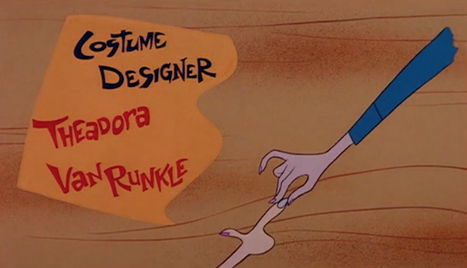
Still from the title sequence from around 1:55, where an arm was not extended for the full animation frame
So you shot the thing – they formatted it for like a slightly wider release, you know? So on TV, the characters had no legs. You can actually see that there are no legs on the character. That’s pretty bad.
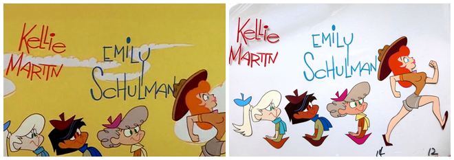
Image Set: Comparison of still from title sequence (left) and original animation cel (right).
And there’s a couple of shots where John insisted on placing the titles in a really arty position but way too close to the edge. So when we saw the titles in the theatre, some of the people’s names were actually off-screen. If I had been the producers, I never would have accepted it! You know? I would have said, you gotta go back and fix this. But they never did. We gave them the finished work and they really loved it, and it played well, and they never asked for any changes.
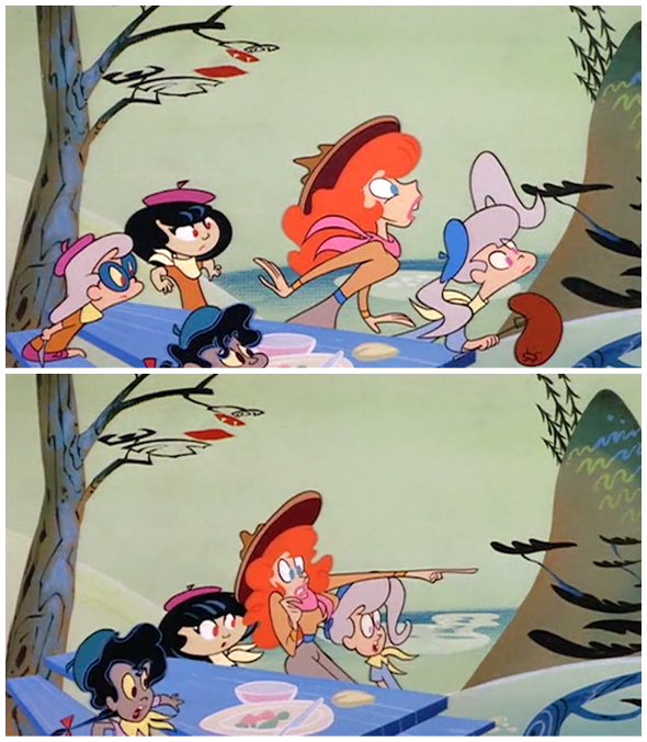
Stills from the title sequence that feature a continuity error: around the 2:15 mark, the girl with the glasses is with the troop, but is missing seconds later
They just didn’t notice?
If they noticed, they didn’t care. That’s a job that I hardly remember getting notes on. That’s the strangest thing. That whole production, it was rushed to get it done, and they really liked the look of the art. It’s all hand-inked and everything – it looks great. I think they were just so excited about that so the little things about the staging or composition, they just didn’t mention it.
And another thing – [the studio] never asked for the art. You know, when you do something for Warner Bros. or Disney, they want all the art. But when we did this, they didn’t. I guess they’d never done an animated title and it never occurred to them! To this day, I have friends working in studios and the biggest executives have no clue how animation is done.
That’s not that surprising, actually.
I was talking to somebody the other day and they were telling me about this executive who was checking in on the progress of a film, and he said [to my friend], “When can I see the B roll?” My friend said, “What do you mean, the B roll?” The executive says, “You know, the other camera, the second camera. When do I get to see that?” My friend said, “There’s no second camera in animation! We only shoot what we’re making. There’s no second or third takes.” [laughs] I looked at my friend and said, “You’re kidding me, right?” I mean, it’s amazing, these live-action people, they really have no clue. So when you have a situation like that, where you have a studio making a film, and they have no experience in animation at all, and they ask for an animated title, I guess that’s how it goes.
For Troop Beverly Hills, did you use your combo technique that you’d used on Honey, I Shrunk the Kids and Christmas Vacation, or was this all cel animation?
We used a little bit of the combo technique on certain things. There were a couple of little moments where we have – you know, like the caviar dangling, so we did use a little bit, but not nearly as much as the other ones, because Kricfalusi did much of the design.
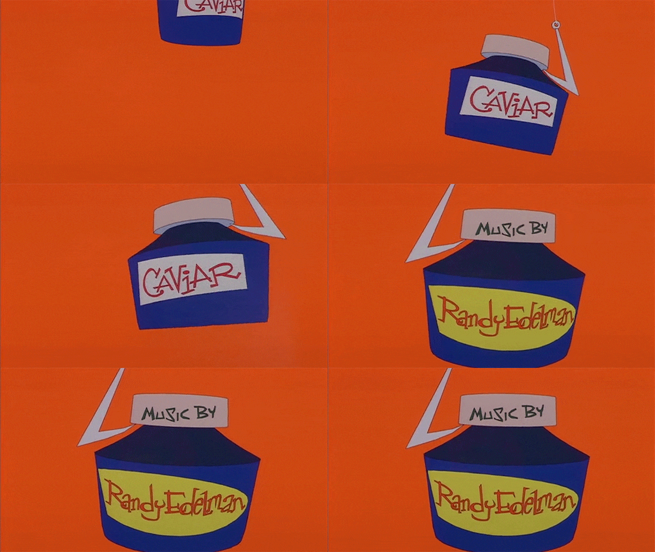
Caviar on a hook from the Troop Beverly Hills title sequence, animated using Kroyer Films' combo technique
Tell me about the music. How did that come into this?
They did that in post. We did not animate to the track, you know.
I mean, when we did Christmas Vacation, Angelo Badalamenti was the composer. He scored our opening, and it was really great. When the movie came out, they slapped the song over our titles and completely destroyed the timing of everything! I thought that was really too bad.
Are there any moments of this production that kind of stick out to you, looking back now?
Well, you know, I like the look of it but I didn’t think it had the flow of a lot of the other things that we did. When directing something a little straighter, which this was supposed to be, it’s hard to align that flow. Part of it, I think, is because John is an overwhelmingly – his design is the big thing, and then he has that odd sense of humour, which is hilarious, you know, the Ren & Stimpy stuff.
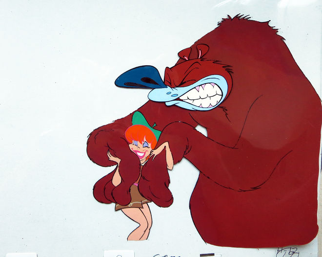
Original hand-inked animation cel in which Phyllis, the troop leader, luxuriates in a bear's furry paws
LIKE THIS SITE?


