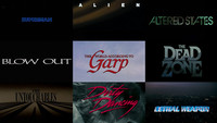
Title Designer Richard Greenberg of R/Greenberg Associates spent much of the ’80s designing film titles with a flair for innovation, particularly when it came to typography. The Greenberg brothers' first title design, for 1978’s Superman, involved the innovation of a slit-scan technology that would allow the title to “swoop” through space. Next came Ridley Scott’s Alien featuring strangely dismembered bits of type, lending the opening a definitively ominous tone. Then, a slew of films including Altered States, The Untouchables, The Dead Zone, Blow Out, all featuring type in a conspicuous, structured way, created using primarily practical effects.
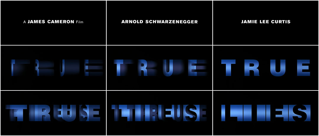
In the '90s, new digital technologies arrived on the film scene, and the Greenbergs, as usual, were on the front lines. As the letters in "True Lies" slowly turn, the perfect example of an incredibly simple idea executed flawlessly with the exact tools for the job is revealed.
Title Designer RICHARD GREENBERG speaks about his work on True Lies in this excerpt from our feature article R/Greenberg Associates: A Film Title Retrospective.
Richard: It was probably around ’93 that R/GA LA [R/Greenberg Associates West, Inc.] was started and by that point we were entering the digital world. Even in the artwork for The Untouchables, the shadows were created digitally, and of course True Lies is completely digital. Something like that wouldn’t be possible without a computer because you have all those points to change “True” to “Lies” and there’s just no way you could do that otherwise.
I don’t like decoration for decoration’s sake – I think that an idea has to be pared down to its essentials to really come alive. That’s a philosophy that I hold to in every part of my life. We came in as everything was beginning to change over.

