What is the most important element of typography?
Is it what you see or what you don’t? Is a letterform the presence or absence of something?
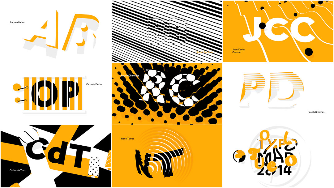
In the title sequence for Spain’s Typomad 2014 conference, Dutch designer Jeroen Krielaars asks these questions and so much more, gleefully exploring the idea of ‘oculto’ - or the hidden part of type.
Conference title sequences, unlike their film and television counterparts, have an unfortunate tendency to be unfocused, meandering pieces; a list of names with little in the way of context and a theme far removed from the topic at hand. Typomad 2014 is thankfully an exception to this rule. This is a sequence about typography, how it is created, and how we understand it.
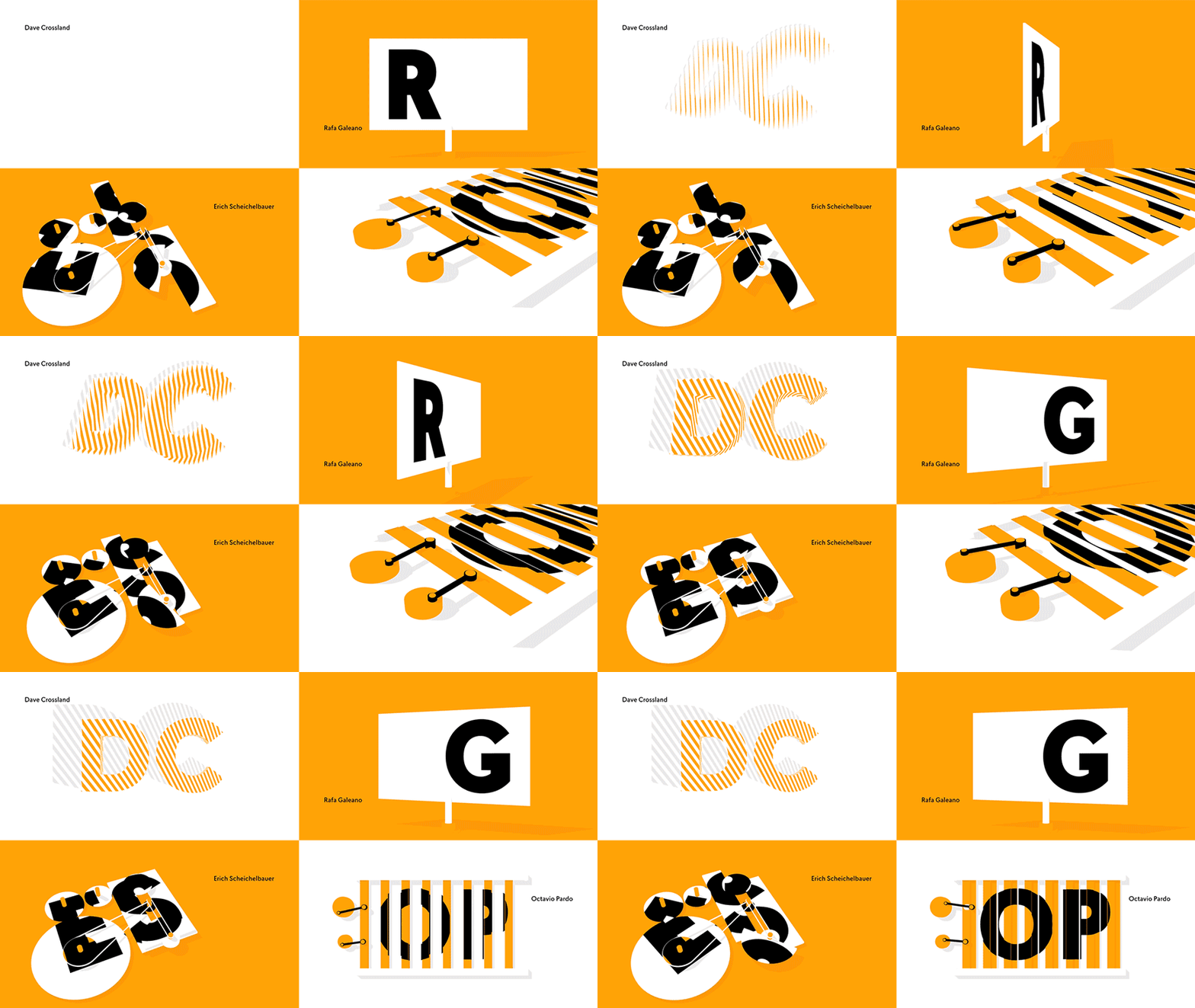
Presenting viewers with a dizzying array of animated puzzles and contraptions, Krielaars renders the initials of Typomad festival speakers as giant letterforms caught in some incredible machine. Mazes, billboards, tile puzzles, and even an old timey thaumatrope become a playground for type; Matteo Taheri’s soundscape imbuing every set of letters with a feeling of fun, each one a new mystery to be unravelled. Letters appear and disappear with subtle changes in perspective or the turn of a dial. Form and meaning are broken down and reassembled by the clockwork of some unknowable geometry. It hides, we seek.
A discussion with designer JEROEN KRIELAARS of Calango.
Give us a little background on yourself, and your design studio Calango.
I studied concepts and brands at the Amsterdam Fashion Institute. It gave me certain creative skills, but I quickly discovered that a career in fashion was not for me. I always enjoyed the graphic design and presentation of my projects more than the actual content. So, in the evenings I taught myself the basic principles of design and played around with software.
Right after my graduation I worked at MTV Networks for a month. That's when I decided to start my own business, as working for a boss was not my cup of tea. I started small, by doing some flyers and animations for Club 11, one of Amsterdam's best night clubs back then. From there it slowly grew into a more serious practice.
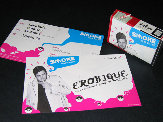
Club 11 flyer designs by Jeroen Krielaars
Now, almost 10 years later, I'm having the success I dreamed of back then. It feels really good to have achieved so many goals, while still having lots of goals to strive for. I'm still mostly a one-man company, but I have a great network of freelancers around me, so I can comfortably service larger clients as well.
How were you approached for this project?
A friend was one of the speakers. I had just done my first talk about my side business Animography at a small event called High On Type. I wanted in on the action at Typomad so I contacted them. Instead of a talk, I got asked to do the opening titles. Last year's titles were done by Tavo. They did a great job and set the bar pretty high. And later on I also got invited to do that talk after all.
Could you tell us about the original concept for the title sequence and how you developed the visual puzzle ideas.
The theme of the event was "oculto," or in English: the hidden part of type. So I started to think of ways to distort, hide and reveal typography. I've been playing around with flat colors in 3D for a while. It allows me to use true 3D perspective without losing the graphic look and feel that I love. This project was a perfect chance to do real significant project within that style. Because all the colors are flat, I could hide all kinds of geometry within certain perspectives. With that in mind, I started to sketch out all kinds of ideas on paper.
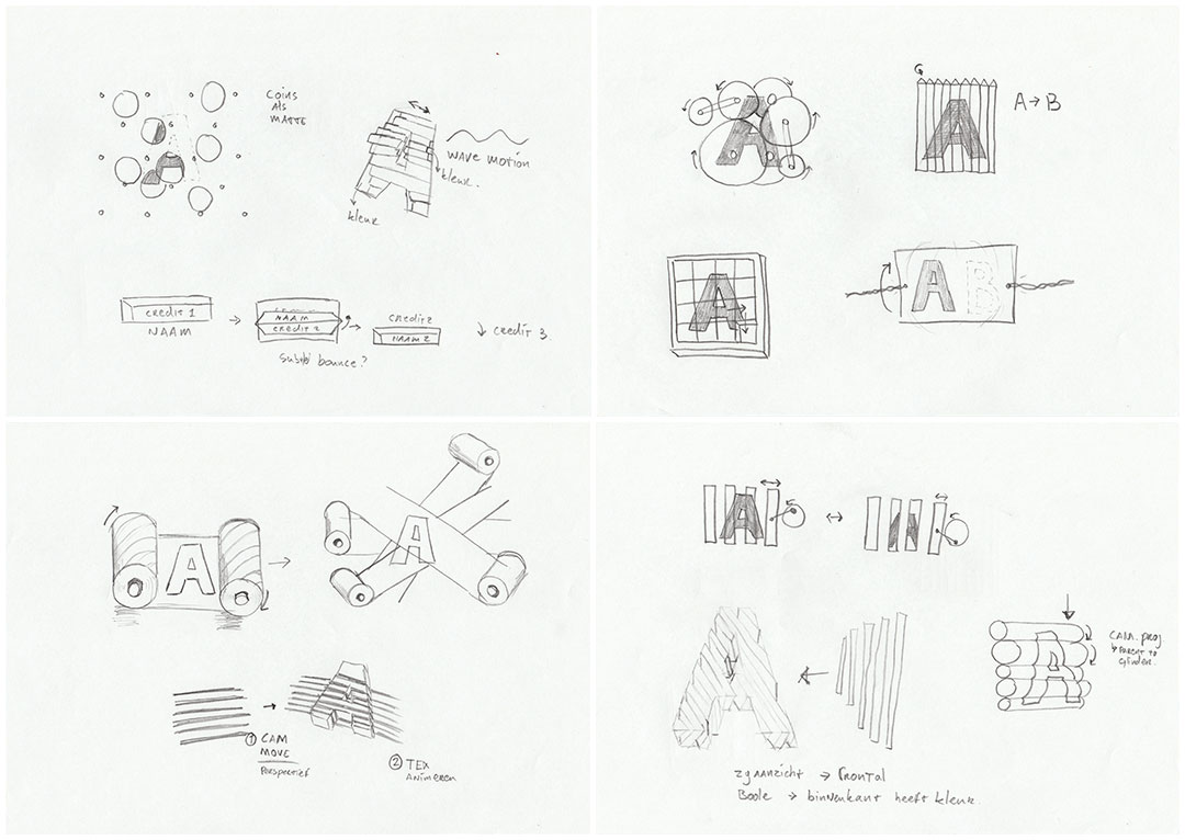
Initial sketches and type reveal concepts
How was it working with Typomad? What was the feedback process like?
It was very nice, because they trusted my judgement and gave me a lot of freedom. After showing them a little moodboard with some references, and a really brief explanation of my concept, they gave me the green light to get started. I checked in with them a couple of times to make sure everything was up to expectations. It was a breeze. No killed darlings. No cutting corners. Nothing of all that.
A little friction between me and a client is usually good. But this time they kept a certain distance and just let me do my thing. It felt really good and I am very pleased with the end result. The best project and best client of 2014.
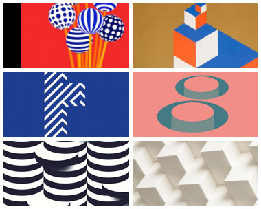
Reference images
Were there any visual puzzle ideas that you ended up not using?
Yes, a couple. I had some sketches that I did not use. And only one animated scene that just was not interesting enough.
Which tools and software did you use to put it all together?
I used pencil and paper, Cinema 4D to build everything, and After Effects for a little compositing.
What is the typeface used, and how was it chosen?
I was given a list of typefaces that were designed by the speakers. I went with Lasiver, a very nice clear typeface that matched perfectly with the whole concept. It remains strong even when I distort it in various ways. It stays interesting in large sizes and still offers great readability in smaller sizes. That last quality is extremely important in motion, because you can only see it for a limited time. It came in plenty of weights to choose from. I used the black weight for the initials and the medium weight for the full names.
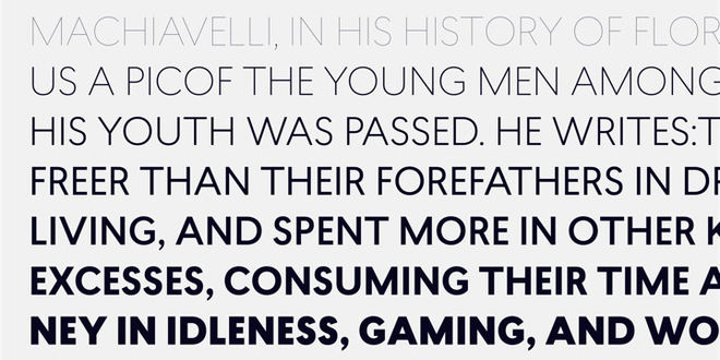
Various weights of the Lasiver font
What elements of this sequence are you most happy with? What are some of your favorite reveals in the piece?
I like the scene with Dave Crossland, because I think it's just a really clever reveal. I think a lot of people miss how it works when first seeing it, but that's okay. I like it when people scrub back to really catch the trick.
The scene with Rafa Galeano is another favorite. The same trick is used with in the bird/cage optical illusion. It is so simple, but really fits Rafa since he is also a motion designer with a love for typography.
But I like the scenes of Octavio Pardo and Erich Scheichelbauer the most. It was such fun to build little machines like that and figure out all the math behind it. It enabled me to operate them with just two or three keyframes. It feels like you're really building your own little invention.
What was the music and sound design process like?
I worked together with Matteo Taheri from Pastelle Music for that. He is one of my trusted sound designers. I instructed him to let the sound determine the feeling of the materials. With these flat colors you have no clue of scale or material. Take the rolling balls for example. With sound you can make it feel like glass marbles rolling on grainy wood. That has a very distinct sound. Rubber balls on a smooth surface sound totally different. Since the visuals are so minimal, the sound is 50% of the experience.
We had a few rounds of revisions to make it sound just perfect. The visuals are very digital, so I wanted audio to form a contrast. Like they were little mechanics the were hand build with small servo motors etc.
For the music Matteo presented me with two options. A poppy beat, which was not at all what I had in mind. And a more cinematic piece. It reminded me of a Harry Potter-esque atmosphere. It really took the whole piece to a new direction. It became adventurous in a small contained way. It could also work for an opening scene for a movie with tiny people living in human houses. Much like The Secret World of Arrietty from Studio Ghibli. It really grew on me.
TEDxTianhe opening by Bito
What are some of your personal favorite title sequences, either classic or contemporary?
This is a small selection of the sequences I really like: TEDx Tianhe by Bito, MAD 2014 by Sebas & Clim, and the MTV EMA 2012 opener by Sehsucht.
Was there anything that took you by surprise when working on this sequence?
Not really. The process was really smooth. It was hard to come up with all the different puzzles, but the actual production went fluid. Normally I run into a huge problem because I can't seem to build what I had in mind. I was waiting for that moment to happen, so I had to take a few steps back and try something different. That didn't happen this time. Maybe that was the surprise. That everything went according to plan for once.
What excites you outside of design?
I like to spend time with my 4-year-old son, reliving my own childhood. Play with cars, build robots from Lego, looking at nice illustrated books, and have a good wrestling match on the couch. To clear my mind from stress at the studio I go to the climbing gym. The focus that is required to make it to the top is a form of meditation for me.
Support for Art of the Title comes from


