Something beautiful.
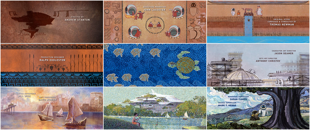
Jim Capobianco’s end credits to Andrew Stanton’s WALL·E are essential; they are the actual ending of the film, a perfect and fantastically optimistic conclusion to a grand, if imperfect idea. Humanity’s past and future evolution viewed through unspooling schools of art. Frame after frame sinks in as you smile self-consciously. It isn’t supposed to be this good but there it is. This is art in its own right. Peter Gabriel and Thomas Newman’s song, “Down to Earth” indulges you with some incredibly thoughtful lyrics and, from the Stone Age to the Impressionists to the wonderful 8-bit pixel sprites, you are in the midst of something special.
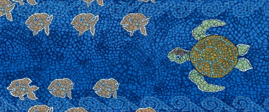
A note on type: WALL-E is promoted with an interpunct as WALL·E which Wikipedia tells us “is a small dot used for interword separation in ancient Latin script, being perhaps the first consistent visual representation of word boundaries in written language.” More inherent, embedded greatness from Pixar…as well as finding Finding Nemo’s Crush the Turtle (see contact sheet center frame).
In a great and successful attempt to preserve our likeness through the lens and canvas of art history, Jim Capobianco, Alex Woo and many others have rendered something epic; art without sublimation and an imprint of hope.
Art of the Title had the great fortune to speak with end title sequence director JIM CAPOBIANCO and animator ALEXANDER WOO from Pixar.
What was your approach to directing the end credit sequence? What were the first questions you had and how were the answers arrived at?
JC: Unlike our credits in the past, the main goal of the credits was to finish the story. To communicate that the humans were going to be okay. They would survive. It became a balancing act of telling the survival story, using art history to do it and to make sure things weren’t too distracting from the names themselves.
How did you go about developing story with Scott, under the aegis of Jim?
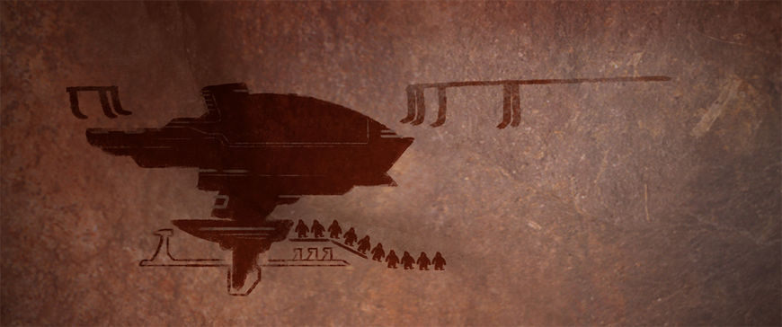
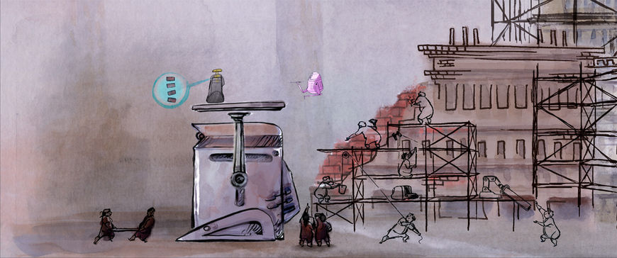
AW: It was a lot of brainstorming and research. We started by figuring out the different points of the re-civilization process of Earth 2.0 that we wanted to highlight. The early stuff was pretty straight-forward: the invention of fire, irrigation, agriculture, etc. Things got more complex the further along we got on the civilization track (division of labor, trade, development of architecture). We didn’t want earth 2.0 to follow the same destructive path that forced the humans to leave the planet in the first place. We ultimately decided that we would stop our depiction of the re-civilization process somewhere before the industrial revolution. I think the last thing we depict is the discovery of electricity. Once we figured out which milestones we wanted to hit, it just became a matter of finding the connective tissue between those points.
What were your references? Why were these eras chosen?
JC: Andrew told us to make it as if you opened one of those enormous art history books we all had as art students. The difficulty was in what art to show, how to integrate it into the narrative and then to keep the animation economical. We knew from Kevin O’Brien’s beat boards that we would start with cave paintings but in Kevo’s initial pitch of the idea the art was all over the place. So we had to figure out timeline wise how to proceed. We soon realized that about the time of the Renaissance, art becomes associated with particular artists and more specific to that artist.
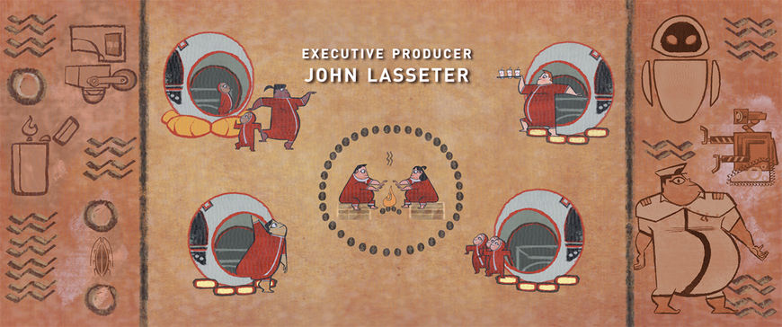
Before that it is easier to generalize the art. Some Egyptologist might be able to tell you who created certain Hieroglyphs but the audience is just going to lump together Egyptian Hieroglyphs. They are graphic, the greek pottery and mosaics also very graphic and lent themselves to a stylized simple form of animation but once you get into the renaissance everyone is saying that is Da Vinci or Michelangelo and things get complicated. You begin to ask yourself, “Are we saying that the Axiom Humans had another Da Vinci?” And it gets worse the more modern you get. So we started to refer to each section as a period and had to find an iconic style to represent that time in art which inevitably became associated with a famous artist of that time.
AW: Well, we were doing research along two different tracks. The first was researching the history of human civilization. For this, we used mostly the internet (Wikipedia!), and our own (limited) knowledge of history. The second track was the history of artistic expression. A lot of that reference came from art history books. I brought in an art history book that I had from college. Jim brought in a whole bunch of books from his own personal collection. It was a bit like doing a school project!
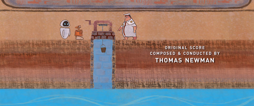
When we were choosing the eras, we tried to match the developments of Earth 2.0 with the developments of artistic expression in our history (Earth 1.0). So, for example, the development of fire in Earth 2.0 was depicted with cave painting, the earliest form of artistic expression from Earth 1.0. One problem we ran into was that there wasn’t always a direct correlation between a development in civilization and a distinct form of artistic expression. For example, the invention of irrigation occurred around the 6th millennium BC, but we used Greek Pottery from 5th Century BC to depict it. The way we got around this was to assume that the developments in artistic expression in Earth 2.0 would only very loosely follow the path that it took in Earth 1.0.
Why is 2D animation such a highly regarded way to end, and sometimes bookend, a 3D feature? As this is a recurring theme, do you get the sense of a potential resurgence in 2D features?
JC: The graphic nature of the text of the titles themselves lends to a more 2D approach I guess. The text is in 2D space so it is easy to imagine other 2D elements occupying that space and interacting with the text. 2D is also visually distinct from the CG feature so it may keep a few more people in their seats after the show is over to see something new. It is also I would imagine cheaper to execute. As far as will we see a resurgence of 2D features because there are a lot of 2D titles out there I don’t think they are one and the same. A 2D feature is definitely a viable way to make a film. It is a tool that has it strengths and does things CG just shouldn’t do or can’t do. And vice versa.
It’s just that someone is going to have to come along with a story told in 2D that just works so well in 2D. Perhaps a more graphic form of 2D. There is this film out in Ireland right now, The Secret of Kells and it looks tremendous, very graphic looking, stylized animation. Taking it’s design cue from illuminated manuscripts. I think this is they way things will go in 2D. 2D will come about again because it is the best way to tell that director’s vision of the story. Not necessarily that story! That is bullshit! I am tired of hearing the “Why would you animate that story?” It is about the design of how it is told. Look you could take a story like The Three Pigs and tell it in any form of animation or film for that matter these days and each form would give you a different feel for the same story.
Think about it you have photographs of boats, watercolors of boats, oils of boats, pastels of boats, computer images of boats they all say boat. Are some stories better suited to a certain medium? You bet. Toy Story works great in CG, obviously, probably not in hand drawn animation but it could have been done in live action with computers and pretty cool in stop motion! But it is done in CG and great in CG.
AW: I have no idea why it’s a highly regarded way to end a 3D feature. I actually don’t know if that’s an accurate description of 2D animation titles. I don’t think directors are choosing to do 2D animated titles because they’re ‘highly regarded’ or because it’s the popular thing to do. My guess is that it’s coming more from a place of a love for the art form and the aesthetic that 2D brings.
How does traditional animation influence your work?
JC: Huge. It is in my blood. I love it. Since I storyboard it influences how I depict a shot or board the character. I realized though that the animation I grew up on, that I went to school to learn and wanted to do is dead. It died long before CG usurped 2D. It passed away with the demise of the theatrical short. The animation at Warner Bros and the Disney stuff of the late 30’s , 40’s and Fifties, I am talking about. This was pure animation and the way those old guys thought about story was pure animation. It is hard to describe but they weren’t trying to get close to live-action or even the illusion of life they new the medium they were in and these guys knew how to milk it. I find the last two projects I had the good fortune to make have been my attempt to capture a little of that pure 2D animation.
AW: I LOVE traditional animation. It’s what got me into the world of animation and film in the first place. When I think of traditional animation, of GOOD traditional animation, I think of it as the foundation of what I’m doing now in 3D. It’s where I got all of my principles: design, composition, performance, timing, etc. For me, traditional animation formed the foundation from which I’ve built my understanding and love for film.
Do you begin working on the titles before story is finished?
JC: Nope, not in my experience. The titles are such an after thought it is almost like someone wakes up one morning in a cold sweat realizing that they hadn’t put any titles on their film and then it is hurry up get some credits on this thing! It is the nature of the beast, no one wants to think about the titles, they are too involved in getting a film done to attach to the credits. This hurts us a bit in artist resources and the time crunch but you learn to be flexible and resourceful. I actually kind of like it. I like being scrappy and being forced to figure out how to make the best of what I’ve got on hand.
How did you decide on the order of the painterly flourishes? How did you emulate the textures of the artwork?
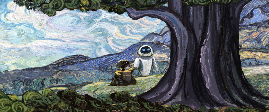
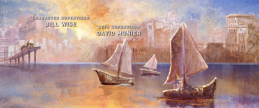
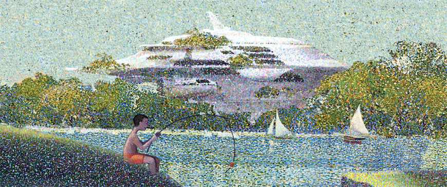
JC: We landed early on with Van Gogh, Kevin had put WALL·E and EVE in this lush feeling Van Gogh and it felt to both Andrew and I that that was were we should end with the cards. It was a good depiction of the Earth’s vegetation fully back. We then worked backwards. Van Gogh is post-impressionist so naturally we had to have impressionist and Seurat seemed right, his idyllic sunday in the park. The period between flemish drawings and the impressionists was a bit difficult to figure out. We couldn’t really do anything super representational like Rembrandt. since every section was going to have some animation in it. It seemed we could get away with more if we could stay abstract. Like the earlier art forms lent themselves to.
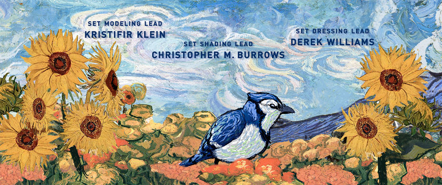
So the painting sections became real nail biters. This goes back to art periods being represented by particular artists. Once you say okay this is going to be Turner like into Seurat like into Van Gogh like you now have to pull off these particular painting styles. We have very talented artist at Pixar, the best, but I didn’t know if the painter I would get would be able to pull this off. Maybe they could do one of the styles. But we persevered and we got John Lee who basically could be an art forger. I am so grateful for what he brought to the piece, he actually suggested Turner for the pre-impressionist painting. I was able to sleep again. As far as technique it was mostly done in photoshop. John is just a whiz with his tools. Really unbelievable.
What’s the ratio, if any, of traditional vs. digital in this piece?
AW: When you’re referring to traditional vs. digital, do you mean hand drawn vs. After Effects? I think the question assumes a dichotomy that doesn’t necessarily exist. All of the animation and the backgrounds in the titles were put together digitally, painted digitally, and timed digitally. There was a lot of hand drawn work in there (the actual frames of animation, and even some backgrounds Scott painted on real media and then scanned in to the computer and further manipulated it), but all of it went through some form of digital manipulation. I don’t know if I can give you a proper ratio.
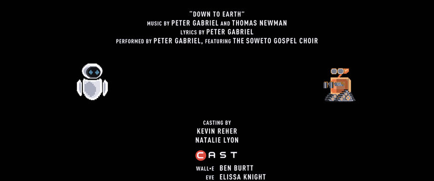
Why the 8-bit style characters in the long credit roll?
JC: Originally we were talking about carrying the art history into the crawl with 20th century art – cubism, Pollock, etc. but then Alex and Scott Morse had the idea to design the crawl as 8-bit. At first I wasn’t sure the style would work after Van Gogh but I guess since the “they survive” narrative was done with the cards we had license to play with a new thing. I also didn’t know until it was pretty much irreversible if this would work with Peter Gabriel’s song. But it is amazing how our minds associate images with what information we are given, auditory, visual, and just makes a connection. We had such a success with the 8-bit Mountie in “Your Friend the Rat” (it always gets a laugh) it was fun to be in that world again and it struck me as funny that here you just watched a feature of probably the most advanced computer graphics around and we end it with the most primitive. All the characters were designed by Scott and then animated by Catherine Kelly in After Effects.
AW: Because it was so cool! We pitched three ideas for the credit roll, and one of them was the 8-bit version. We pitched them all to Andrew, and he picked the 8-bit one. There was a reference to Pong in the film, so we figured this would be the next step in the development of that gaming technology for them.
What does Pixar look for in an up and coming animator? Can you offer an example of a career trajectory within Pixar?
JC: Pixar looks for people who can tell a story with what they do. For an animator it could be a unique way someone may act a scene with a character. In story boarding, it could be an interesting sensible perhaps unique approach to the material. We are really interested in the individual artist and what s/he can bring to the films. We always want to see personal artwork in an artist’s portfolio. This way we can get a gage of what makes them tick, what their interests are.
Tell us a secret; something you use that works most, if not all of the time.
JC: Be brave enough to take educated risks and apologize after. I believe this is how you get really great, interesting unique stories and storytelling. Here is another for the price of one. Always move. Don’t sit around waiting for approval or something to happen. I have found there is always something to do on your project. Even if it is the smallest thing it keeps the momentum going and momentum is everything. By always moving it gets you that much closer to getting the project done and you stay ahead of the people who feel it is there job to judge and can put a stop to what you are trying to say before you’ve had a chance to say it. Like a shark keep moving or die.
AW: Hm… follow your instincts, but be very open to critical feedback. Truth is hard to hear sometimes, but it needs to be heard, because it’s truth!
What do you have on the horizon? What did you learn on WALL·E that you will take into future projects?
JC: At Pixar I’ve been bopping around helping out here and there. Outside of work I have been concentrating on some of my own projects. I have a short hand animated film titled “Leonardo” I am finishing after ten years of weekends and stolen time. That will be out in festivals hopefully this year and next. The look we achieved in the Renaissance section of the credits is reminiscent of how I am finishing the look of “Leonardo”. So it actually gave me the chance to see how to pull it together that way. I’ve learned so much working on these projects, Your Friend the Rat and WALL·E’s credits, it is hard to pin point one thing I would take forward. I really like the people I’ve worked with and some of the same crew came on to the credits from the short. Alex, Scott Morse, Bob Scott, Willy Hwang, Kirstophe Vergne, Chris O’Dowd, and I would work with them all again and again if given the chance.
