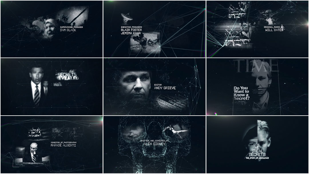
The story of controversial figures like Julian Assange and Bradley Manning seems an easy one to tell. Egomaniacal hackers, stolen top secret government cables (and their release), worldwide underground networks; these are all the ingredients of a classic cloak-and-dagger spy fantasy. Exciting stuff, and yet as anyone who knows the reality of hacking and cryptography will agree, the task of making computer code and computer networks look thrilling can be tricky. After all, film portrayals of “hacking the Gibson,” though a cult favorite, felt cheesy by late ’90s standards let alone today's. This is where Marc Smith and Framestore struck just the right balance between techno-cool eye candy and the mundane reality of navigating global networks and stealing classified information.
The ASCII art and lifeless color palette at the beginning of the sequence for We Steal Secrets invokes the cold and sterile world of quadrillions of data points and their myriad connections. As dithered images of Assange and key players in the WikiLeaks scandal materialize, the human drama of encrypted cables and their significance takes shape. Powerful protest imagery and gun cam footage interplay with the iconic bald pate of Midnight Oil's lead singer as he sings one of Assange's favorite lyrics:
"You talk of times of peace for all, and then prepare for war."
That theme plays throughout the film, but the title sequence tells the story of government lies and stolen secrets revealed from the uncaring perspective of raw data. Whether or not WikiLeaks' members are heroic ideologues or reckless anarchists, the sequence makes a pointed effort to stay impartial. The result is a cleverly presented digital universe of information, ultimately inviting the viewer to decide. Who are the true villains, here?
A discussion with MARC SMITH, senior design director at Framestore, New York.
Give us a little background on yourself.
I am a designer and director originally from Wellington, New Zealand, now based in Brooklyn, New York. I am currently senior design director at Framestore's New York office, a position I've been fortunate enough to hold for the last year.
How did this project begin with director Alex Gibney?
Alex approached the team here at Framestore to create his film's interstitial graphic sequences, illustrating the IM chat logs between Bradley Manning, Adrian Lamo, and Julian Assange.
This section was led by Maryanne Butler, head of design, and Murray Butler, the creative director. I was brought onboard once the conversation turned to the opening title sequence. The brief then grew substantially to encompass a number of animated sequences throughout the feature.
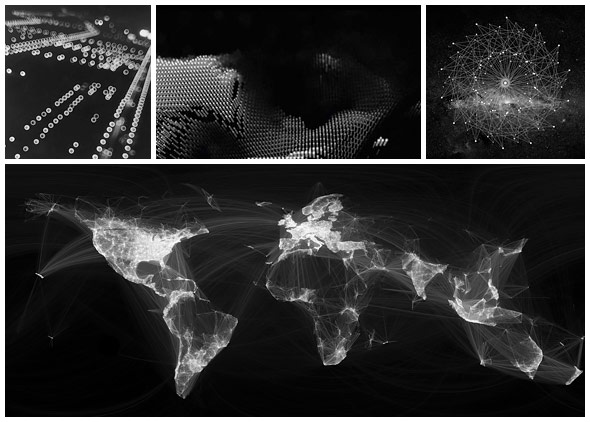
Research imagery
How was the original concept for the title sequence developed?
In keeping with the film’s sinister subject matter, the design development focused on creating a foreboding, tech-driven aesthetic involving international cyber-espionage, leaked military secrets, and the so-called “cult of personality.” Our research focused on conveying the sense of interconnected growth central to the film’s storyline – the spread of information in the modern digital age.
This concept of growth also relates to the structure of the film itself, a collective "montage" of facts that, when brought together, serve to form a picture of the whole dramatic Wikileaks saga.
So, to answer the brief, we drew reference from satellite imagery of the earth’s illuminated city networks, the molecular growth of viruses, web-like structures, and flight path patterns.
To visualize the spread of information, an interconnected structure of pixels acts as a backdrop, framing imagery that becomes visible over time – often from only one angle – to then shift and transform to present a new set of information and imagery.
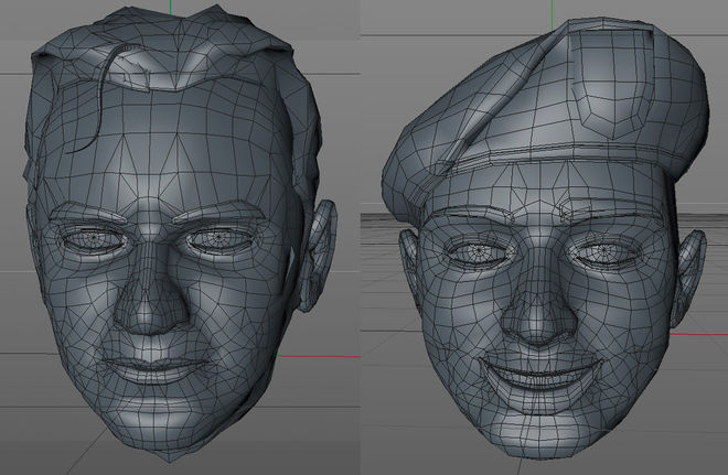
As for the “cult of personality” storyline, that was represented through the use of a 3D construction of our main protagonist’s skull and facial features. Over the course of the sequence, this image is presented with increasing, shifting clarity, seemingly formed out of the pixelated headlines and media content. There is a duplicity in the final reveal; the image represents the two sides of the film’s unfolding drama.
Were there any issues with working on a film about a controversial topic such as WikiLeaks? Anything you had to be careful of?
While the title sequence should serve as a prologue to the film's often sinister content and tone in its graphic approach, we were very mindful of the exposure of the project, and being a documentary, the need to remain accurate and as impartial as possible in our presentation.
Render tests
What was it like producing graphics work for subject matter that was constantly updating itself in real time?
That certainly was a unique challenge on this project! When talking about the production timeline, for example, there were many stages when we needed to stop and simply wait for the storyline to develop. When you develop a design strategy, and then need to wait months before implementing, it's very tempting to constantly reassess and re-work.
Another hurdle was the nature of having an edit that would need to expand and contract to fit the story it was telling. It became evident early on that we needed to develop a set of nimble techniques and strategies to successfully deal with that.
The sequence seems to feature an extensive use of Plexus for After Effects to create the connecting lines, which has a rather recognizable look. Why did you decide to go that direction?
*Plexus is a 3D particle system plugin for Adobe After Effects by Rowbyte Software.
Highly integrated into After Effects, it allows you to create generative art with ease, is native camera and light aware, has a modular workflow that is infinitely configurable, and has a high quality custom rendering engine.
For other examples of Plexus in use and for more information, visit aescripts.

Work-in-progress stills
While a 3D "pixels, nodes, and lines" aesthetic had been established months earlier in our initial concept meetings, there were a number of reasons we went with Plexus 2* for the finals, not least of which was the extremely fast turnaround speed required to make the deadline.
I had been creating the entire build within C4D, using a combination of cloner and tracer effectors to create the look. While I loved the absolute control it gave us, the rendering time was looking problematic, especially with the high volume of edit changes coming our way. So the timing of the Plexus plugin release was perfect for this project.
Were there any other tools or plugins you used in unusual ways?
We probably used a rather unique combination of toolsets. From the outset, we didn't want the piece to simply rely on one technique or "trick." Even though Plexus 2 was a relatively recent release at the time, there were already some beautiful examples of its use out there in the world. I was interested in combining that with what I saw as complementary techniques and toolsets, including Cinema 4D, Trapcode Form, and Trapcode Particular – throwing in a bit of Chroma-Warp and Data-Glitch for good measure.
As for the graphic sequences for the film aside from the title, how did those develop?
The design of the main titles served as a springboard for the majority of the other graphic sequences. We endeavored to keep a somewhat unified tone across the board. In fact, many shots were added as Alex, the director, discovered the story-telling scope of many of the techniques we were employing.
On a technical front, one of the challenges that manifested itself in both the main titles and a number of other sequences, was the low-resolution of much of the web-based archival imagery we were supplied with, and needed to present. We decided early on to play this in our favor, and feature this pixelation and degradation in our creative.
Graphics work montage
What was the production timeline and how big was the team?
For the title sequence, I was an army of one! Following the initial concept stage of around one to two weeks, the production itself was approximately four weeks on one machine, including changes.
For the large volume of graphic sequences – we delivered 34 minutes of animated final content – we enlisted the help of two talented local freelancers, Joe Lawrence and Gabriel Pulecio, to assist our in-house team including Byunghoon Han, Zack Lydon, Callum McKeveny, and Maryanne Butler.

Location title cards
While this work was spread across several, staggered months, the final production push was about 6-7 weeks from locked-edit to delivery. In making this deadline, a huge thanks has to be given to our producer Sumer Zuberi.
And just more generally, what are some of your personal favorite title sequences, either classic or contemporary?
I couldn't answer this question without first mentioning the masterful intro sequence to Se7en by Kyle Cooper. This landmark piece almost single-handedly unified my passions for typography and moving image and inspired a generation of designers like me to pursue titles design. I would of course also want to mention the numerous works of Pablo Ferro (Dr Strangelove in particular), Saul Bass, Garson Yu, and Danny Yount. I'd probably be upset with myself if I didn't also mention Napoleon Dynamite.
Support for Art of the Title comes from
