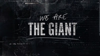
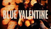
The question at the heart of Liz Garbus’s affecting documentary is one posed by Dr. Maya Angelou in a 1970 piece published in Redbook. She asks, “What happened, Miss Simone?” and Garbus uses Nina Simone’s own words and the characters of her life, never-before-heard recordings, and rousing archival footage to paint the picture.
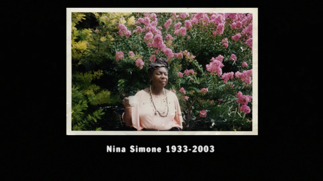
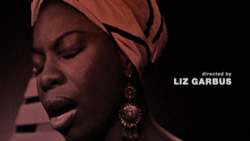
Taking design and editing cues from music documentaries of the late ’60s and early ’70s, Garbus details in impressionistic moments the rise and fall of one of America’s most powerful voices and freedom fighters, the High Priestess of Soul, Nina Simone. The biographical film is bookended by performances, the opening footage taken from later in Simone’s career, and the closing footage from earlier years. In this way, the film begins at the end: the complicated and afflicted genius, staring into the audience, moving from a blank, hard expression into an easy smile. “I have decided that I will do no more jazz festivals…,” she says softly, declaring herself and her limits.
The footage chosen for the closing sequence (featured above) is exultant, layered with photographs and scenes from other performances to create a celebration of the vibrant and magnetic artist at the film’s center. Performing an extended version of the 1967 song “I Wish I Knew How It Would Feel to Be Free” by Billy Taylor and Dick Dallas, Simone is at her warmest and her most magnificent. Her arms are in constant motion. She is electrifying, her body an instrument of light and energy, her voice lifting and lifting.
What is genius, and what is mental illness? How can you be an artist and not reflect the times?
A discussion with Director LIZ GARBUS and Title Designer CHRIS RUBINO.
Let's talk about the film a little first. One of the last major biographical documentaries you directed was Bobby Fischer Against the World. Was there something that you wanted to do differently this time around?
Liz: I think that every film kind of dictates its own needs and styles. I don’t look at a film and say, “What do I want to do here?” I am listening to what I have and listening to the story and thinking about its best incarnation.
Bobby Fischer Against the World (2011) trailer
Bobby was a recluse, he ran away from the media. He didn’t express his feelings throughout his life very openly until quite late in life when he was suffering from mental illness, and then it was more in the form of a rant, rather than the young Bobby Fischer who was the genius. With Bobby, there was a lot more interviews, a lot of other people who had to put together the story.
Nina was very expressive and obviously was often filmed performing and was forthright with her views. For me, for the Nina Simone film, it was about getting as much Nina to speak about her life and ideas as possible.
It’s interesting that you don’t go through the events chronologically. You paint a kind of abstract portrait of her life and character.
Liz: Yeah. I mean, I never really approach a film chronologically, I really approach them thematically. It’s really about presenting a mystery and unspooling it throughout the course of the film. I think that’s a more satisfying storytelling technique.
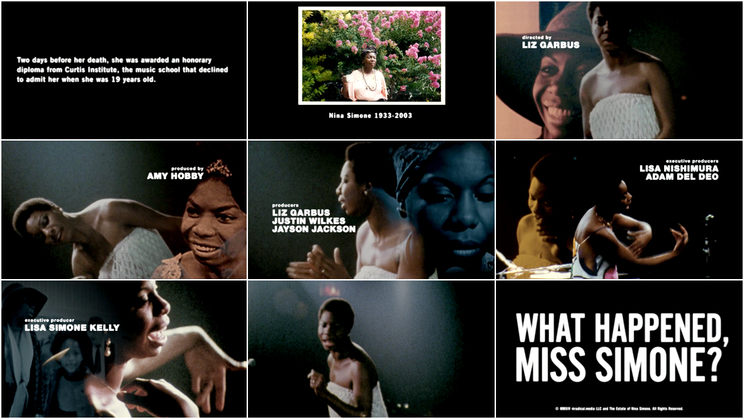
What Happened, Miss Simone? opening title sequence
For a documentary, What Happened, Miss Simone? is a bit unique in that it pays considered attention to its title sequences. What was your approach for the opening and closing of this film?
Liz: When I was making the film, we were really collecting archival material from the heyday of Nina’s career in the ’60s and ’70s. For me the title design was inspired by rock and music documentaries – the great rock and music documentaries of that era. I looked at the title design of Don’t Look Back and Gimme Shelter and other films that were around at the time to get the inspiration for the font and the layout.
Dont Look Back (1967) main and end title sequences
Chris: We also found inspiration in the album art of the time. We were looking at pieces that used photography in an illustrative and graphic way. Pretty quickly we liked the idea of working with monotone and duotone palettes and incorporating the footage into a sequence that would resemble an album cover coming to life.
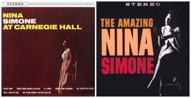
Image Set: Nina Simone album covers used as inspiration. The Amazing Nina Simone was her first album, released in 1959, and Nina Simone at Carnegie Hall was recorded live at her first solo appearance at Carnegie Hall in New York, on April 12, 1963.
Chris: I worked with an animator named Craig Lacombe and he also has a deep interest in Nina and the world of music she was part of. It’s always the best when one can work with content that is special, that you feel a connection to.
How did you work with the typography and decide on the typefaces?
Chris: I started with the design of the title itself. At the time we were still working out the final title of the film so we were trying out treatments on a few directions.
With the typography we wanted to give it a look of being optically printed. Unfortunately, due to time restraints we weren’t able to make that happen but we were able to simulate that digitally. We had gone through a number of period-specific typefaces before landing on Nimbus Sans which predates Nina by a decade but had gained popularity during her time. For the main title itself we worked with Alternate Gothic.


Early title card designs by Chris Rubino
When did you know you wanted to bookend the movie with performance footage? How did that happen?
Liz: I don’t think one knows those things until one collects the material and you decide how your story works, and where you’re going. That’s something that evolves through the edit.
We didn’t get any footage from the family. The footage came from all over the world, you know, spanning a 40-year period of her performing in concert halls and on television shows throughout her career.
“Ain't Got No, I Got Life” performed by Nina Simone and band in the Netherlands, 1965
Chris: Liz had a great team pulling archival imagery already leading up to my involvement. She had done so much research to tell Nina’s story in her film so we had a great archive of stills and footage to select from in order to tell a story within our sequence.
Nina’s actual diaries were on-hand for this film. That was incredible, to have an opportunity to look through those and have that sort of first-person contact with such an icon. They are an incredibly personal insight into the struggles she had as an artist and as a human being.
For the main-on-end sequence specifically, where did that footage come from?
Liz: That came from a 1968 NYU student film called Nina that was shot by a film student at the time who spent some time with Nina at the Village Gate in Downtown Manhattan.
Chris: In the end sequence we wanted to show a balance between Nina as performer and Nina as a person.
It’s really spectacular because her energy is so magnetic, she’s almost head-banging.
Liz: It’s a terrific – I mean, it was an incredible performance and really, really well shot.
How did you work together as director and as title designer?
Liz: Well, I told Chris the ideas that I was interested in and some of the movie references that I was inspired by and the look and feel that I wanted. Then we would go back and forth on some of the rest, and he would send me ideas.
Chris: Liz was very open. She was interested in a period-specific aesthetic and a creative direction at the end of the film that would reinforce the incredible and complex life of Nina Simone.
Soon after starting we decided that the heavier part of the graphics would appear at the end of the film.

Credit layout examples
Liz: In terms of the title sequence and folding in the images, that was a combination of him and my editor Josh Pearson. We were thinking about layering the still images of her with the performance footage, and that kind of happened in the edit room.
Chris: I presented concepts to Liz and Josh as they were in the deep midst of editing and finding the story. They would be able to try out some of the directions this way immediately in the cut and see what was working or not. Liz is easy to work with. As with most great directors she is able to delegate a task like title design and knows when she is getting back what she is looking for.
Now, I know this is a loaded question, particularly with your knowledge at this point, but do you have any favourite Nina Simone songs or moments that really stick out to you, on a personal level?
Liz: [laughs] No, I definitely have favourite songs! I mean, “Ain’t Got No, I Got Life” is one of my favourite songs. And “Four Women” – which isn’t in the film – is one of my favourite songs also. There are many treasures, but those are some of my faves.
"Four Women" performed by Nina Simone and band at the Harlem Cultural Festival, 1969
Chris: It’s difficult to choose songs – she doesn’t really miss when it comes to her music. To name a few favourites I’d say: “Wild is the Wind”, “Mississippi Goddam”, “Suzanne”, “Let It Be Me”. The film actually inspired a tribute album by some great artists like Lauryn Hill, Mary J. Blige, and her daughter Lisa Simone.
"Mississippi Goddam" performed by Nina Simone and band in the Netherlands, 1965
In terms of title sequences, are you a fan generally? Is that something you take note of, when watching a film or TV show?
Liz: Oh yes, absolutely!
What do you think are some of your personal favourites?
Liz: Well, certainly I was inspired by those early ’70s films that I mentioned, but also anything Saul Bass had his hands on. Vertigo is amazing!
Chris: The Shining is so classic. I love the oddness of the colour choice and movement. That iconic music is playing over those powerful landscapes, then the bizarre choice of blue type scrolling over the picture. I think it throws the viewer off for a second and is a little hint at the strange things to come. Really, a perfect opening.
Also I really enjoyed the titles for X-Men: First Class. Simple, beautiful graphics that we don’t see often right now, especially in giant superhero films. That sequence is thoughtful, sophisticated, and a great match to the ideas behind the film.
X-Men: First Class (2011) main-on-end title sequence, designed by Prologue
And what’s coming up next for you?
Chris: I just completed and released a short film, my first time directing. It’s named Some Of Us Had Been Threatening Our Friend Colby, based on the story by Donald Barthelme.
In terms of title design I’ve just completed the titles for Derek Cianfrance’s newest film The Light Between Oceans coming out later this year. Also a great new doc that just opened Sundance named Norman Lear: Just Another Version of You. Keep your eyes out for that one!
Liz: I have a film on HBO called Nothing Left Unsaid and I’m in development on a bunch of projects that I’m not able to talk about yet!
Do you have a white whale, something you’re dying to tackle but that still seems out of reach?
Liz: I think I’m tackling the things that I want to tackle, actually. I think the whales are coming into shore and I’m bringing them in!
That seems really satisfying.
Liz: Yeah! It is.
