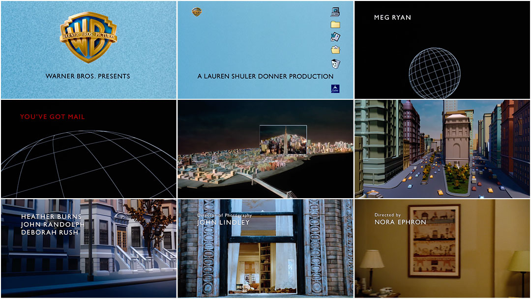
There is a kind of magic in human memory that functions much like the structure of the Internet: a web of invisible connections, ever present but waiting to be activated. Hearing a sound can transport us back in time, to memories thought lost. The click of a mouse can do the same, taking us back into our own archives or into entirely new worlds. In the first moments of You've Got Mail, we hear the chittering of a '90s-era PC booting up and see a digital window opened on a desktop. We are transported through a stark cyber universe to a vibrant and 3D Manhattan. We click through, Harry Nilsson’s "The Puppy Song" floating in friendly and charming as the cursor opens successive windows, finally opening on reality: Director Nora Ephron’s bubble of New York City in 1998.
Poetically, there is one more window to be passed through, this time a real one in an Upper West Side apartment where Kathleen Kelly sleeps.
The title sequence perfectly sets up Nora Ephron’s vision: a gentle marriage of the future and the past. It was created by a powerhouse team including graphic designer Mirko Ilić, animator Lauren DeNapoli, and design firm WBMG, led by Walter Bernard and "I ❤ NY" design hero Milton Glaser. The screenplay for the film, a collaboration between sisters Nora and Delia Ephron, is a rewriting of the 1940 film The Shop Around the Corner, itself based on a 1937 play called The Parfumerie by Hungarian playwright Miklós László. In You’ve Got Mail, Nora Ephron takes the original form of correspondence between the lovers – letter-writing, on actual paper – and updates it to email, then a burgeoning form of communication. These were the days when logging on was a ritual and the Internet itself had a title sequence complete with a screeching soundtrack. If you were lucky enough to have new messages, it also had a bit of a narrator, a stolid male voice uttering the titular words: You've got mail.
Logging on to AOL clip from You've Got Mail (1998)
For AOL users of the '90s and early 2000s, this voice was part and parcel with their experience of the Internet. It was the voice of Elwood Edwards, an unassuming TV editor from Cleveland, Ohio, who first recorded the slogan in 1989 with a cassette deck.
By combining this nostalgic romance with a sophisticated look to the technology of the future, Nora Ephron’s film became a window into two worlds. It also prophesied how many of us watch movies today – on our computers, just one window of many.
A discussion with graphic designers MILTON GLASER and WALTER BERNARD of WBMG and MIRKO ILIĆ.
What were you doing in the late '90s? What was your practice like then?
Milton: I was working with a lot of supermarkets, restaurateurs, Sesame Place, and big industrial projects. I’ve tried to keep a varied practice because I don’t like doing just one thing. We were still designing magazines and newspapers at that time as well.
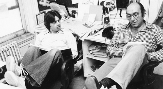
WBMG: Walter Bernard (left) and Milton Glaser (right)
Walter: As WBMG, we were principally redesigning magazines. In the late ’90s we were redesigning Fortune magazine, among others.
Mirko: My company was doing a lot of 3D illustration and animation at that time. We were designing identities for different companies, and book design as well.
How did You’ve Got Mail come to you?
Milton: Nora Ephron worked for New York magazine which I was running together with Clay Felker at that time. I got to know Nora through her assignments at the magazine.
Walter: I had known Nora Ephron since meeting her at Esquire and New York magazine in the '70s. She invited me to design the title sequence of her first film This is My Life in 1991.
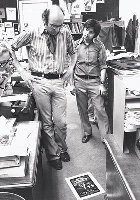
Milton Glaser and Walter Bernard at New York magazine offices pondering a cover design, 1974.
Photo: Cosmos Sarchiapone
Milton: She knew what I was interested in and capable of doing and she just asked if we’d be interested in doing it. It was the first time that I’d done anything more than an illustration or a jacket for her.
Walter: Milton and I successfully designed titles for that and her next three films, and she hired WBMG to work on the You’ve Got Mail title sequence as well.
I also invited Mirko, who was well versed in computer graphics at that time – much more knowledgeable than we were.
At what stage of production did you come in? Was the film already shot?
Mirko: It was the real beginning of shooting.
Walter: We were hired early. We visited the sets to meet with Nora and show her our progress many times in New York City and New Jersey during filming.
Tell us about the process. How did you start?
Milton: I think the idea came early in the game, of sort of entering into [the character Kathleen’s] universe, scene by scene, as though you were coming into New York. It was the arrival that we were interested in portraying.
Walter: The initial concept proposed by Nora and Delia was the starting point. Nora wanted the world of cyberspace and email to be a theme of the sequence. The computer as it existed in 1997 and the graphics of AOL were our guides.
Mirko: Then Milton came up with the idea to replicate and animate Mondrian's Broadway Boogie-Woogie painting, where the little squares would start to move around like cabs on the avenues, and the camera would go lower on the canyon of Broadway and everything would become geometrically abstract 3D.
—Walter BernardNora wanted the world of cyberspace and email to be a theme of the sequence.
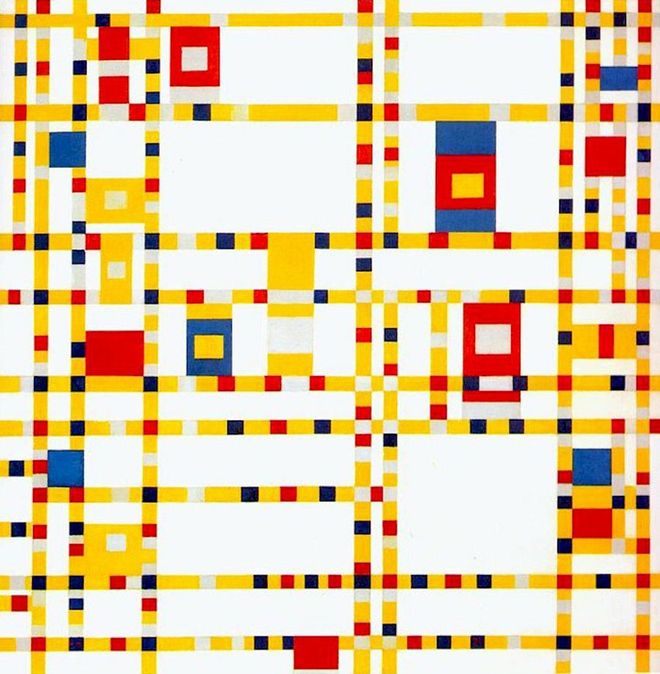
Piet Mondrian's Broadway Boogie-Woogie, completed in 1943
We even did a little test and it was actually looking really good, but Nora wanted something more realistic or romantic. We turned Milton's idea into a more realistic version, dropping the Mondrian and adding computer aesthetics to the landscape. We started from outer space with simple wireframes of the Earth, to look a little like the first interface of the computer. For fun, we only put Manhattan on the globe, because nothing else existed in this movie except Manhattan.
Milton: The nice thing about it is the way – I think, in terms of filmmaking – the way it cuts from scene to scene and in an obvious way was both an allusion to New York and to filmmaking.
Did you storyboard? How did you develop that?
Mirko: Yes, I did storyboards, which changed a few times after doing a few tests.
Walter: We decided to photograph all the buildings of Broadway on the Upper West Side from 72nd street to the brownstone where the film begins. These photographs would be a guide for the computer graphic animation.
Mirko: At one point, we were trying to cover too large a ground with the fly-by. We were afraid people were going to get motion sickness.
With each click of the arrow a new window would open, with a little bit more sophisticated or advanced 3D world, more details, more colors. The final click is the opening window from 3D to the real world.
Right, and this was a time when 3D graphics were just starting to become a tool for motion and graphic designers.
Milton: It was, and I was more ignorant then than I am today – and I’m totally ignorant today – so we asked Mirko because we were largely inexperienced in that whole area, to see if he could support our idea and figure out a way to make it attractive and interesting.
Mirko: The sequence is almost like a little history of computer graphics and visual aesthetics of computers.
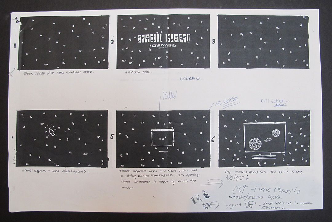
Storyboards for You've Got Mail by Mirko Ilić, featuring comments from Director Nora Ephron
How were you making the graphics? What tools and equipment did you use?
Walter: Mirko hired a team of computer graphic animators to work with us.
Mirko: We used Alias|Wavefront software and Softimage software. The process was very complex. For example, all the hi-res rendering was done at Sony in California. Sony had proprietary software and didn't want to deal with our software. We needed to send two of our animators to California together with the computers to recreate a few things on the spot.
—Mirko IlićFor fun, we only put Manhattan on the globe, because nothing else existed in this movie except Manhattan.
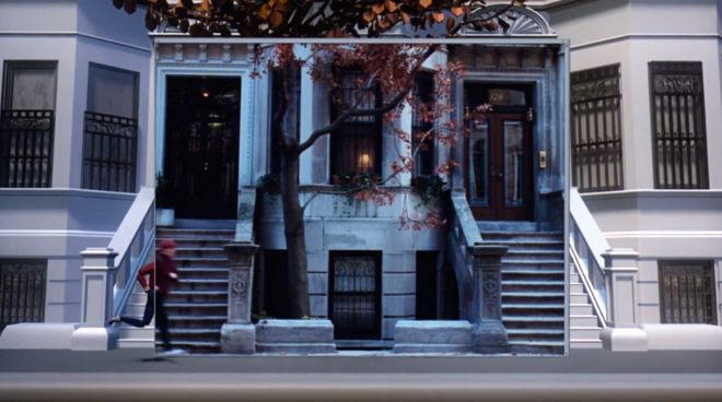
The moment in the sequence when a window is opened onto reality – the jogger goes from 3D animation to live action
They spent two or three weeks there working and trying to figure out how to communicate between our software and Sony's software. Don't forget this was the beginning of 3D and no one was very used to it or knew exactly what they were doing!
Walter: It turned out to be a very arduous process. The concept was much easier than the execution given the state of our computer equipment at the time. We might have been naïve about what we could produce causing some concern by the producers about budget.
What was the relationship like with AOL? How did you navigate using elements of that brand?
Mirko: Part of the plot of the movie includes the constant voice alert – "You've got mail" – which was very distinct for AOL, and is also the title. I believe when Nora was securing the rights to use that she also secured the rights to use America Online's logo.
Walter: My understanding is that AOL was happy to be the email brand used in the film. This was a Warner Bros. film, part of Time Warner Inc., which later merged with AOL.
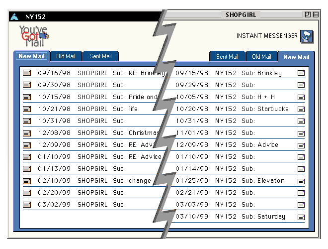
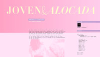
Remarkably, the You’ve Got Mail website developed in 1998 by Warner Bros. as part of its online marketing campaign is still live. Visit it to check out the characters' emails, download desktop patterns, and look at ASCII art. See it here.
How did you work with the music and the sound design?
Mirko: We created sound effects, the keyboard typing and mouse clickings.
Walter: We did suggest and demonstrate the computer sounds but Nora was undecided about the music during our design process. She chose the music after the title sequence and the film was completed.
Mirko: I didn't think the music was a great choice at the time. It felt to me like an odd couple. However, seeing everything together for the first time, it felt just perfect. Nora was right.
What was it like working with Nora Ephron?
Milton: Nora was a delightful woman – extremely charming but with a will of iron. It was fun to work with her, because she — did you ever meet her?
No, I never had the pleasure.
Milton: She was a very vivacious, attractive personality and full of energy. Generally speaking, she was optimistic, but if you really were in disagreement, she was tough.
—Milton GlaserNora was a delightful woman — extremely charming but with a will of iron.
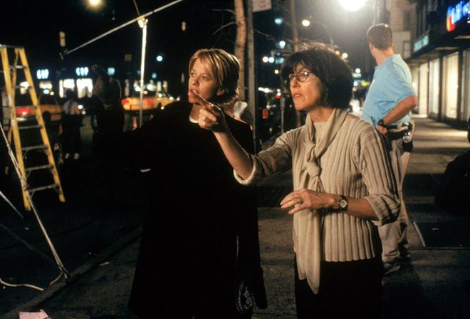
Nora Ephron directing actors Tom Hanks, Meg Ryan, and Jean Stapleton on the set of You've Got Mail
Mirko: It was great. She either liked things or she didn't. There was not much ambiguity.
Walter: This was Nora’s fifth film and we had worked on all five. She was very clear and decisive about what she wanted us to accomplish.
And more generally, do you have a personal favourite title sequence?
Walter: Saul Bass, Walk on the Wild Side.
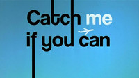
Mirko: Somehow the first thing that comes to mind is the title sequence for Catch Me If You Can. It's a nice combination between classical and modern.
Milton: They’re so skillful now, and so many of them are extremely well done. My own feeling is that many of them are too self-conscious and they very often call more attention to themselves than they should. Their real role is to prepare you for the experience of the movie. But many of them are sort of independent creations which act like an overture that’s not necessarily in line with the content of the picture. My own feeling, philosophically, would be to do a title that would seamlessly enter into the film. I find that most of the introductions are more assertive than I would like them to be.
What are your thoughts when you look back on this sequence in particular?
Walter: I think the end result was absolutely brilliant thanks to the work of Mirko and his team. The film and the title sequence was a great success.
Milton: I looked back on it the other day, having not looked at it since the movie first came out, and I was quite charmed by it. I thought, even with the relatively primitive nature of the animation – it sort of looks like the beginning of animation work, as you said, it was very early in that game – that sort of reductive simplicity looks very delightful to me. And it also is very much in the spirit of the rest of the movie. I was quite pleased to see it again.
It always seems fresh after you take so much time away, doesn’t it?
Milton: Yeah, well a lot of times it’s terribly disappointing or disheartening to see what you did 20 years earlier but in this case I was quite charmed by it!
Clip from the You've Got Mail end credits, which are clicked open in a new window
Support for Art of the Title comes from

CINEMA 4D BY MAXON
Featuring an Unmatched Live 3D Pipeline with Adobe After Effects CC.

